
The home page plays a significant role and takes up the central position in any project. First and foremost, it is responsible for producing the first impression, and as we all know, this factor is extremely vital if you want to succeed in your industry and the fiercely competitive web. It also sets the tune of the project and instantly reflects the concept. That is why, and, of course, for some other strong reasons, as a rule, designers pay much attention to building front pages.
For a long time, utilization of lavish and visually interesting images as a header background was considered to be a win-win solution; however, the time has changed and video backdrops, and subtle and refined animated canvases have come to replace them. The latter is going to be today’s topic for discussion. Let’s explore together some fresh typical examples of energized homepages with fancy animations that radiate dynamic elegance.
Outstanding Examples of Home Pages
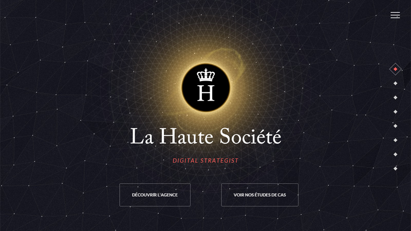
La Haute Societe
La Haute Societe exudes an image of chic sophistication with its splendid and highly energized “welcome” section. The effect is achieved with the help of a small yet eye-catching and well thought out animation that sets up the rhythm and tone of the project. Delicate line style graphics, hamburger button and the logo with a royal touch enormously add to the atmosphere.
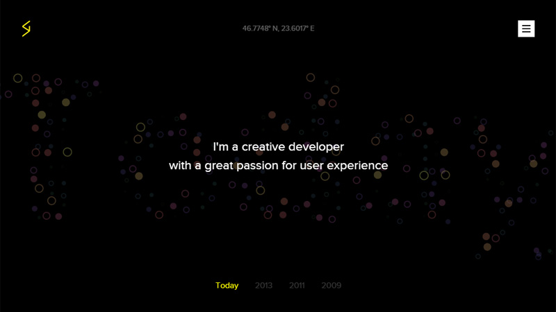
Stefan Gugurel
Stefan Gugurel brightens the front page of his personal portfolio with a fancy dot style animation that naturally stands out from a boring black background. Chaotically moving circles add movement and dynamics to the static page.
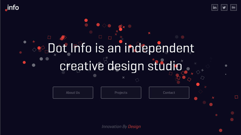
Dot Info
Much like the previous example, the landing page also includes a splendid dot style animation that originates in the lower right corner and crosses the entire page. It helps to create a visual path that leads users from one side to the other and unobtrusively focuses the attention on the bold tagline. Here, dots are chosen not accidentally, they graphically reflect the name of the website dotInfo.
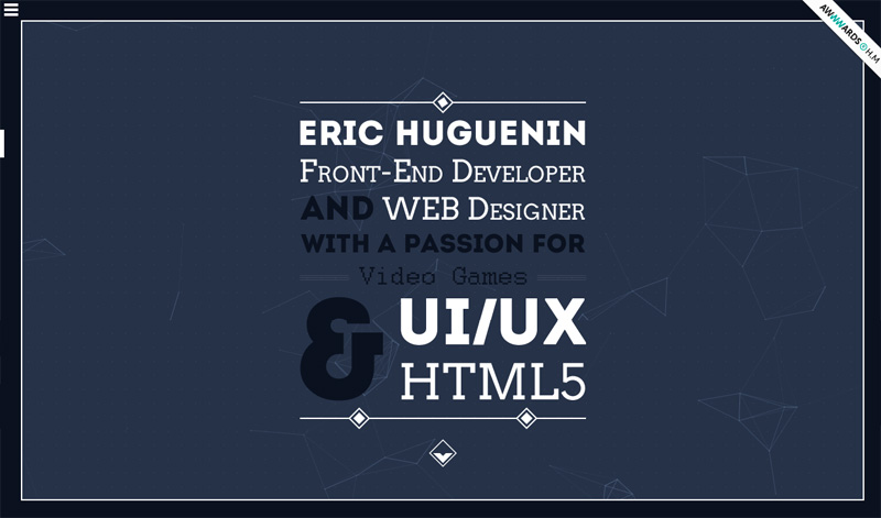
Eric Huguenin
The home page of the personal portfolio of Eric Huguenin is marked by a fantastic and striking type-based centerpiece that briefly familiarizes users with the artist’s potential and sphere of expertise. Although this is quite enough to grab the attention, the developer has reinforced the overall impression with the help of a small yet eye-catching animation.
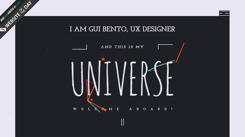
Gui Bento
The front page features a powerful animation with a lovely chaotic feeling that instantly catches the eye. Thanks to a well thought out choice of typography and gorgeous color scheme, the animation serves as a complementary element that does not distract the attention.
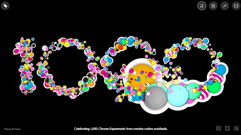
Celebrating 1000 Chrome Experiments
Websites that are marked with the sign of “Google Chrome Experiment” are famous for high-end animations, and this particular project is no exception. The home page includes a vibrant top-notch animation that demands an interaction with users for a better experience. It is so alluring that it is quite difficult to resist.
Celebrating Chinese New Year 2015
Nodeplus is a successful experiment made with the help of mighty WebGL techniques that are able to bring to life outstanding ideas. Here, the “welcome” section produces a strong first impression thanks to a spectacular scene enhanced by a neatly executed subtle motion.

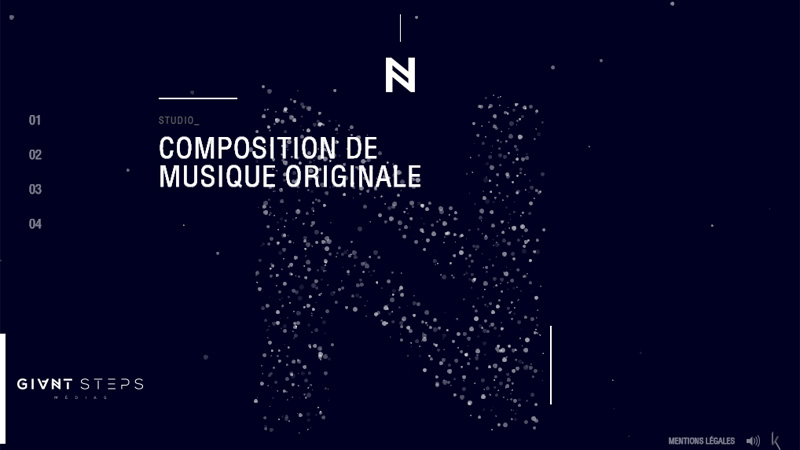
Giant Steps Medias
The website features a first-rate animation where particles gracefully shape the huge letter “N”. Users can blow it up via the mouse cursor – an action that certainly keeps interest alive as well as urges you to delve deep into the project.
UAWEB
UAWEB have succeeded in creating a magnificent cosmic theme where subtle and refined line style graphics in tandem with some minor animations create the whole aesthetics. The powerful geometric touch beautifully charges the overall appearance and makes the website worthy of attention.

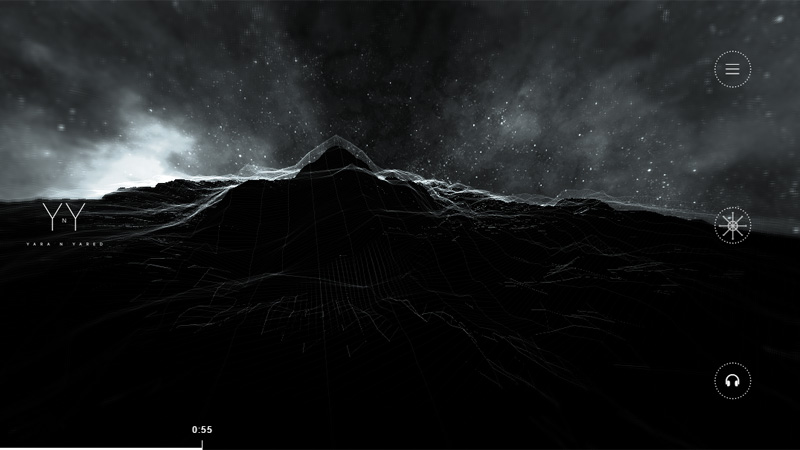
Yara ‘n’ Yared
YnY produces a profound effect with its sophisticated and exquisite atmosphere. The designer demonstrates how a gloomy dark coloring bolstered by an enigmatic animation can do wonders. The page unobtrusively prompts you stay for a while and explore the project.
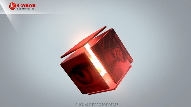
Canon
Canon’s official website with its predominant grayish coloring and a generous amount of gradients conveys a beautiful old-timey feeling from the era of skeuomorphism. A matchless centerpiece that depicts a dynamic 3d cube naturally blends with the environment and adds a note of modernity.
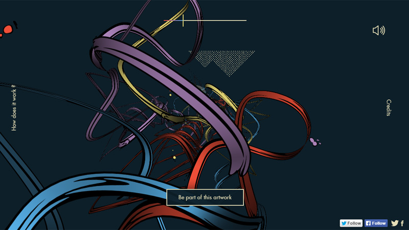
2015 is yours
The interest of the home page of 2015 is yours lies in its unusual animation that features vibrant moving stripes. This solution brings some energy to the website as well as embellishing the dark solid color backdrop.
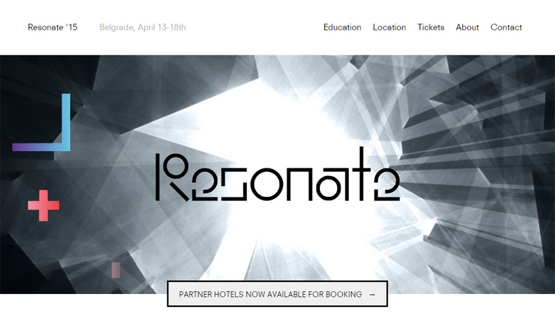
Resonate 2015
The official website of Resonate 2015 gets its impressive appearance from a series of enigmatic and elaborate header backgrounds. The latter naturally collaborates with flawlessly animated geometric shapes and beautiful structural typography.
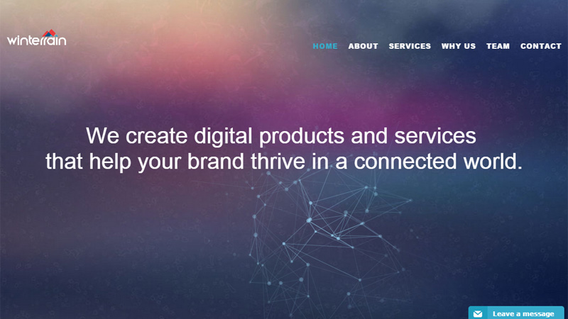
Winterrain
Winterrain effectively communicates the concept and illustrates its cause. Rich header backdrop creates a visually appealing depth that showcases the spirit of the project. Small accompanying animation that follows the mouse cursor fits here like a glove, adding a note of subtlety.
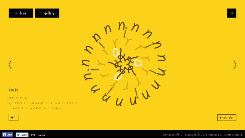
Kotobana
Kotobana is an experimental project that draws flowers from words; to be more precise, blossoms are created from symbols. The front page serves as a demonstration tool that displays items from the gallery without pauses.
Wonderful Colorado
Wonderful Colorado makes you almost feel the cold air of Colorado with a picturesque illustration enlivened through subtle motion. Everything here contributes to the general atmosphere: cold color scheme, delicate flat style characters, lots of white space and accompanying animations.

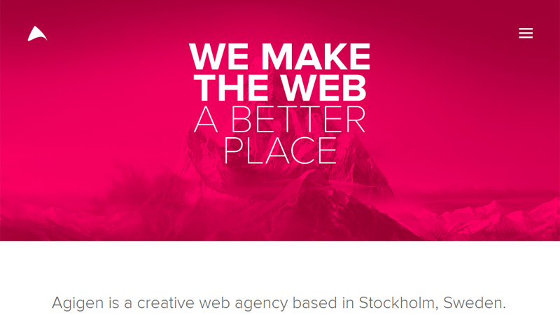
Agigen
The front page of Agigen is marked by a carefully reproduced subtle motion that adds dynamics and a beautiful sense of movement to the header background. As a result, the landscape image establishes a proper general feeling, supports the tagline and sets the pulse for the project.
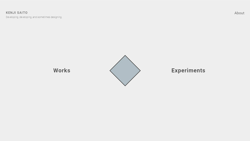
Kenji Saito
Kenji Saito has a top-notch personal portfolio, although it is made with minimalism in mind. Ditching all unnecessary elements and opting in favor of animated details enables the artist to draw attention to his personality in a natural manner and give subtle hints about his potential.
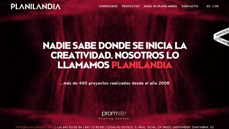
Planilandia
Unlike the previously mentioned examples, this website gets its energizing look from a simple video background that revamps the whole appearance. It effectively highlights the tagline and adds vibrancy.
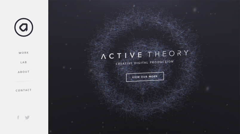
Active Theory
Active Theory features an enlivened background that successfully urges users to play with it. Magnificent polygonal canvas with subtle convex areas naturally strikes the eye, highlights the content and prettifies the appearance.
Conclusion
Animated home pages are slowly but surely displacing static ones from their pedestal and occupy their special place. In the era of HTML5 and JS, such an outcome is quite predictable. The more so, all you have to do is add some tiny fancy animations or charge the image backdrop with subtle motion, and your project certainly will distinguish itself from others.


