
Today we are going to speculate about navigation. As we all know, it is a key element of the UI. Can you imagine a website without it? I bet you can’t. There is always a group of links that is located somewhere on the page. In terms of design, navigation undergoes changes and has a tendency to self-improvement. Moreover, solutions that, once they have carved a niche for themselves, stay in web designer’s arsenal forever.
Although depending on the UI, even outmoded and boring menus can come in handy, yet trends dictate rules so that there are always teacher’s pets. And 2015 had its set of preferable types of navigation. We are looking at 10 types of modern navigation styles, and two extra navigation solutions that don’t fall into those categories.
Modern Navigation Solutions
1. Hamburger Menu Button
This is the most popular choice when it comes to gathering all the navigation links under one roof these days. It is mobile-friendly, subtle, stylish and dynamic. While its form that is composed of three lines placed one after another remains the same, the inner part with links varies: from a neatly structured list to a collection of image-based items.
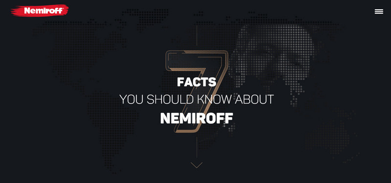
Nemiroff shows one use of the hamburger menu button. It goes perfectly well with a techno vibe and geometric feeling that prevail on the page. It opens up a full-screen window that skillfully balances images and text.
2. Navigation in the Fixed Centered Layout
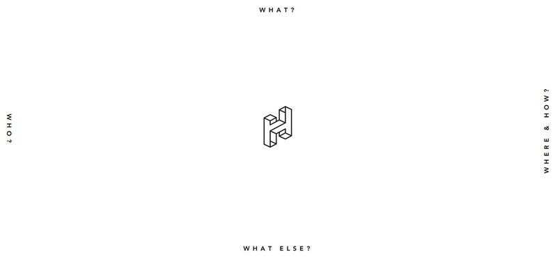
Navigation that is scattered around the perimeter of the ‘welcome’ section looks fresh and original. As a rule, it can be found in the personal portfolios of creative folks. It provides the owner with a ton of free space to maneuver. The only drawback is that the method is applicable for menus that consist of four items.
Handhy Hutomo looks just refined. The dominant roomy feeling achieves an impressive effect. Paired with a minimal solution it sets the project apart from the others. The approach fits here like a glove, enhancing consistency in aesthetics.
3. Full-screen Multimedia-based Navigation
Images and videos are quite often used as supporting visual devices for menu items. Thanks to modern technologies that allow incorporating lots of multimedia without sacrificing the functionality, accessibility and productivity, navigation is becoming more and more sophisticated, lavish and dynamic.
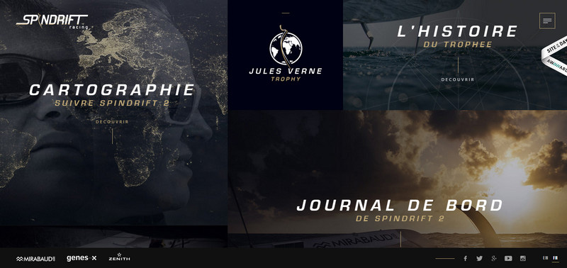
Sprindrift Racing offers several aids to move around. There is a hamburger menu button, footer navigation and a striking image-based nav that takes up the entire screen and sheds the light upon the important parts of the project. As a result, the page looks visually appealing and intriguing.
4. Interactive Navigation
Interactive videos, virtual walks, static scenes spiced up with dynamic features are powered by non-standard navigations that grab the attention. Although, they suffer from absence of full compatibility with browsers and devices, it is a huge leap forward that promises us that the web will be more intricate, impressive and engaging.
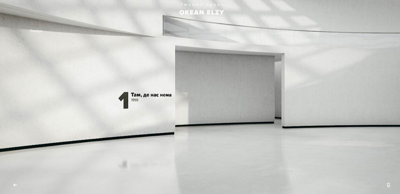
Twenty Years of Okean Elzy is a pioneering Art Project that was skillfully brought to life with the help of cutting-edge techniques. It offers you a small adventure through the history of the cult music group. Indulge yourself with a marvelous interactive walk.
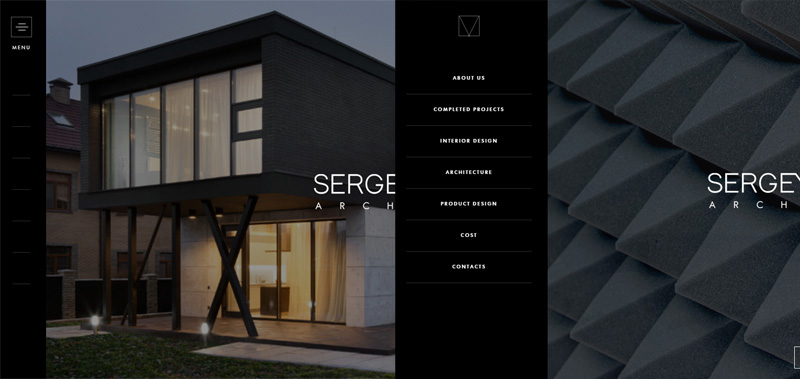
5. Slide-out Menu
Much like the hamburger button, the concept of slide out menus was borrowed from the mobile UIs. Due to its handiness and compact size, it has received widespread and a great deal of popularity. It is bolstered by some visual clues that are presented either via text or icons. Traditionally, it slides out from the left side. However, there are cases when the menu jumps from the right side, top, and even bottom.
Personal Portfolio of Sergey Mahno is a vivid representative of this mainstream. The solid relatively large panel emerges from the left side occupying the third part of the screen. It supplies users with navigation and at the same time gives the online audience an opportunity to enjoy fantastic works of the artist.
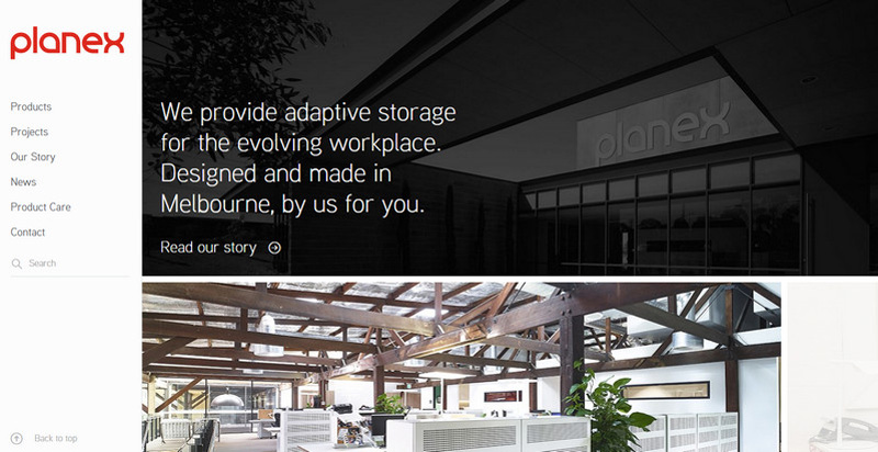
6. Static Sidebar Navigation
Static sidebars were in demand several years ago. Although it seems that they gave way to more sleek and compact solutions, yet numerous blogs and online magazines still derive benefits from them. What’s more, they can be useful for corporate UIs as well. They give visual weight to list of links as well as make users feel more comfortable since the navigation is always at your fingertips.
Planex utilizes a static solid color panel that sits on the left to effectively display all the important links. While the right side can be scrolled down, the menu always stays in the same place.
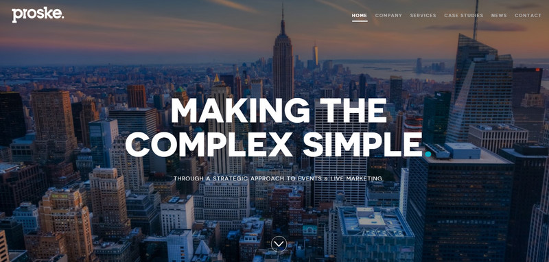
7. Streamlined Navbar
Along with the hamburger menu button, this type of navigation ruled the roost last year. It is an elegant and stylish way of showing main links of the project. Including no more than seven items, it quite often occupies the top right corner or is centrally disposed.
Proske – With such a spectacular photo background, a streamlined navigation bar seems to be an ideal option. Not only does it let users enjoy the picturesque cityscape but also does not divert the attention from the title. It stands in sharp contrast to the canvas, catching the eye of online visitors.
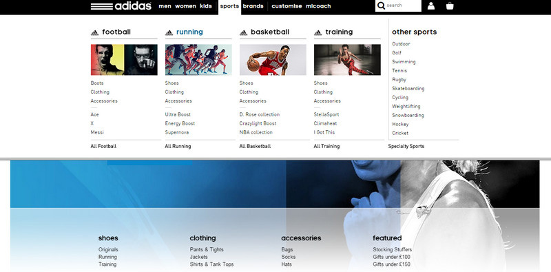
8. Massive Drop-Downs
Enormous, multimedia-rich drop-downs are the choice of websites that present Goliaths of industries such as famous sports brands, international e-stores or online newspapers. It is a complex and multifunctional component that extends over the entire width of the screen. It balances text, images, videos and even some extra features such as a shopping cart or weather widget.
Adidas Football
has a tremendous drop-down menu that covers all the sorts of information. Nevertheless, it works sufficiently and pretty fast without overloading the page. The information is neatly laid out, and the structure is clean and well-organized.
9. Footer Navigation
This approach is similar to the streamlined navigation bar. It takes place at the bottom of the page and sticks to its position while the users are moving down. Although it is entirely unexpected, since we are accustomed to looking for the menu on the upper part of the UI, yet it benefits the concepts in some way.
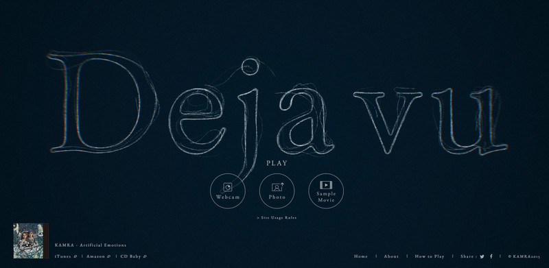
Déjà vu has such an exceptional and eye-catching animation on their front page that it draws the whole attention. Instruments for surfing through the project much like social media icons are modestly and seamlessly located in the footer.
10. Navigation in Parallax-Powered Websites
Projects that are driven by parallax quite often opt for plain graphic-based navigation. Th circles or dashes that are rarely accompanied by the titles are used to help viewers not to get lost.
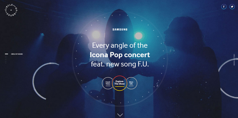
Circle of Sound by Samsung utilizes several lines with corresponding titles that blend with the environment perfectly. The approach complements the design and gives users necessary visual hints.
Absence of Navigation
While one-page websites are gaining more and more popularity, the solution of abandoning navigation is coming into vogue. It is suitable for projects with one or two sections, clear and predictable storylines or minimal layouts.
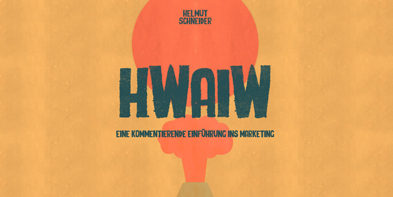
HWAIW is a typical example of omitting a menu. It is a fully illustrated website that has a relatively small and evident structure. The scroll bar is sufficient to effectively navigate through it.
Original Navigation
There are a ton of projects whose navigation breaks away from those listed above. It is an area where you can let your imagination run wild. So it is quite difficult to categorize. We want to depict the representative example that certainly stands out from the crowd:
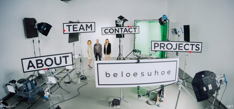
Beloesuhoe’s website has a navigation that seems to be a part of a real life scene. The trick kills two birds with one stone: it introduces to the online audience to the team and the workplace as well as puts a twist on the main menu.
Conclusion
There are numerous ways to show navigation: starting from the traditional streamlined navbar and ending with smart interactive marks. The trends emerge each year, replenishing the toolkit. Who knows may be floating action button will replace hamburger menu button in 2016. Well, we will see…
What type is the most preferable for you? Which one is handy to use? Which one is not?


