
There will almost certainly be a time in everyone’s life when they need to use the services of a lawyer/attorney/solicitor, however you may refer to legal eagles. So how do you choose the legal team that will best suit your needs? Their website design will probably tell you a lot about their practice – is it modern or old-fashioned, is it clean or cluttered, etc.
If you need traditional law advice, you may feel the more old-fashioned, clean and clear approach is best. If you need advice on a more modern issue, perhaps you should be targeting firms that have a modern approach to their website design. Or maybe you take none of these things into consideration and just pop into a local office. However you choose who to use for your legal advice, it can still be inspirational to take a look at some of the better website designs of legal businesses from around the world.
Legal Website Designs
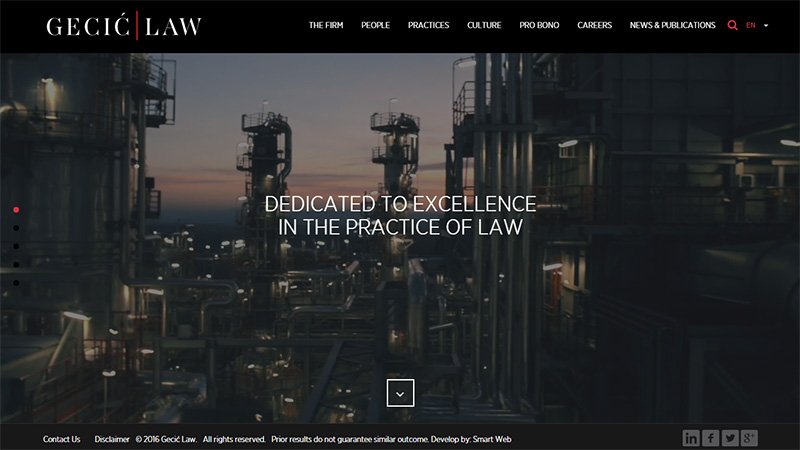
Gecic Law
A full screen slide show of video clips of landscape and cityscape images greets you on this law firm’s site, with white revolving headline text that relates a little information about the company. The whole site is a fairly modern and clean one page design with plenty of information.
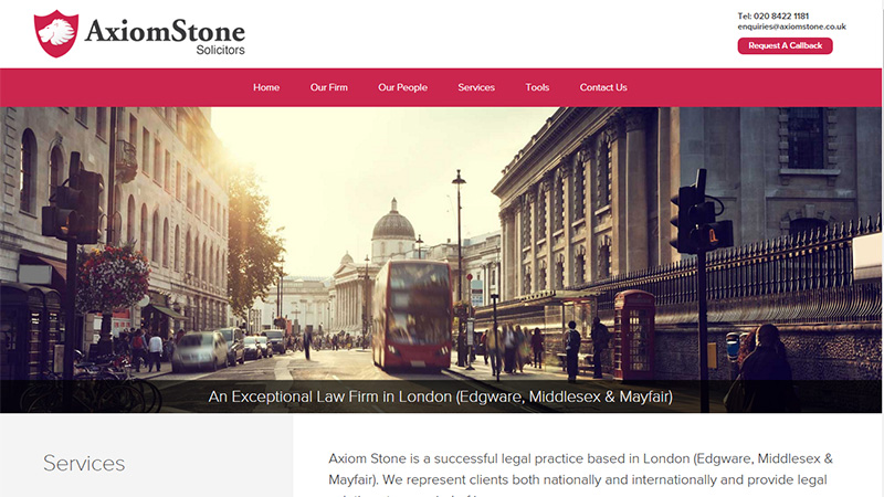
Axiom Stone Solicitors
This London-based firm of Solicitors uses a full width hero image on the landing page, followed by the description of the services they offer. The homepage uses parallax scrolling and a simple red and white color scheme.
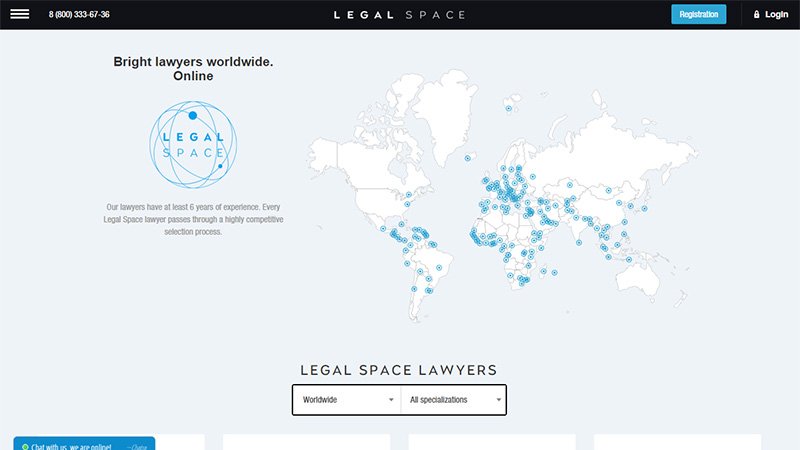
Legal Space Lawyers
This site offers an online consultation with the lawyer of your choice from almost anywhere around the world. The landing page shows the logo and a brief statement on the left, and a map of the world with markers showing where associated lawyers are located. As you scroll down the page there are circular images of each lawyer, their location, length of experience and consultation price. A very clean and clear design.
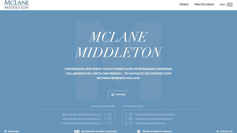
McLane Middleton
This is another firm of attorneys using the internet to their full advantage. They have more than 90 attorneys and cover a vast array of legal issues. When you arrive on this page, an explosion of animated dots eventually form the center M shape, and the blue and white color scheme is a typically serious business approach.
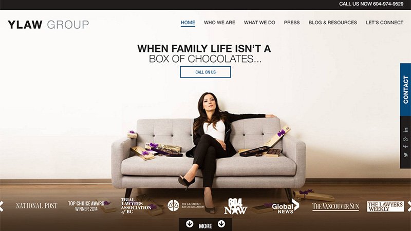
YLaw Group
YLaw Group is a family law litigation firm based in Vancouver, Canada. They have a very effective slide show on the landing page depicting different aspects of family law, such as child custody, divorce, etc. The homepage layout is divided into sections that use different currently trending layouts such as card layout, round icons, etc.
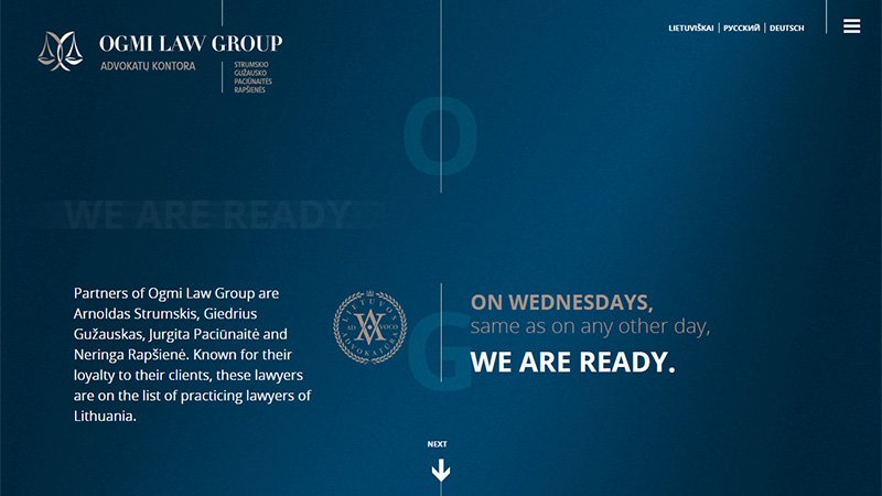
Ogmi Law Group
This Lithuanian law company has a very easy-on-the-eye site design. As you scroll down the page each section alternates between the blue gradient shown in the screenshot, and a brown gradient. A pretty unique touch is the statement on the landing page: On Wednesdays, same as any other day, we are ready. I am assuming that changes depending on which day you visit the site.
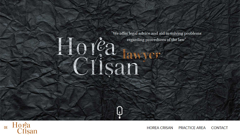
Horea Crisan
Horea Crisan is a Romanian lawyer, but offers his services across the internet to other nationalities as well. The landing page has a black crumpled paper texture with gold fancy typography. The rest of the site is a mixture of dark and light sections and includes parallax scrolling.
SME Property Lawyer
SME is owned and run by Andrew Kleiman and centers around property law in Australia. The home page is presented in a clean design with three sections. The main navigation bar is along the top, but the 3 pastel colored circles are additional navigational links. This is followed by a full width slide show, then a footer that includes recent blog posts and contact details.

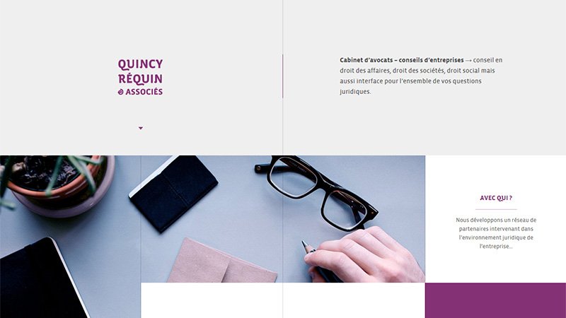
Quincy Requin et Associes
This French law firm has a beautifully laid out site. Using a grid system, the parts that have text or images are assymetrical and they use very washed-out colors on the images with blocks of bright purple for some text blocks. Over all the site has a very calming ambiance.
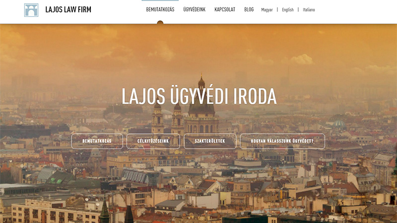
Lajos Law Firm
This company is located in Budapest, Hungary, and the landing page full screen static image shows a cityscape of across Budapest with an orange transparency overlay. A line of ghost CTAs run across the center of the image, and this is another site that is nicely presented in sections as you scroll down the page.
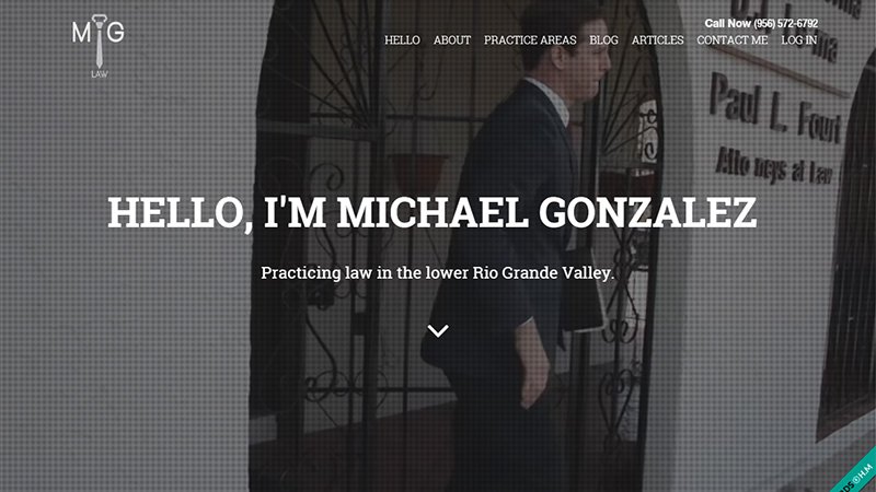
Michael Gonzalez
Michael Gonzalez is a lawyer practicing in Texas. The landing page has a slide show of video clips of the man himself both at work and at play. This approach make the lawyer seem more real and ‘human’. Revolving white headline text introduces the visitor to the lawyer.
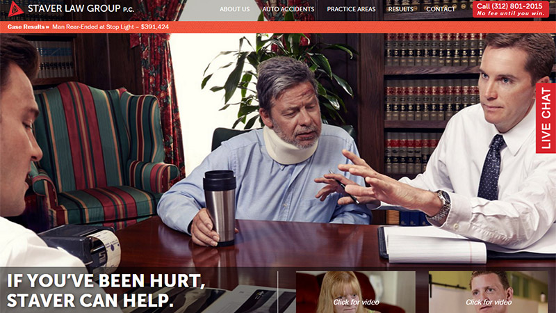
Staver Law Group
This personal injury law firm is based in Chicago. The site is very brightly colored, and very busy. They put a lot of information into relatively little space, but somehow it is not overwhelming, due in large part to the site being split into clearly defined sections.
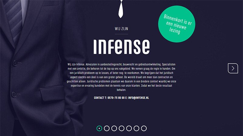
Infense
Infense is a Dutch company of lawyers. Unusually for this type of business, they have a horizontal scrolling site – which makes quite a refreshing change. The landing page shows the torso of a suited gentleman on a background of a very similar color. The little white tie at the top center of the page appears on every page and is slightly animated.
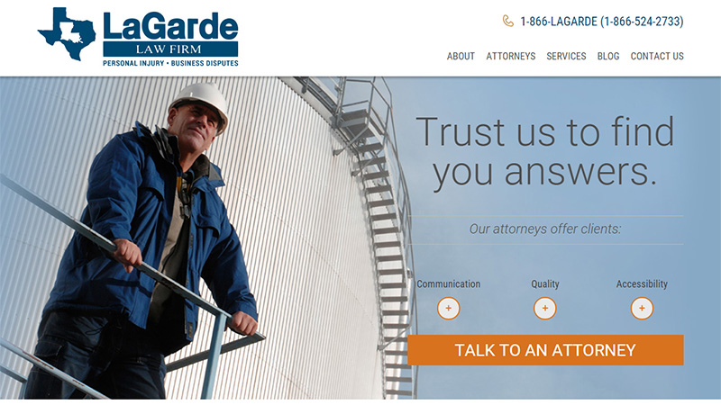
LaGarde Law Firm
This personal injury firm of lawyers has a couple of offices in the US. The over all presentation of the site is in a predominantly blue and white color scheme, aiming to convey a serious and trustworthy persona. The three circular CTAs on the landing page reveal a pop-up box of text when the + is clicked. A very clean, clear and quite minimal design.
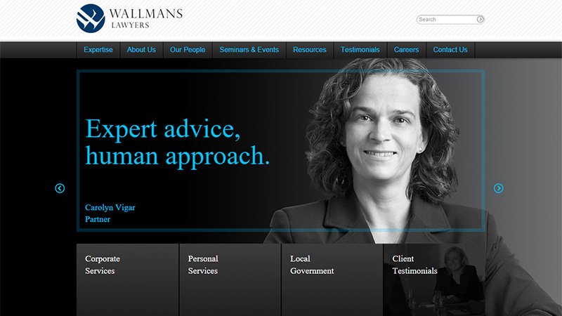
Wallmans Lawyers
This Australian law firm has a very dark landing page, using a black background with blue headline text. There are rotating images of the partners of the firm. There is a main navigation bar along the top of the page, and 4 gray boxes with white text along the bottom of the landing page with links to the company’s varying services and testimonials.
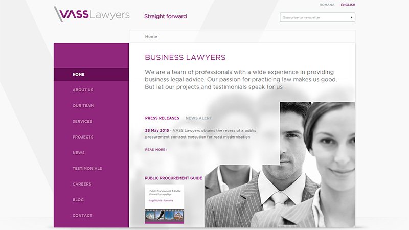
Vass Lawyers
This is the most minimal site design in this round up. A very short landing page with a white and purple color scheme, blurred image and an obvious grid layout. If you click on any of the items on the navigation menu on the left hand side, you will find that every page has a similar design.
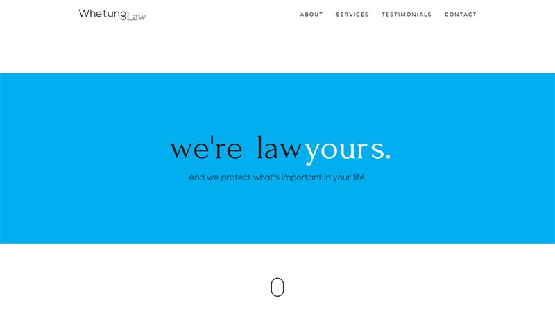
Whetung Law
This very minimal, one page website design is owned by a Canadian company. They have opted to stick with the businesslike blue and white color scheme, and include a lot of content whilst keeping the presentation minimal-looking.
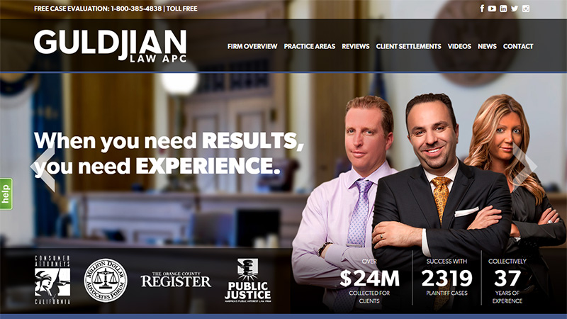
Guldjian Law
This American firm of lawyers has a busy-looking landing page, but scrolling down the page, the presentation is not such an assault on the eyes. As you scroll down, you will see that the designer has once again adhered to the traditional blue and white color scheme.
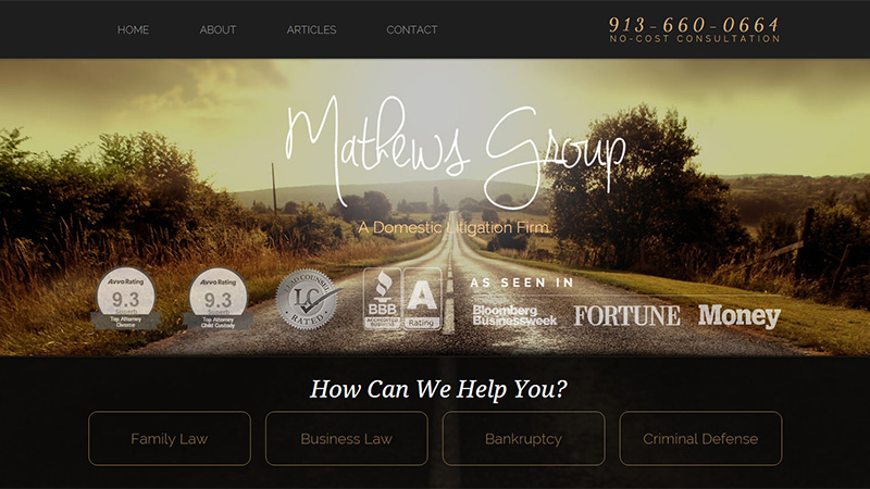
Mathews Group
An American law firm that uses a static image on their landing page. They used to use the tagline ‘Helping families find their way home’ – which really suited the image of a long, long road. They have the company name in a handwritten script font in white. They use gold colored ghost CTA buttons along the bottom of the landing page and the first impression when landing on this site is a warm welcome.
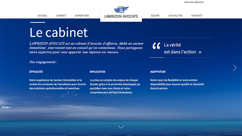
Lawrizon Avocats
This French firm of lawyers takes the idea of a blue and white color scheme to another level. The landing page has white text on a blue sky and sea image, and as you scroll down the page, which uses parallax scrolling, every image is blue colored with white text. This is a fairly minimal design, but the extreme amount of blue takes away the minimalist look.
Conclusion
Were you surprised to see that legal firms have kept up to date with some of the modern trends? I found it to be an interesting exercise sourcing these sites and discovering how even the serious business of law is turning to the internet to rustle up business, even offering consultations online.
Have you designed a site for a legal firm? If so, did you stick with tradition or did you add in some modern twists to the design? Please share your opinion and links with us in the comments section below.


