
If you are a real pro or at even a novice with a vast potential and immense enthusiasm there is no insurmountable obstacle for you; and such a trifle as the size of a device screen that, as a rule eases off a workflow and sometimes even halts the whole process is a simple barrier that needs to be overcome in a short time. A great deal of designers have proved this with their recent works that feature incredible app UIs of the highest quality created specifically for iWatch.
Although the brand new Apple product has not even hit the shelves of the American market, creatives around the world have already presented their visions of future app interfaces that can run on this tiny smart gadget. What’s more, each such concept is built according to all specifications provided by the company and constructed with current design trends in mind. So that with just a little imagination and our fresh collection you will be able to visualize a future of smart wrist wearables. Let’s take a look at 20 first-rate, carefully planned and neatly realized designs.
Smart Watch UIs
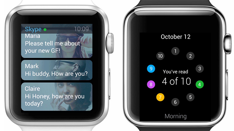
Future of Popular Apps for Apple Watch by Jan Losert and Lukáš Kus
This pair of highly gifted designers have a refreshing take on various popular apps including Skype, Shazam, Yahoo News Digest, Tinder, Instagram and others. They present their vision of how these app interfaces will look on tiny screens of iWatches. The project is truly inspiring.
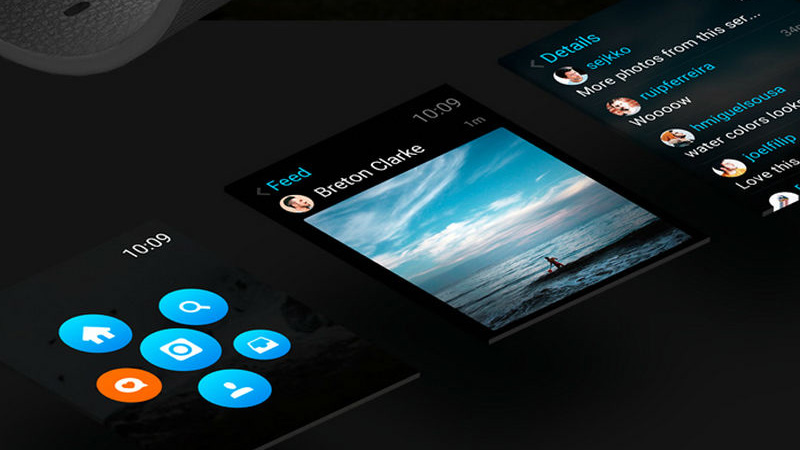
Apple Watch: Instagram by Joel Filipe
The artist speculates about what kind of changes Instagram should undergo to meet the requirements of the smart watch. How will it handle a bulk of splendid photo shots and at the same time not overwhelm regular users? He demonstrates a series of chic and sophisticated screens with black and blue used as core colors.
Taasky for Apple Watch by Jakub Antalík
Here you will find different standard user interfaces starting from the home screen and ending with a screen flow. The artist has managed to take into account numerous essential details inherent to the Taasky app and provides a potential user with an excellent functionality and comfortable environment. For better understanding, there are animated gif samples.
Spotify Pulse – Apple Watch UI by Omar Choudhry
Much like the previous example, the designer has done a great job of reconstructing and even slightly improving a basic user interface of a popular app, in this case Spotify. There is a range of professionally crafted screens accompanied by descriptions that clearly demonstrate a workflow.
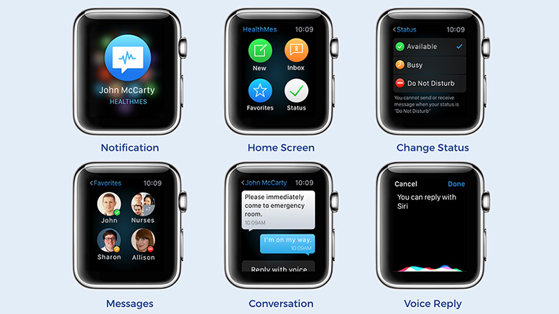
Redesign of Healthcare Communication
Redesign of Healthcare Communication by Marian Mota features almost 10 flawlessly executed interface designs that totally comply with Apple market standards. The artist has succeeded in creating a pleasant and handy experience for medical workers.
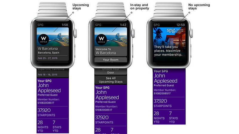
Starwood Preferred Guest App for Apple Watch by Stephen Gates
Featured on Apple.com, iTunes and even official commercials, this smart concept is an excellent example of how to properly create app interfaces for the newest Apple product and always be ahead of others. The project is based on a well-thought-out color scheme and a considerable amount of white space.
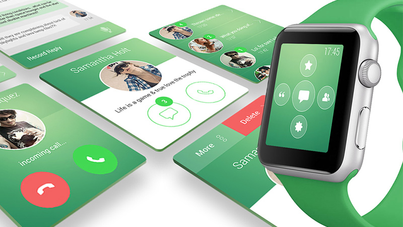
WhatsApp – iWatch Concept by Shaun Stilwell
Here, green that is synonymous with everything organic, natural and peaceful plays the first fiddle, recreating the whole aesthetics and establishing a friendly atmosphere. You will find a dozen small yet sophisticated interfaces made in this color. Flat style, contour graphics and a ton of white space also contribute to the theme.
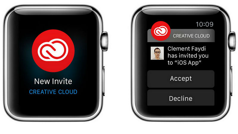
Adobe Creative Cloud for Apple Watch by Rumiana Williams, Clément Faydi and Paul Osburn
The team has a done an excellent job. They showcase a top-notch version of Adobe Creative Cloud interface for tiny wearable devices, skillfully bringing consistency in style and adding a zest for each layout.
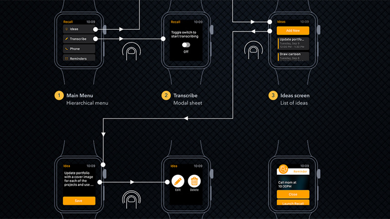
Recall
Recall by Aravind Ravi displays a whole workflow chart made in an illustrative wireframe-inspired manner that presents the overall process in easily digestible portions.
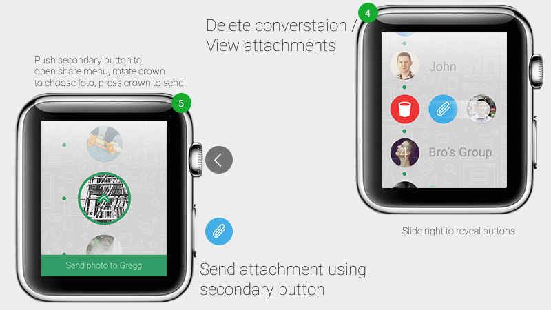
Whatsapp for Apple Watch
Whatsapp for Apple Watch by Benjamin Schmitt has a distinctive circular vibe that makes each interface look harmonious and eye-pleasing. The artist has skillfully laid out content, giving the project a straightforward look.
Rush – Apple watch app by Creaktif
The UI strongly relies on a bright color scheme and basic scrolling technique that in tandem offers users a great visual experience. Intelligible icons, contour graphics, and solid color backdrops provide the design with a refined and subtle appearance that is pretty easy to operate.
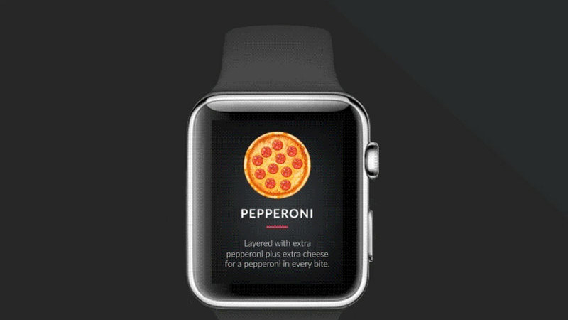
Pizza Order Process
Pizza order process by Cuberto Design instantly increases the appetite with a series of delicious and mouth-watering photo shots. The artist has managed to place into a single screen both image and description without losing readability and cluttering the overall design.
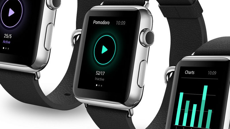
Pomodoro Plus
Pomodoro plus by Hanna Curie catches the eye from the first seconds. The sophisticated and attention-grabbing interface owes its appearance to neon-style elements. While the latter energizes the entire design and adds dynamics, a ton of white space improves each screen with an open feeling.
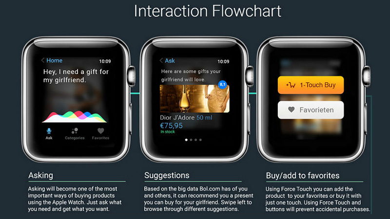
A New Way of Buying by Just Asking!
A new way of buying by just asking! by Nermin Hasanovic has lots of interest. There is a series of vigilantly crafted tiny designs, interaction flowchart, animated walkthrough and a bulk of descriptions that make the project quite valuable and informative.
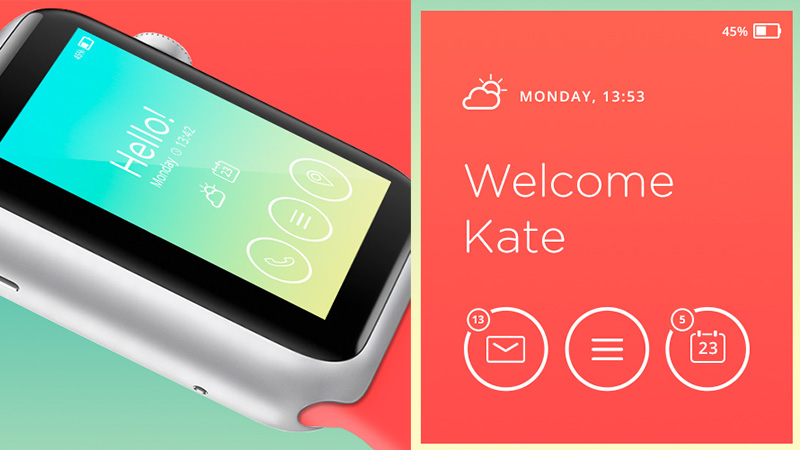
Simple UI Concept
Simple UI Concept by Owi Sixseven exhibits a startling gradient and majestic monotone background. Paired with a white strong, narrow typography and sleek outline icons they make the interface simply shine. Add to this a lot of white space and your users will read and navigate through the app very comfortably.
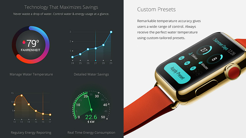
Heatworks Apple Watch App by Xubliminal Agency
Here is another app interface design that gets its fantastic look from gorgeous gradients and a sharp contrast between background made in solid black and foreground elements brightened by some tiny effects. As a result, statistics do not look boring, but, on the contrary, motivate to exploration.
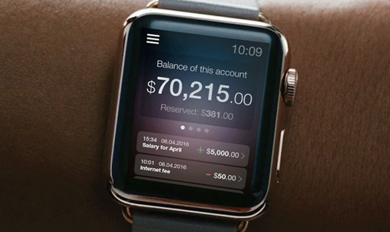
Future Banking Design Concept
Future Banking design concept by Arcana Global transforms a dull, mundane and simple looking app that deals with banking operations into a real masterpiece. Subtle touches of beautiful gradients, semi-transparent panels, and white smooth typography give the interface a soft and pleasant aesthetic.
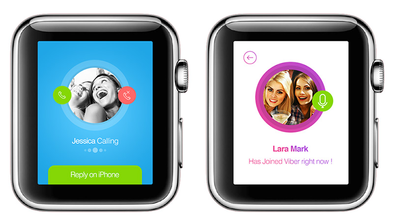
Apple Watch with Skype and Viber by Moe slah
The artist showcases designs of the two most popular apps for communicating with friends and relatives: Skype and Viber. As usual, each interface is made with user experience in mind so that there is plenty of white space, icons are intelligible and easily discernible, and typography is sharp and legible.
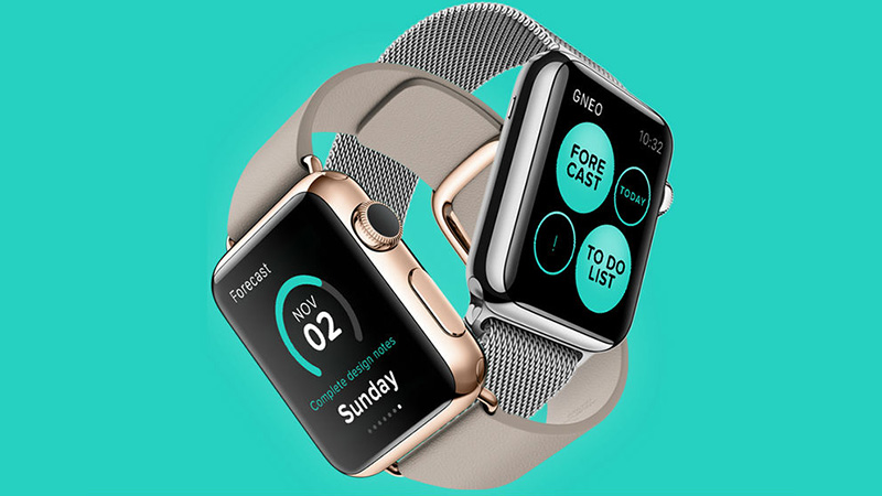
Gneo for Apple Watch by Gábor Balogh
Circles, flat style, brilliant coloring and clean backdrops in collaboration with an effective use of space make this design. Want to delve a bit deeper? Explore the video provided by the designer that clearly illustrates the purpose of the concept.
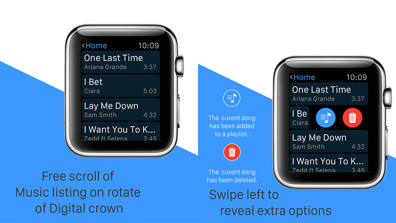
Free Muzik
Free Muzik by Tinny Le has an enigmatic and slightly dark interface that is skillfully brightened by some splashes of vibrant colors. Relatively huge graphics, horizontal line stripe layout, distinctive typography and some visual effects for sprucing up the appearance give this app an incredible feel.
Conclusion
It seems that designers do not notice the difference between various screen dimensions since whether it is a wide desktop monitor or tiny iWatch screen; their projects look refined, top-notch and pretty handy. It is great that dimensions of devices do not slow down creative folks from building outstanding projects.


