
Crafty typography always strikes the eye, especially when it diversifies the website design that, as a rule, is lacking in adornments and ornamental elements. Though the lion’s share of artistic typography falls into graphic design (posters, booklets, magazine covers, flyers are highly populated with such kind of type), the web sphere also has something to offer.
What is more, web designers leverage various decorative fonts starting with classic exquisite hand-written ones and ending with modern sculptural ones with a powerful 3 dimensional appeal. The Internet has numerous collections with representative examples, so that we won’t “throw everything into one pile”; we are going to narrow our range and concentrate on one specific font style: today fancy, crafty typography with distinctive brush strokes is our main focus of attention. Let’s take a look at what we have found for you.
Web Design with Brush Stroke Typography
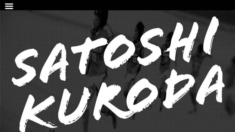
Satoshi Kuroda
How to make the title look attention-grabbing? The answer is simple: just play on a contrast between background and foreground as well as going for a more artistic kind of typography. The landing page of this online portfolio demonstrates this method in action.
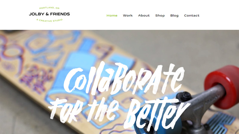
Jolby and Friends
Here, quirky, bold, brush type with a grunge feeling accurately excels from the video background and draws attention to the slogan; it is exactly what is needed. Moreover, the font choice reveals the true creative nature of the digital studio.
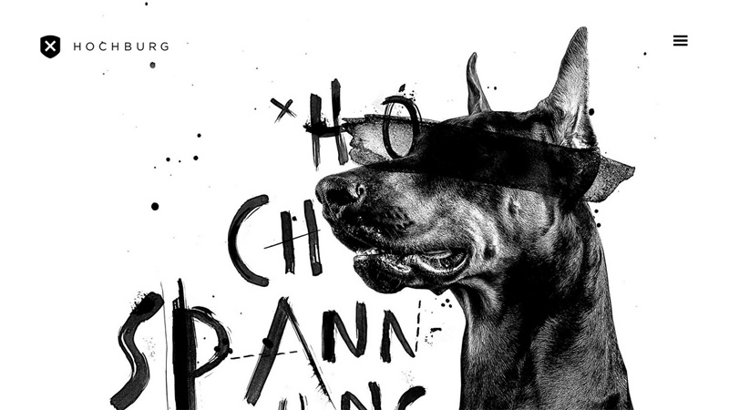
Hochburg
Hochburg looks positively messy. Who would have thought that this landing page with such an unbalanced, slightly cluttered appearance could look so impressive and intriguing. Here, brush-esque typography made in black fits like a glove, giving the page a powerful artistic vibe.
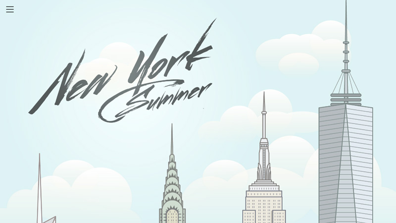
New York Summer
Elegant hand-written brush typography looks extremely gorgeous and appropriate when it is used for conveying a personality. Here, it even looks more sophisticated and refined thanks to complementary, clean, subtle, vector urban scenery.
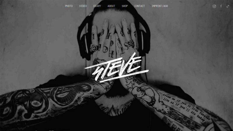
Steve
Here brush typography with a subtle grunge note helps to make the title stand out from the background. Even being relatively small and surrounded by an amusing image, it still has its own charisma that is hard not to notice.
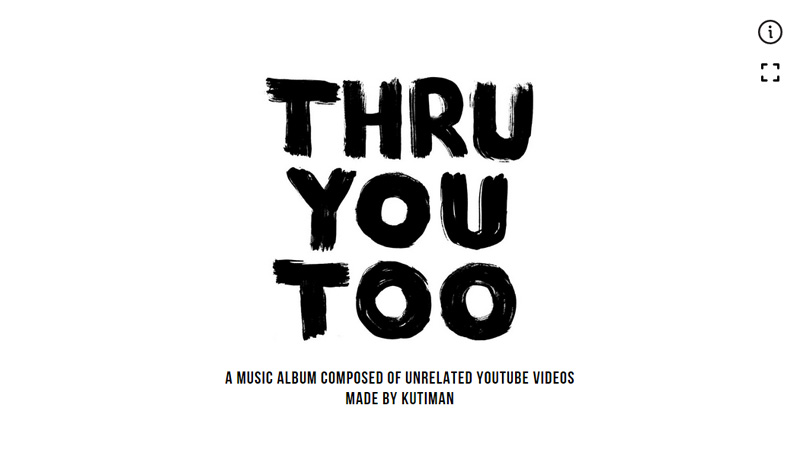
Thru You Too
Here, the title is thrust into the limelight. The designer turns a quite simple and pretty traditional color scheme into its advantage, having created the landing page with an absolutely refined and clean appearance that just can’t go unnoticed. The brush type helps to stamp the artist’s charismatic personality on the website design.
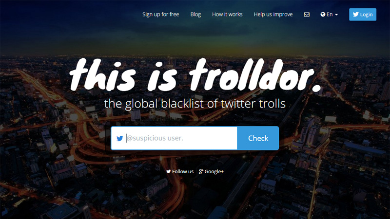
Trolldor
The title looks smooth and sleek. Such an appearance not only goes perfectly well with the urban scenery placed on the backdrop but also brings its own note of individuality.
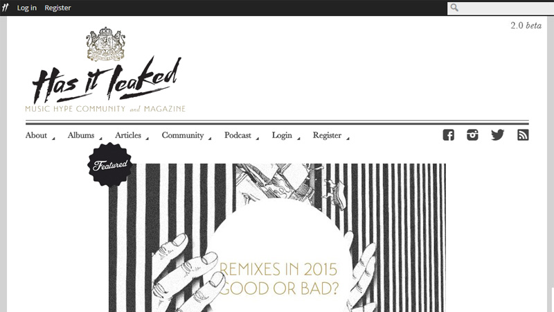
Has it Leaked
Has it Leaked has an exquisite website design with a fragile creative vibe. Here everything contributes to the aesthetics: classic coloring, sketchy backdrop, graphics, and of course, decorative typography used for the logotype.
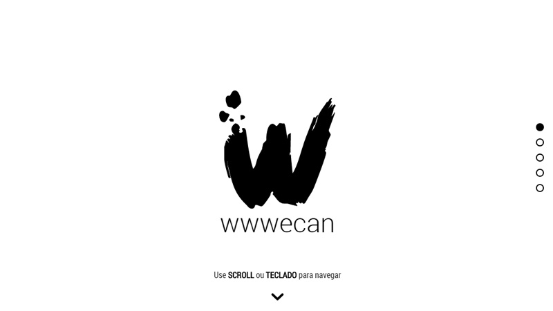
Wwwecan
This is another splendid example of a website based on a black and white color scheme. As it turns out, this color choice naturally collaborates with brush typography that makes it shine with its inner radiance.
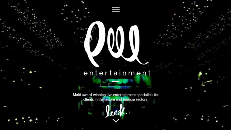
Peel Entertainment
Peel Entertainment is marked by an elegant script style title, effectively reflecting a strong charisma of the agency that is behind this amazing website. The crafty typography lets the lettering ideally blend in, and at the same time, adds to the project a note of individuality.
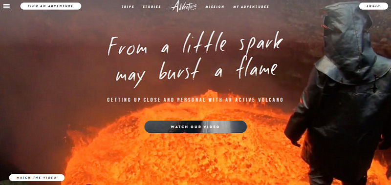
Adventure
The artist skillfully makes use of several types, effectively mixing and matching them. Thus, the sharp font with distinctive edges is supplemented by a sleek, hand-written typography that is used to emphasize the logotype and the title, making them look delicate and subtle yet with a barely noticeably brutal touch.
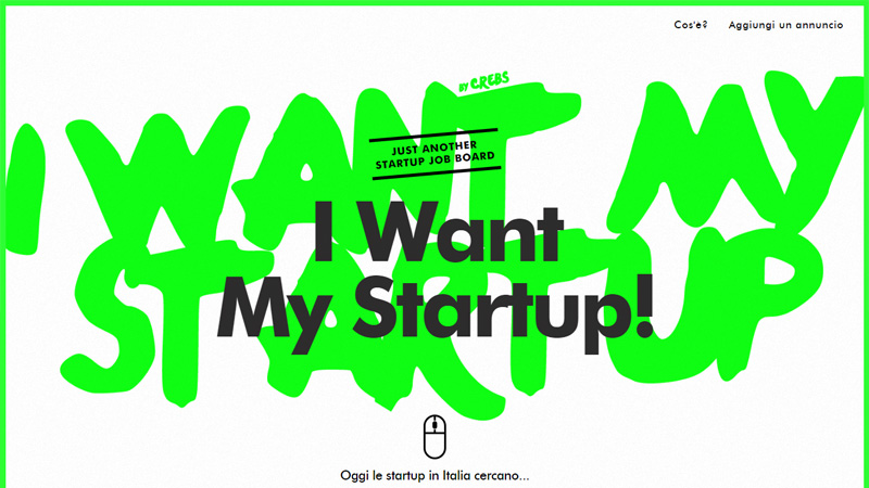
I Want My Startup
Here, the title sounds louder than ever. The artist has made sure that the watchword “I want my startup!” looks simply stunning through having it involved a sort of “heavy metal” of the design tools: toxic coloring, bold smooth massive letterings on the background and solid, sharp, relatively small, supporting lettering on the foreground, as well as excluding everything that could accidentally catch the eye.
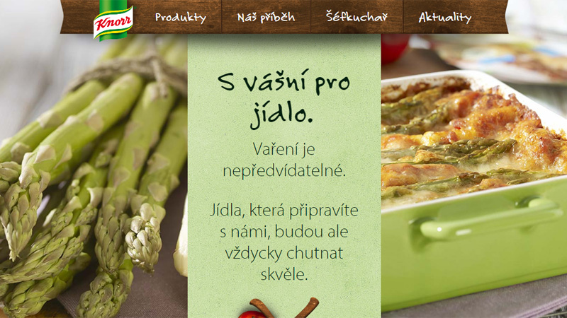
Knorr
Food-related websites, as a rule, feature a skillful combination of natural textures (usually, the choice falls into wooden textures and paper textures), appetizing images and of course, some crafty typography that will slightly diversify the appearance and give the project its charm. Knorr is no exception; it gets its marvelous and yummy appearance exactly from such sort of blend.
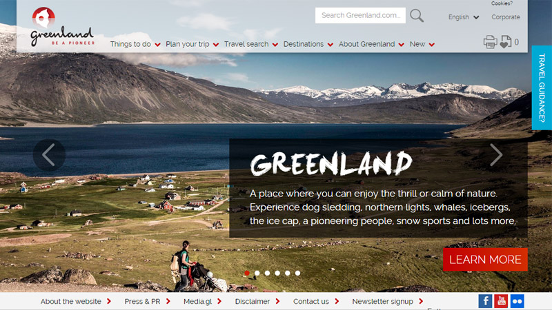
Greenland
This website has several carefully selected typography choices: a regular font used for the copy, a script font used for the logotype and the decorative one with some distinctive brush touches is used for prettifying the headings. The latter, of course, is worthy of attention due to the natural traits that reinforce the general feeling on the website.
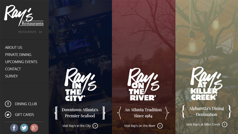
Ray’s Restaurants
Here everything is imbued with the restaurant’s spirit. The bold, hand-written name literally marks every section, giving the website distinctiveness, beauty and powerful appeal.
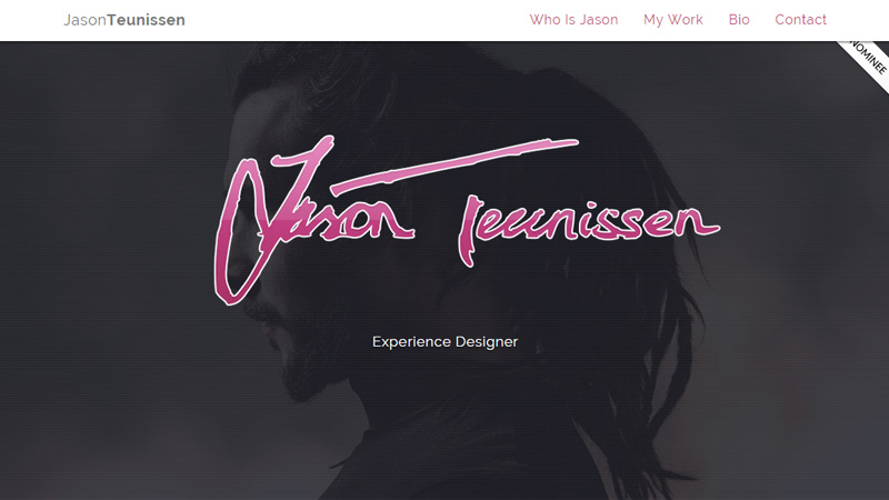
Jason Teunissen
The website is enlivened by a personal signature of the artist that brightens the front page not only with its touch of sparkling personality but also with a touch of creativity. Here, the artist opts for a quite piquant realization, having painted the signature in pink shades and supplied it with a white edging.
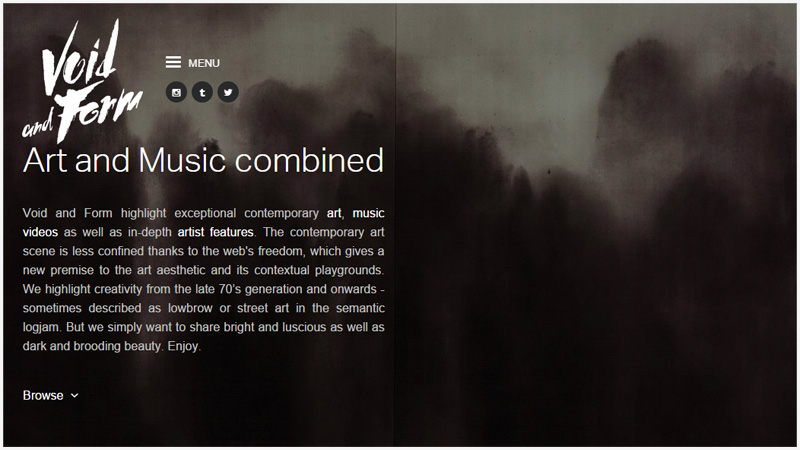
Void and Form
Art and music: what a strong and powerful combination. The website that should reflect the inner world of such a mighty tandem should also look impressive, intriguing and profound, much like Void and Form does, whose landing page can boast a highly artistic, yet a bit enigmatic, watercolor-esque appearance marked by a crafty logotype.
Conclusion
Brush typography looks gorgeous almost in any environment: whether it is placed in an art-inspired scene that can feature illustrations, drawings, watercolor art etc. or it is surrounded by objects and elements that can be hardly called artistic. It will certainly find its suitable place, adding its own piquancy.


