
Users are often annoyed with bothering pop up windows that require them to fill out forms or answer questions, but are they all so bad? There are pop ups that help users, give tips or offer product discounts.
So, a pop up is usually a small window appearing suddenly in the foreground of the visual interface of a website page. Pop up windows may be an advertisement, information block, a contact form, etc. It is more likely to be small and with contrasting colors, but we will define all elements of pop up design and factors that influence how users perceive it in sequence, not everything at once.
Pop-Up Windows
Brilliant Appearance
Pop ups may serve for different goals and this influences the way a pop up is initiated. If it is an ad or a promotional banner, it will appear with no actions, just in a certain time period after you open a web page. The other case is an informative pop up. It should be initiated by a click. An informative pop up has an explanatory function, for example it helps with filling out a form. Pop up windows can also be an additional content block with some secondary information on this or that point, so that just interested users will read it. This may help you with content arrangement and keeping spacing rules on your website. A pop up with contact form is better not suddenly pop up, because users won’t treat it well. Contact pop should be opened by a specified button, this would be perfect.
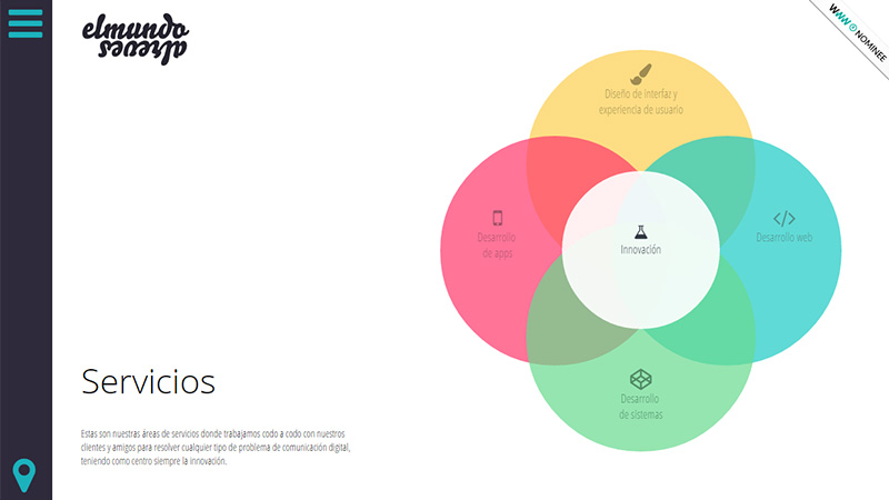
El Mundo al Revés with Simple Pop Ups
There are four colorful blocks with service descriptions on this web page. Each block is supplemented with a pop up informative section. It is easy to initiate it by click as well as to close it via a cross button.

The Bigger the Better?
Size matters for many website design elements, are pop ups in this list? They are definitely there, but the question is whether a pop up should be small or large. To compare: a small pop up window, let’s say 30-40% of an entire web page, will be accurate, nice-looking and not visually block the other content. Still, if you want your pop up to take all the users’ attention and make content highly visible, you would better make this window huge and take up about 80% of the web page space. One more trick to use: if a pop up window is pretty small, make the background blurred or darkened. It will lead to better visual exposure of a little window.
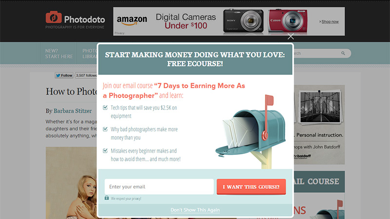
Photodoto Blog with Nice Pop Up Design
What we see here is a pretty cool pop up window done in the right proportions to the web page size. It stands out against the background thanks to its bright color choice and the darkening background effect.
Color Play
Color is an essential part in every web design aspect, it’s true. But which color choice is winning for pop ups? The best color palette is the one based on contrast. Finally, the goal of any pop up is to make people act, so you need to design a CTA button/promo code, or any other detail leading to actions in bright colors. In this case, the main pop up color is to be neutral, such as white, gray or brown.
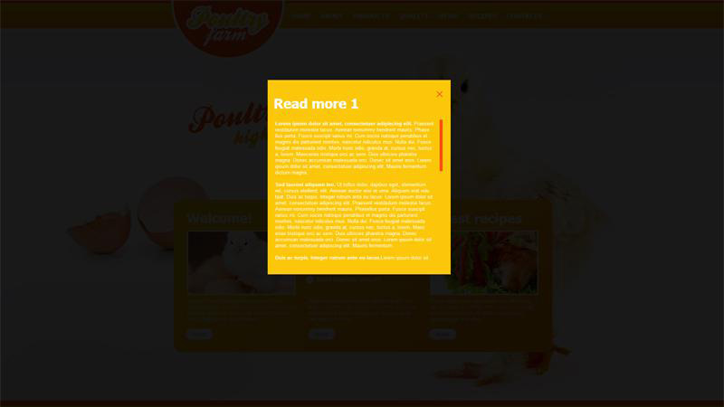
Farming Website Design with Bright Yellow Pop Up
This pop up design is contrasting, but in a slightly different way from that we discussed. It doesn’t use two opposite colors, it is monochromatic with a catchy yellow tone. It looks just great against a darkened background.
Content
Content on a pop up window is very small, so its main task is to be compelling and very wise. These 2 or 3 lines of text you write on this section will decide the future of your online campaign. Some compelling words you can use are: save, free, results, want, ready, need, get, try, bargain, discount, deal, quick, now, hurry up, be the first, last chance, etc.
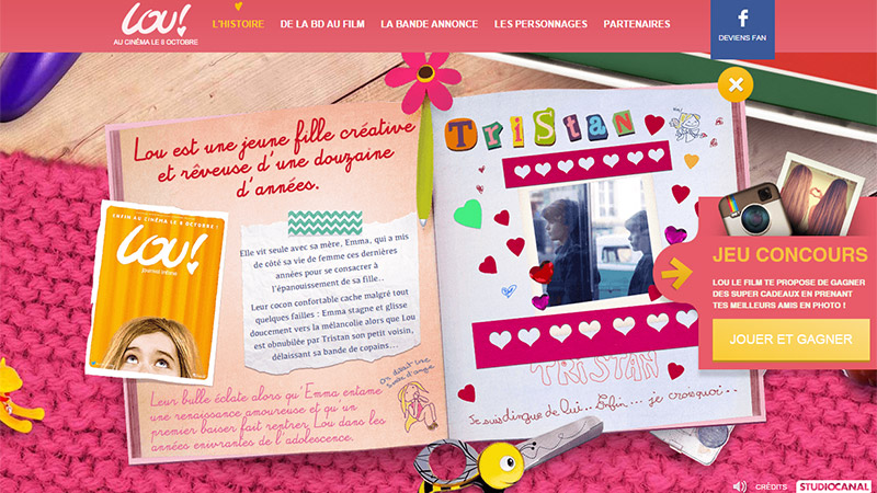
I Love Lou Website with Contest Pop Up
The pop up window on this French website has a persuasive CTA button. It means ‘play and win’ in English.
Give a Choice
It is a very good thing to make a pop up window asking one question and offering two simple answers ‘yes’ or ‘no’. For example, you want your visitors to try a free demo version of your new product, and you have a question ‘Would You Like to Test Our New Product For Free?’. Of course you can make a single CTA button with the text ‘yes’, ‘try’, ‘try now’, ‘test’, ‘get a trial’, etc. But you can make two buttons (preferably of different colors) with the following text: ‘Yes, I want it’ and ‘No, I don’t want anything for free’. These are just approximate variants, but the sense is clear. In this case you need users to understand that they have a chance now, later there will be nothing free.
Limited choice incites users to act and not hesitate.
Entry Form
Any kind of form is suspicious to users because it asks for personal data. It does not concern contact form pop ups, where users go by their decision. Now, we are talking about the forms offering users to subscribe for a newsletter, get a free ebook or course, get a discount, and so on. There is a chance that 2-step pop ups would works much better. You ask a question within the first pop up (like in the example we mentioned above) and then there are 2 scenarios to proceed. You will open another pop up with an entry form for those who answered positively, and just close the window for users who chose the negative answer.
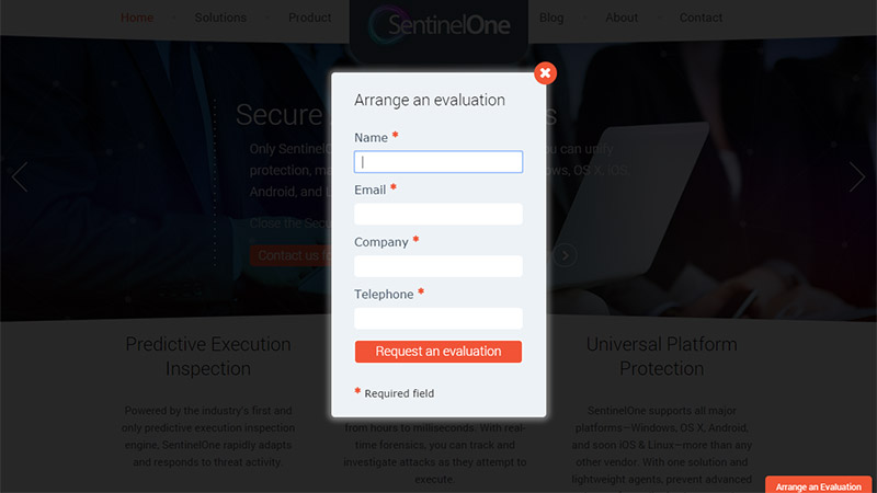
SentinelOne Site with Quick Pop Up Form
The web form on a pop up window allows you to order a company service very quickly with the only button click and a few empty fields to fill. By the way, check the CTA button – its color is really catchy!
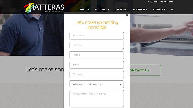
Hatteras Website with Simple Contact Form Pop Up
Push the ‘Contact Us’ button on the homepage or contact page, and you will see this minimal pop up design with a form to fill. Click on the cross, if you change your mind.
Alternative
Every user has the right to choose, and you should respect this. While working with pop up window creation, you need to think about all possible outcomes. Some will like your pop up to appear, others will hate it, there will be some people who close it automatically and then look where to find it again. You need to make your pop up easy to close (without giving any answers) for users who want to come back to the site as quickly as possible, as they are not interested in offers and ads.
Then, the timing is a very big issue you can face – when to make pop up appear, should it appear again after closing? The golden mean is to period a pop up in about 5 seconds after a website opens and if a user closes it, it shouldn’t appear again. Still, if the close was accidental, and the pop up gives exclusive info/discount, make sure it appears frequently enough, say for example every time a user opens the site (or a certain page).
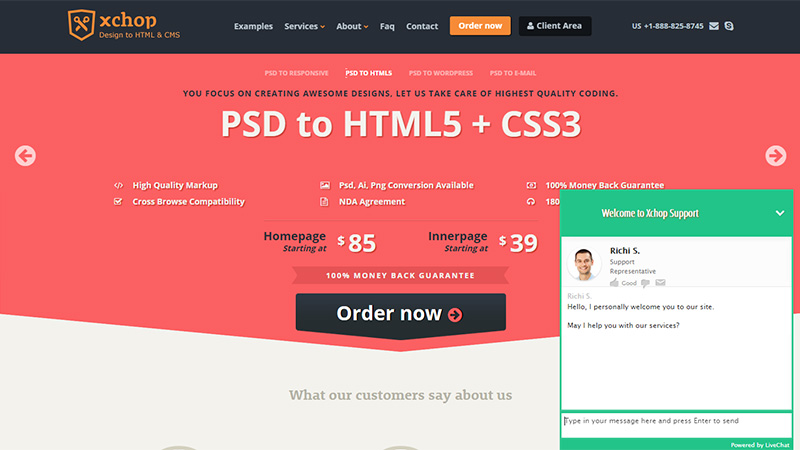
Xchop Website with a Live Chat Pop Up
Live chat is good way to connect with your users, and this website shows how to make the best of pop up design to communicate with clients. The window appears automatically, but you can use a down arrow to hide it.
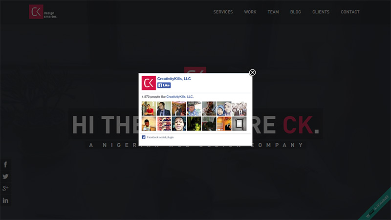
Creativity Kills with a Facebook Pop Up
This variation of pop up design (which emerges immediately after the website opens) is intended to reach more new Facebook followers. In case, you don’t want to follow this community, use the cross button in the left top corner.
What’s Next?
Pop ups should not upset the user experience. Bring users back to the place where they had been before the pop up emerged. Don’t undertake to forward users to a page or section you wish them to visit.
Conclusion
Pop up design has many rules, but the decisive one is to make it effective. Effective it would be when designed, written and placed properly. Make your pop up be a useful website element, not destructive!


