
Culture brings us joy, education gives us knowledge, but medicine makes us healthy. It is cool to enjoy life when you feel good, but you know how awful everything is when you are sick. The healthcare industry is a crucial part of human life, and today its growth is fast and swift.
Medical services should not always be drastic measures for people, because sometimes we turn to doctors for prophylaxis. Many people care about their weight, and they consult dietologists to make their nutrition healthier in order not to suffer from obesity. There are many examples of how people care about their health and the way they feel: cosmetology, physical exercise, psychology, etc.
A strong health concern explains why there are so many medical practices and private clinics these days. In its turn, these centers and hospitals have websites to make their online exposure better and more effective. These website designs differ from each other in functionality terms, they have different content, typography, galleries, but why do many of them use white and blue colors? This is what we will find out in this post.
Why Healthcare Sites Use Blue and White
Doctors Wear White and Sometimes Blue or Green
White is the cleanest color of all existing on the color wheel. It reveals even the smallest details, and this feature makes white perfect for the medical industry. Doctors wear white to demonstrate sterility and the absence of bacteria to patients.
White scruba are classic for doctors, and it was always such. Nevertheless, some time ago blue and green colors came into this play. These colors began to be used for doctors’ scrubs and we know a few reasons for that. Firstly, blue helps to refresh the doctors’ vision, especially in the operating room. When a doctor is performing an operation on a patient, he might be looking at red colored blood quite a lot, and the walls around are white. In this situation blue, or sometimes green, help doctors to shift their gaze to something different.
Doctors’ clothes become the first reason why medical websites tend to be colored in white and blue.
Medical Website Template

White is a Common Color for Hospital Interior Design
Associations are very powerful, they lead our thoughts and decisions. For example you had a yellow parrot in childhood and you loved it, so now you inexplicably like this color and associate it with care and warmth. The same with names: you will always associate a particular name with a particular person (if he/she had any significance to you). The second reason in our list is built on associations.
A perfectly white building often reminds us of a hospital, because most hospitals have walls, furniture and bedclothes in white. Sterility is a matter of such interior design coloring. Hospitals are always kept clean, and clean means white.
White is Good as Background in Web Design
Now, we will digress from associations and get started with more design-like issues. Besides that white is the color of hospitals, it is the most suitable tone for a website background design. It is like an empty wall, where you can write and draw anything. White can never spoil the content, but highlight it. The most winning position of the content is where much white space is (‘white space’ is not necessarily white, it should be empty). Whether you have text blocks, image galleries, promotional banners, lists, CTA buttons: all these elements have a pretty nice look when featured on a white background.
Medical Web Design with White Background

Blue is a Color of Trust
There is no a better color than blue for website design if you want users to trust you. This color means stability and the better side of it is the connection with nature. Blue is the color of sky and water, which are the essentials of human life. Plus, as we know, water has a calming effect on humans, and so does blue. This color is used to symbolize tranquility and sincerity and these feelings are crucial for patients who are going to trust their lives to you.
Bestcare Website

Blue is a Good Color to Accentuate CTA and More
Every website has a goal, and calls to action are usually used to perform these goals. If you have a banner with a hot line number on your medical website, never do it in red, use blue instead. Any button done in blue will have a good appeal on a white background. Make it clear for users how to make an appointment or contact now by making your calls to action visually striking. Navigation menu design can be colored blue to give it a better look and higher visibility.
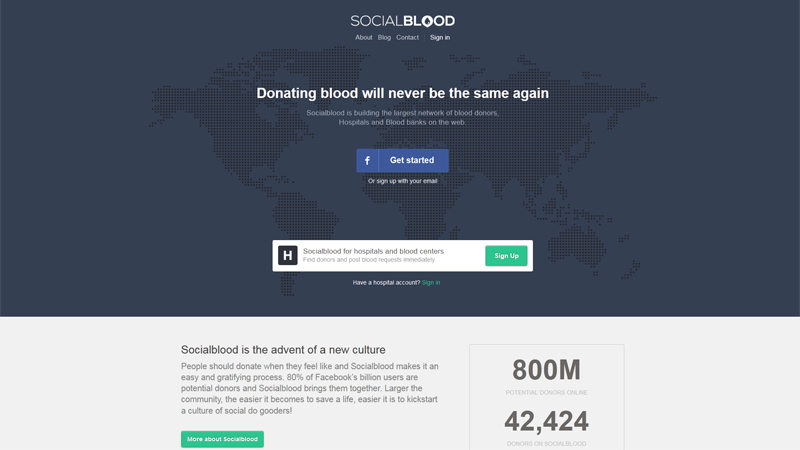
Socialblood Website with Blue CTA Button
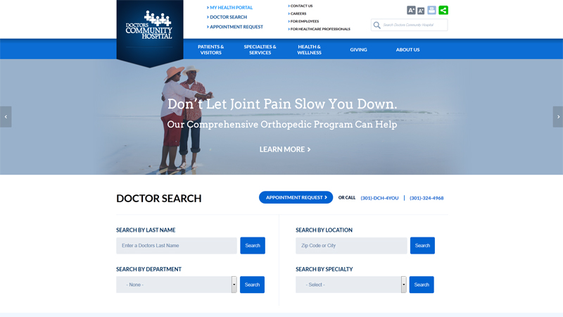
Doctors Community Hospital Web Design with Blue CTA and Accents
Blue and White is a Perfect Color Duo
Blue and white is a wonderful color combination looking harmonic almost for any purpose. This mix is natural for many people, and this may decide your website’s fate. In addition, this color duo is aesthetically pleasing and it is easy on the eyes. If you don’t want your website to be very light or dark, you shouldn’t, because the numerous blue shades allow you to play in a color game and make up your perfect combo.
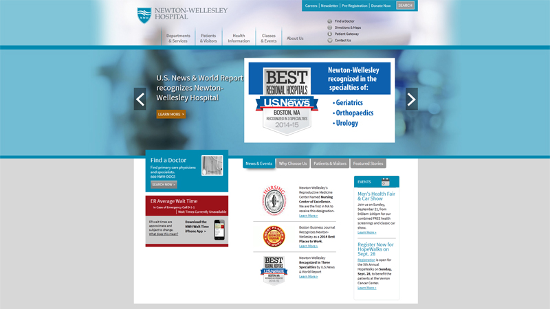
Newton-Wellesley Hospital Site in Blue and White
The Royal Buckinghamshire Hospital

Conclusion
In conclusion we would like to strengthen the importance of many other details that make a medical website great. This is not usually just about colors, even though they are very mighty. While designing your white and blue medical website, you should define your website goal, write compelling web copy, design a welcoming website page very thoughtfully, use good fonts, embed user-friendly photo galleries and make images visible, create catchy and simple website navigation, put accent on details, optimize the website, make contact info accessible, ensure fast loading speed and provide users with responsive design.
By the way, a white and blue color palette would help you to achieve many of these tasks!


