
Do you remember the story of the Beauty and the Beast? Of course you do, as all of us grow up listening to almost the same fairy tales. Actually, the plot is not complete imagination. Let’s look at the situation metaphorically. Just remember your first or unrequited or very passionate love. The very moment when ‘lightning strikes you’. What did you feel at that time?
Our emotions frequently coincide as we are human beings and our psychological reactions are rather predictable. So here is the most probable scenario. When we understand that we are in love over heels and don’t know if the object of our desire returns the affection, it seems to us that we are unworthy, ill-favored, dimwitted and other nonsenses like these. While the adorable person looks flawlessly beautiful, popular, snip-snap and so on. These two lists of antonyms can be continued till the end of time. Our minds play nasty tricks with us. We start to believe in our nonentity even if we are quite well-off and attractive in reality.
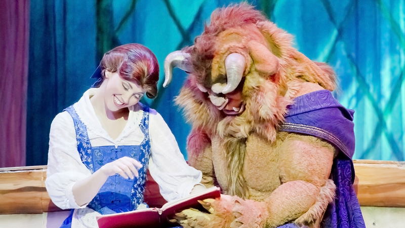
Image credit: Bigstockphoto
We begin to behave stupidly and awkwardly when the beloved person is in the same room. Our body, brain and soul cease to obey us. This uncomfortable situation lasts until two people become a happy couple of sweethearts. The hex dispels and the Beast turns into a handsome prince or gorgeous princess again. And they live in peace and harmony until the next infatuation or death after the long years of marriage with common house, pets, kids, relatives and property parts them. The end.
We try to figure your facial expression of perplexity after the last words. Please, don’t worry fairy tales and psychology are not our profile. We just wanted to draw clear understandable parallels between story-telling, real life and web design.
In today’s collection you will see the examples of websites, where grungy, weird and even frightening elements are combined with absolutely clean, accurate, modern ones. You will be surprised how Beauty and the Beast can supplement each other. Don’t you think that nice, polished designs fall under the risk of being buried somewhere in the distant corner of the visitor’s memory right after closing the browser window? Why do such dismal things happen?
Designers lay themselves out implementing the most trendy techniques and features into their websites, so why is it that most of them won’t be visited again? The answer is simple. They say: “Even bad publicity is better than oblivion”. We don’t insist on interpreting this statement literally. However, it’s impossible to neglect the fact that the visitor needs a visual hook to catch hold of. There are dozens of websites on the net using the same fashionable methods. They simply don’t leave a trace in the user’s memory after visiting.
It may sound unconventional, but one small element (funny, terrible, grunge, unique or peculiar) can save the situation and become a smart hack due to which your website will be discussed, shared and remembered. The ways to publicity are different. This one is not the worst. Nobody judges the winners. Even if the user will experience a light aesthetic shock after visiting your website, it will play into your hands. It’s an undeniable fact that contrasts are very useful if you want to place an accent on something important. Just think how Beauty will look on the Beast’s background.
If you are not afraid of daring experiments in web design, welcome onboard. View this collection of retentive live websites and see how other designers struggle for users’ attention.
Combinations of Charming and Scruffy Elements in Web Design
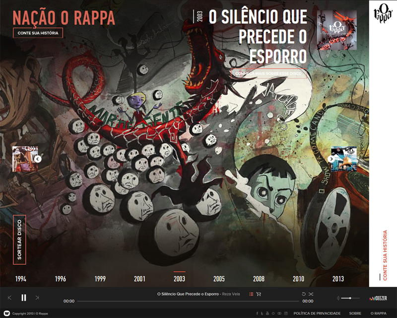
Nacao O Rappa
How do you find this background illustration? Rather dreadful isn’t it? However, navigation, player, fonts and hover effects are very nice and clean.
Pumpehuset
Here beautiful images are mixed up with weird photos and illustrations which make a deep impression on the user.
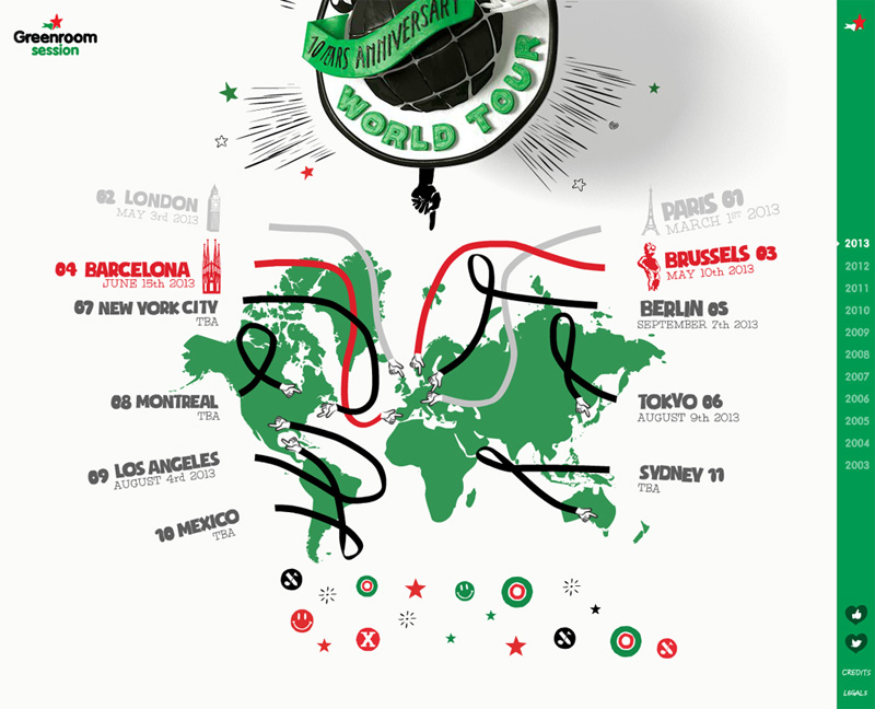
Greenroom Session
These hands look like the ones of Mister Fantastic (Reed Richards) a founding member of the Fantastic Four. Do you remember the movie about the Fantastic Four? Reed’s stretching body looked rather disgusting, just like these hands. But what is great about this site – is its navigation. Click the year in the right sidebar and you’ll see a thumbnail image of the real page. No words, no icons, everything is very simple.
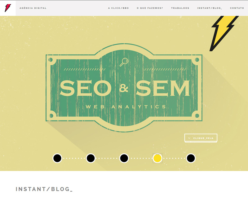
Agencia Digital
It’s rather unusual, but here a retro, grungy slider perfectly blends with the rest of the flat, contemporary layout.
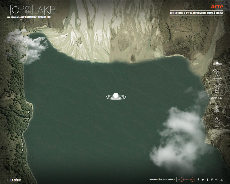
Arte.TV
“Top of the Lake” – the font of this title looks like the one from horror movies. But look at the outlined icons of site navigation and the landscape in general – they are wonderful.
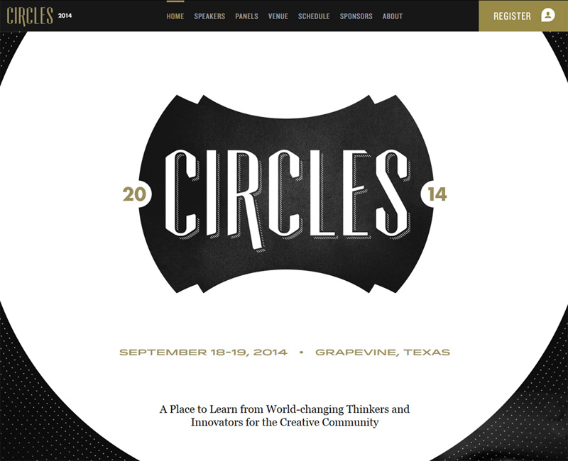
Circles
Watch how this completely retro, outdated design changes as you scroll. It seems as if you enter into another world.
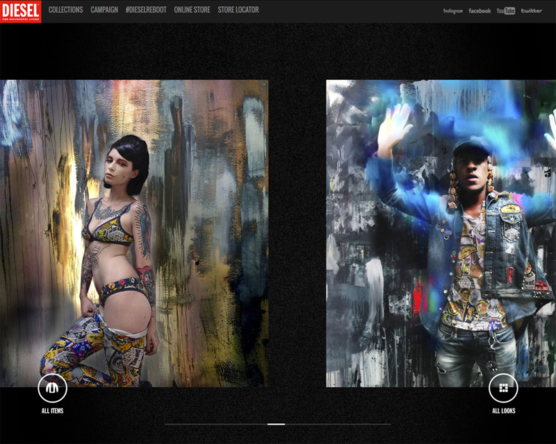
Diesel
We believe that the artistry of photos posted on this site lies in the combination of queer and fine elements.
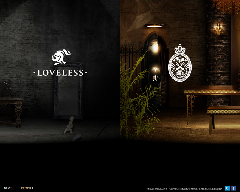
Loveless
It is impossible to take the eyes away from this staggering contrast of an old neglected castle with ramshackle wall and floor, dusty antique table, mirror and broken statues lying about, featured on the left side of the screen and royal, luxury premises on the right. The sight is really spectacular.
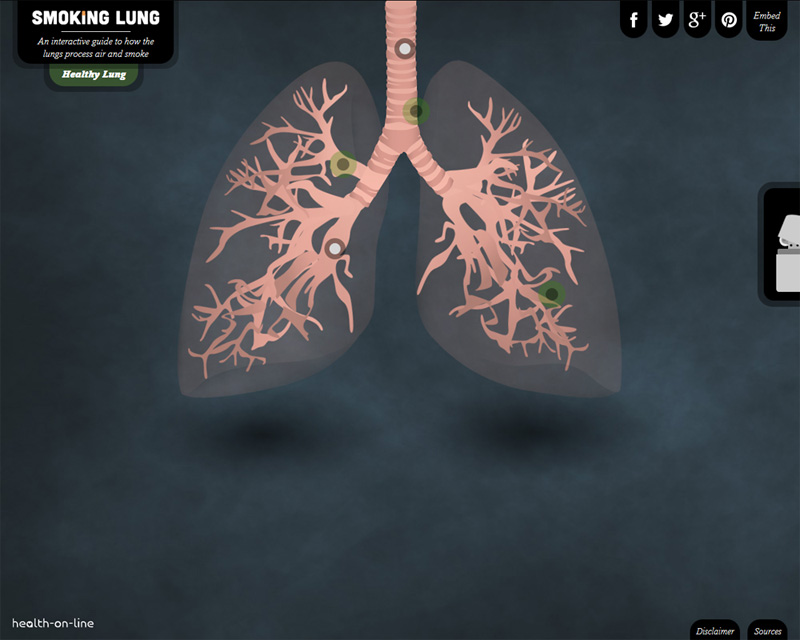
Smoking Lung
Do you smoke? I hope this brief trip inside the smoker’s lungs will at least make you think about this mortal habit. The breathing lungs are the terrible part of this site, while all the rest – fonts, icons, and text blocks are rather good-looking.
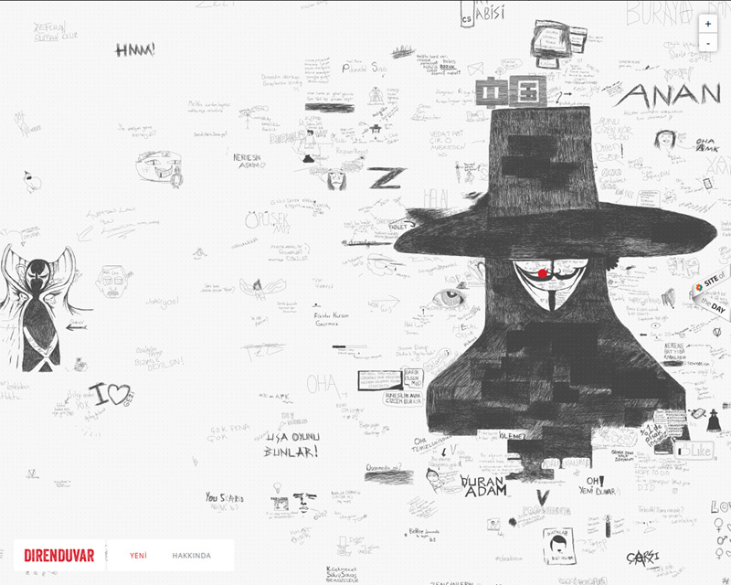
Direnduvar
Sinister illustrations, aren’t they? But in general the website is very stylish and has a magnetic appeal.
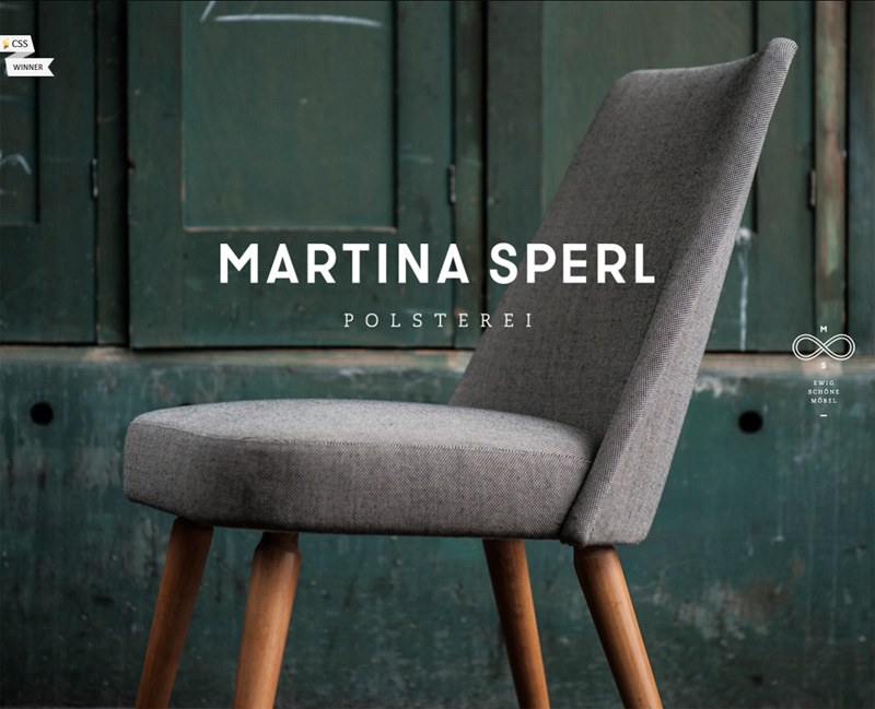
Martina Sperl
A new chair on the grungy background… hmm… an interesting idea.
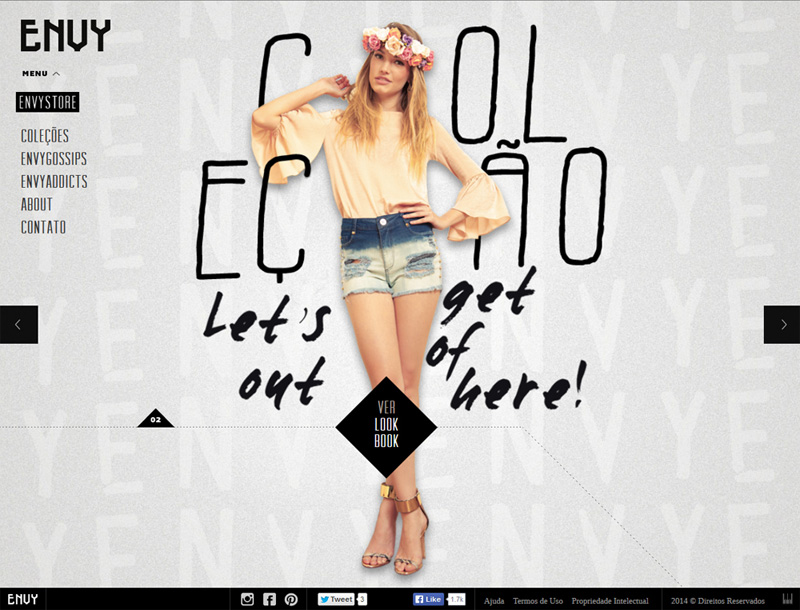
Envy
Noisy background and handwritten scribbles only accentuate the gorgeousness of the girl.
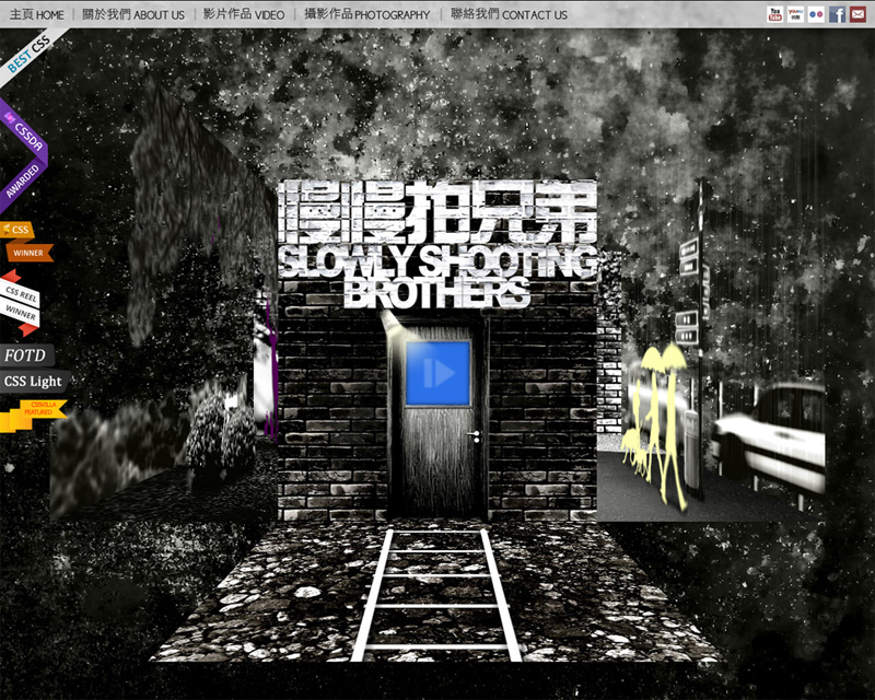
Slowly Shooting Brothers
Try to navigate through the pages of this gloomy, rainy, grungy site. It will be an unforgettable journey.
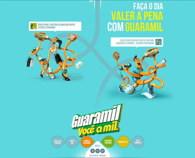
Guaramil
Don’t you think that this absurd long-armed and long-legged couple of monsters resemble the Slenderman’s family striding along the winding road? The rest of the website is rather cute, especially the colors and menu.
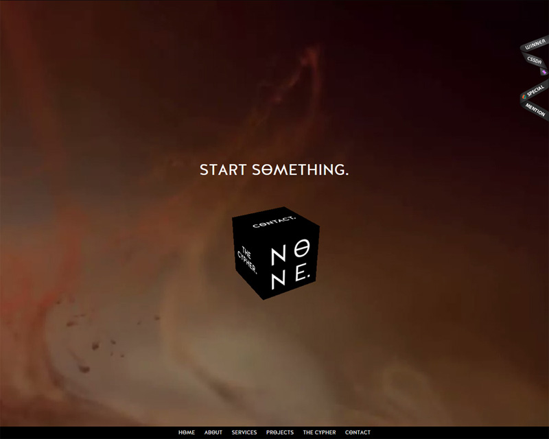
None
What’s there in the background? The substance looks very strange and is constantly moving. But look at the rest of the pages; they are absolutely normal from the point of contemporary web standards.
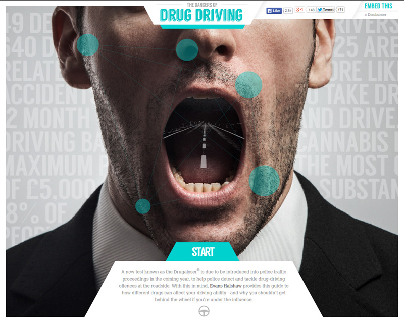
The Dangers of Drug Driving
Don’t you find that it’s rather strange if not terrible to see a highway in somebody’s mouth? It’s only the beginning of the journey. View all available visual effects, they are very realistic.
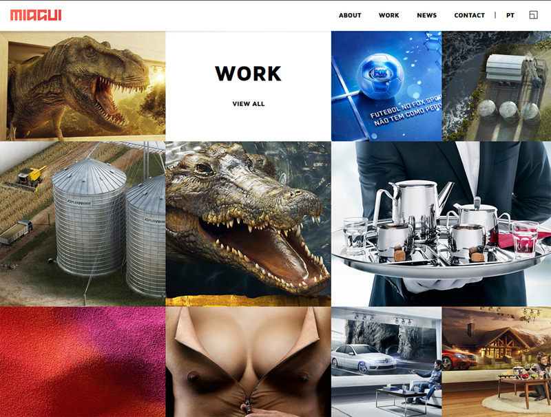
Miagui
Fanged dinosaur and crocodile jaws, seductive bust, speed bikes, modern interiors and landscapes – the original aesthetics of this website draw the surprised looks of visitors.
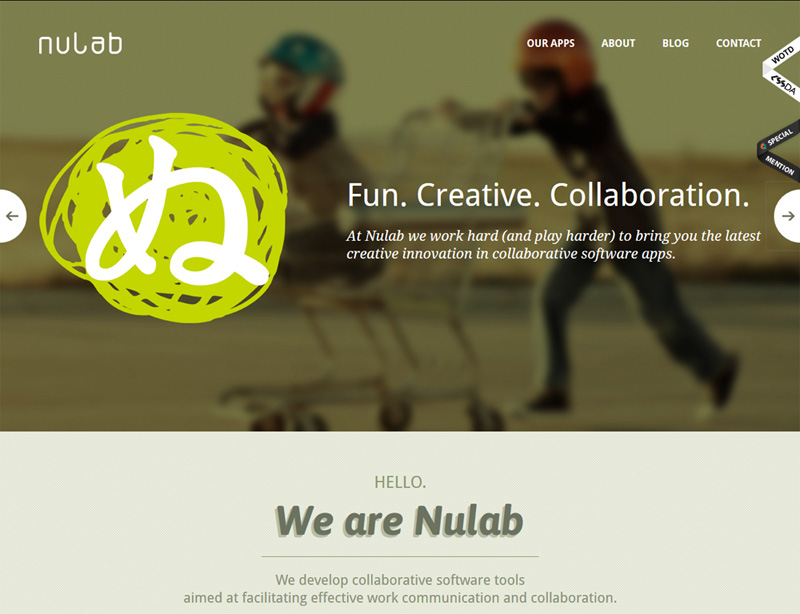
Nulab
Do you see this light-green round object daubed over the first slider image? Don’t you think that such odd elements make you remember the website you visit?
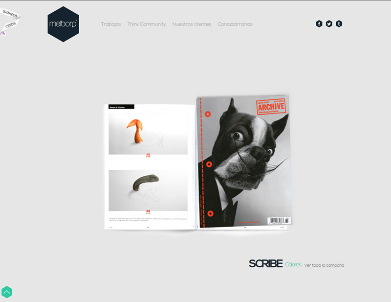
Melborp
The website looks absolutely normal except for this dog with a moustache image and half-alive (we know that it sounds quite queer) drawings of fish and dinosaur.
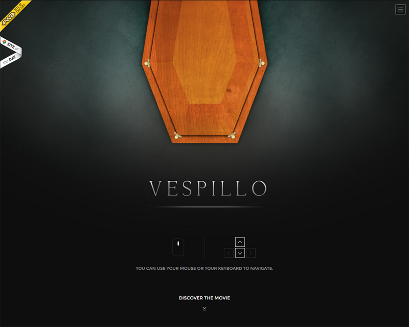
Vespillo
Do you feel awe at the sight of coffins? Then don’t browse this site, although it has an outstanding design.
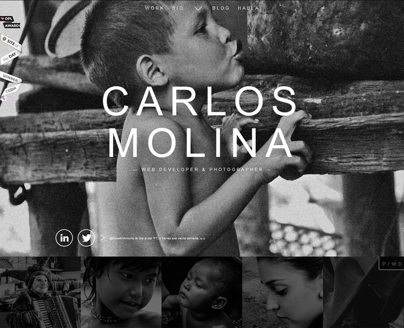
Carlos Molina
Background photo of a little naked boy in beggarly environments is so pathetic. But this black and white photographer’s website is magnificent.
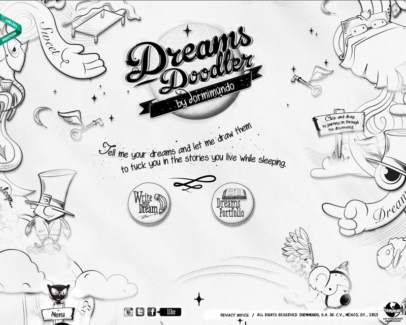
Dreams Doodler
Dreams can be so different – some of them are nightmarish and some are miraculous. Both categories are presented on this creative website.
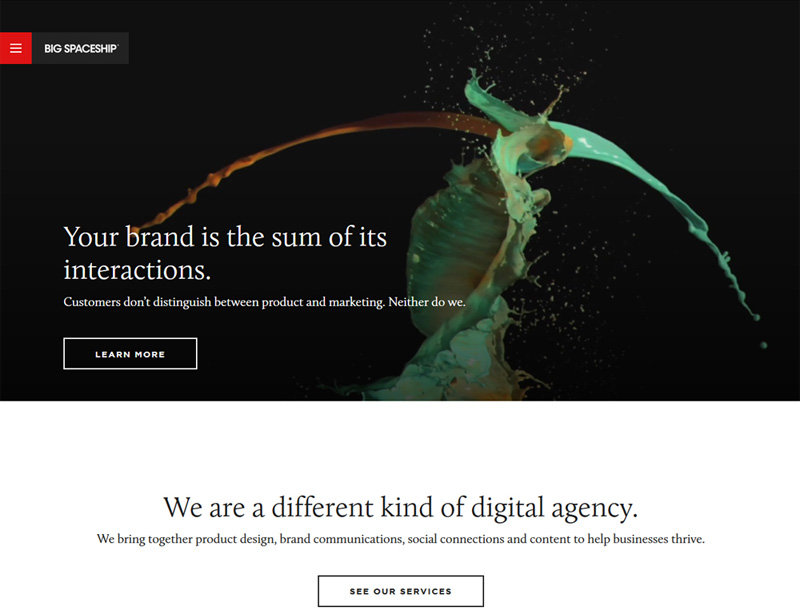
Big Spaceship
Would you like to see what color will come out of orange and blue paints mixed together? Something dirty… This website is extremely clean and accurate, like many other similar sites, so color splashes are its real zest.
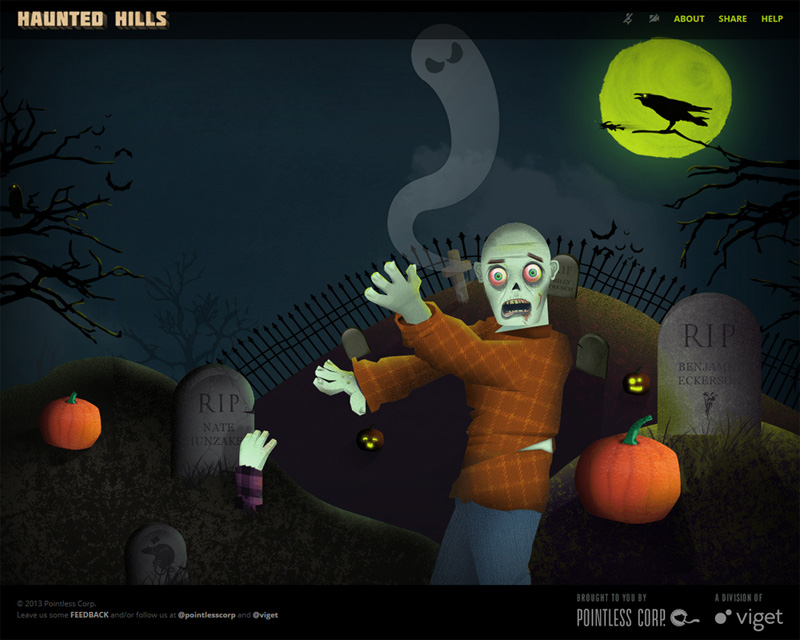
Haunted Hills
This night cemetery with great optical illusion of depth, perspective and retro design of subpages is simply inimitable.
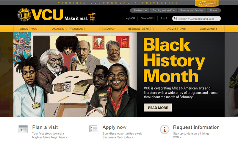
VCU
Caricature faces on a serious site? Why not, a portion of healthy humor is able to add specific charm to any website.
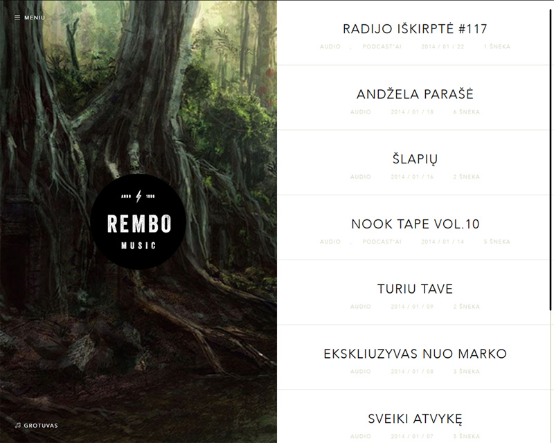
Rembo Music
The forest on the left is similar to the ominous Mirkwood forest from “The Hobbit: Desolation of Smaug” movie. Who knows, maybe the belligerent elves also dwell there…
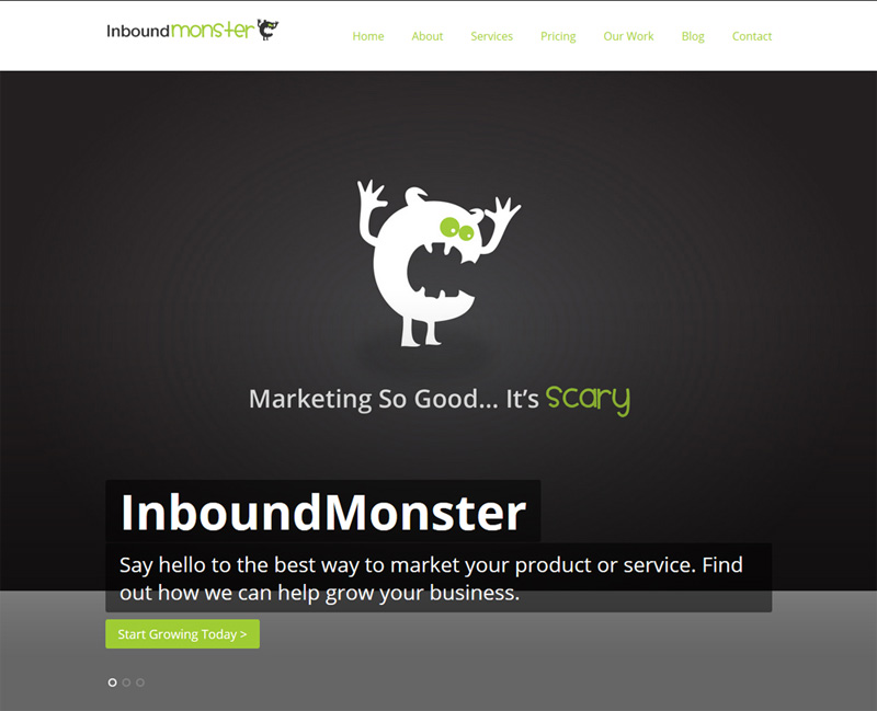
Inbound Monster
It looks as if this small round nibbler is trying to frighten you. If you are afraid of the monsters just scroll down or click to change the slider image.
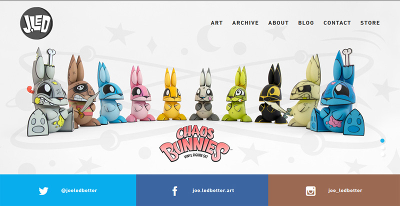
J. Led
Have you ever seen such scary bunnies? No matter how dreadful their appearance is, the website stays unique and cool.
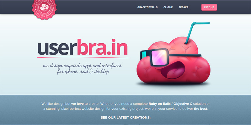
userbra.in
A cute smiling brain wearing glasses… Do you think somebody is going to sip a gray substance through this sticking up straw?
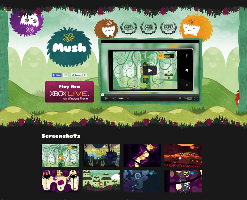
Mush
Dishevelled girls with different facial expressions look untidy but rather sweet and they perfectly blend into the website environments.
Conclusion
All means are good if you want to draw visitors to your website. We believe that even if your project stirs mixed feelings, it’s great all the same. But when the design leaves the users calm as cucumbers, it’s a bad sign as they will never come back again or share it with their friends. The results are easy to foresee – no traffic, no popularity, no bargains, and no money. So, be creative, invent crazy combinations and effects, change the position of elements, apply a humorous approach… Be daring, like the authors of the websites you’ve just browsed. We would be happy to see the outcome of your efforts, so, please share if you have something of the kind.
Please leave a comment as to this interesting technique of combining charming and scruffy elements in web design. What do you think about it? Does it really work? Maybe you have your own examples of such apt combination? What example do you consider the most well-turned? We will appreciate either positive or negative feedback.