
Ghost is a mysterious and cryptic creature that triggers such associations as consternation, transparency, clarity as well as charisma and attractiveness. Though it seems that it has nothing to do with a website design, in fact, this frightening, yet adorable “phantom” manages to transfer its genetic traits into graphics, adding to integral elements its strong appeal and personal charm.
The so-called “ghost” buttons are today’s talk of the office and are apparently a prevailing trend that is growing day by day. So, what actually does an almost translucent entity have to do with it all? Let’s figure it out.
Ghost Buttons in Web Design
“Ghost” button – that also can be called “naked”, “empty” or “hollow” – represents a basic shape with a transparent background that is delineated with a help of a solid border that is usually incredibly thin. It perfectly blends into the composition, becoming an essential, almost indistinguishable part, like a ghost. However, if it is accompanied by a proper background and set in a specific environment it can achieve quite the opposite effect, becoming a focal point of the page, which immediately grabs users’ attention. This type of graphic naturally delivers elegance and subtlety to the project that, as a rule, is wisely bolstered by refined ultra-narrow type and contour-style graphics.
Our list covers fresh examples of website designs that realize this increasing trend.
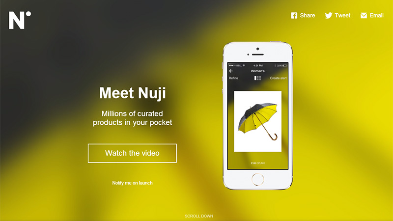
1. Nuji
The landing page of this iOS app website has a lack of textual filling, but it’s for the best. The vibrant heavily blurred backgrounds of slides clearly underline content and easily make the huge call-to-action contour-style button stand out from the canvas.
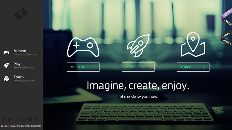
2. Iuvo
The website not only features several “ghost” buttons but also has line-style icons that effectively enrich the design, giving the interface an exquisite and refined appearance. Every navigation item is supplied with a small animation to provide a more pleasant user experience.
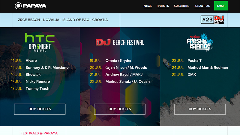
3. Papaya
Papaya is an event-oriented website that gives you an opportunity to book tickets for upcoming festivals. The home page is skillfully split into 3 equal sections each of which has a relatively huge “naked” button that are extremely difficult not to notice.
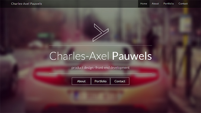
4. Charles-Axel Pauwels
The heavily blurred backdrop of the front page lets every foreground element easily stand out even despite having a highly subtle appearance. Everything looks sophisticated and delicate mainly due to an ultra-narrow type, line-style logo, semi-transparent panels and of course, “hollow” buttons placed in the center.
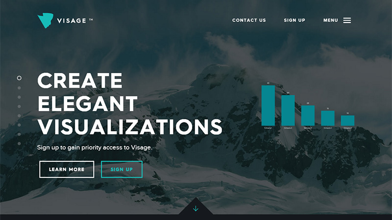
5. Visage
The designer employs an outline style for the majority of buttons. Thus, every section where a CTA button is needed is populated with such graphics. The “Learn More” and “Sign Up” buttons go native with the front page design and are able to instantly catch the eye.
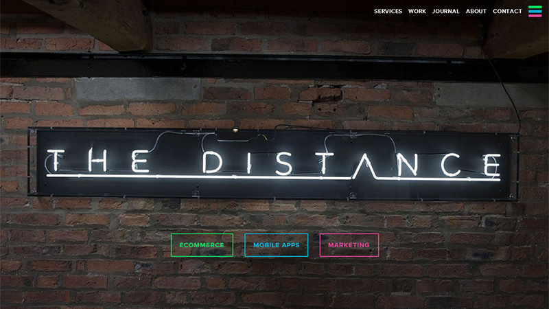
6. The Distance
This site features 3 neon-like colorful “ghost” buttons that go perfectly well with an urban background, effectively embellishing it. They seem to be a part of the whole composition yet they still are extremely noticeable.
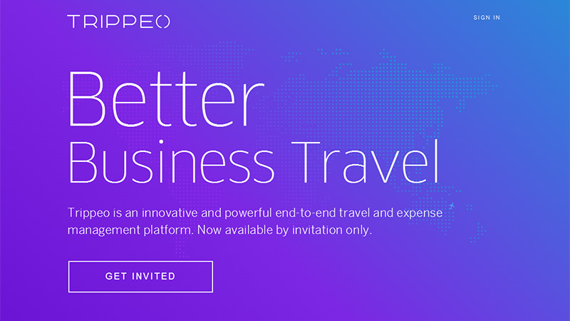
7. Trippeo
This design looks bright and fresh. The designer makes use of a garish, catchy color palette that nicely collaborates with a narrow white type. There are only 2 main things that fall within the focus: the content and the canvas. The latter is presented as a wonderful gradient-style backdrop that helps the “empty” CTA button to loom, so you definitely won’t miss it.
8. Union Room
The website engages the online audience with a video background that depicts a workflow of the agency. The team wisely applies a halftone effect for making the backdrop look more solid and appropriate for displaying foreground content. Thus, the elegant “naked” buttons that complete the content section look especially prominent.

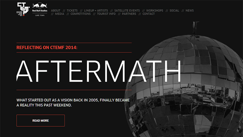
9. CTEMF
Though the designer lays great emphasis on textual filling, making every slide look information intensive, the “ghost” button that is placed at the bottom of each page is really easy to notice; it certainly helps to motivate people to read more about the event.
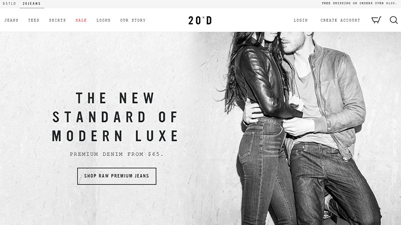
10. 20Jeans
Here, the “ghost” style assists to cultivate a simplistic feel that goes well with the overall design. The website looks neat and spacious due to lots of white space, moderate greyish coloring and of course, similar line-style icons.
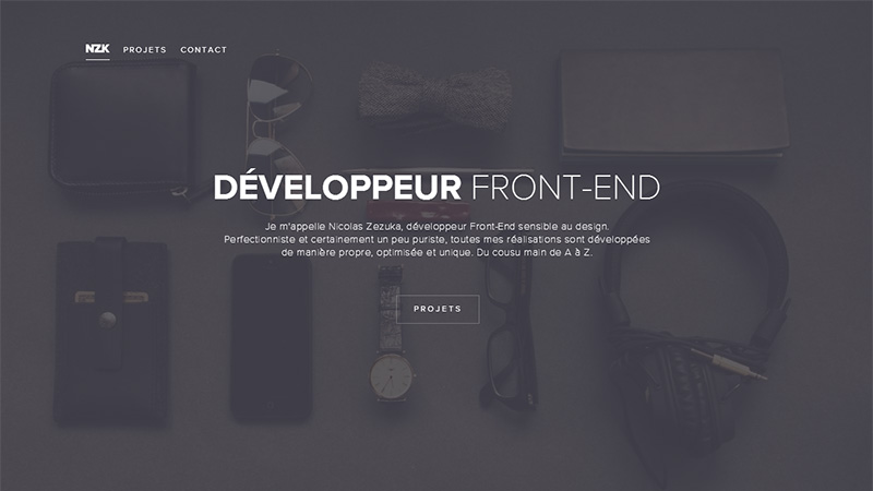
11. NZK
An absence of thick solid borders that are responsible for noticeable appearance of “ghost” buttons make it look almost translucent, however the designer wisely plays on a contrast, effectively muting the backdrop and thereby giving a visible contour to the graphics.
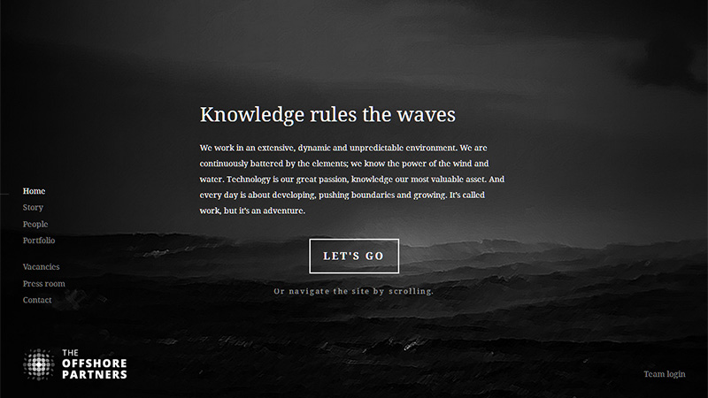
12. The Offshore Partners
Much like the previous example, thanks to a striking contrast between the dark backdrop and light content, the “naked” button looks perfectly legible. Its high “clickability” is also achieved due to the compactly arranged text block, which precedes it.
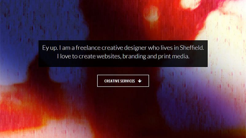
13. Richard Outram
Here, the CTA button looks like a lonely spot that also plays the role of a focal point for the visitors. The background and text box have a solid appearance, whereas the button has the opposite effect that sets it off the canvas. For anyone not fluent in Sheffield Speak, ‘Ey up’ is a Northern English way of saying ‘Hello’!
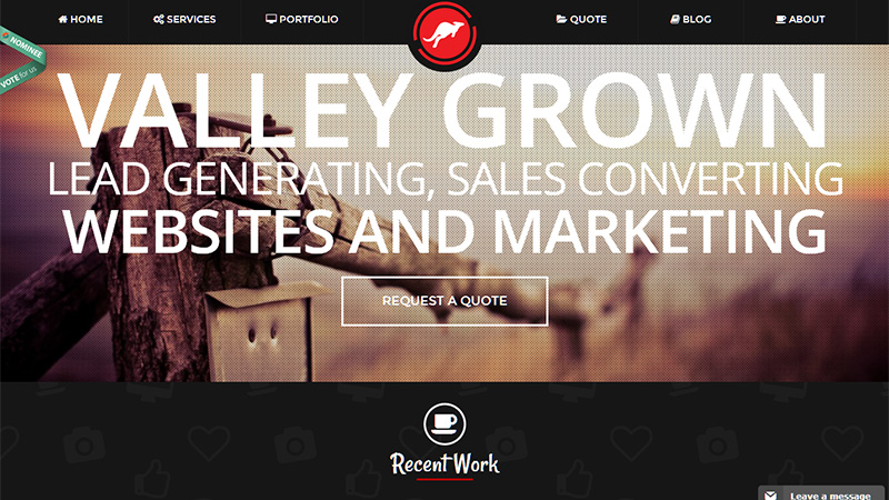
14. KangoMedia
The landing page boasts of its “gigantism”. The designer employs enormous typography for getting the readers’ attention. The line-style button “Request a Quote” is also huge; it pairs well with the rest of the content and is a nice finishing touch.
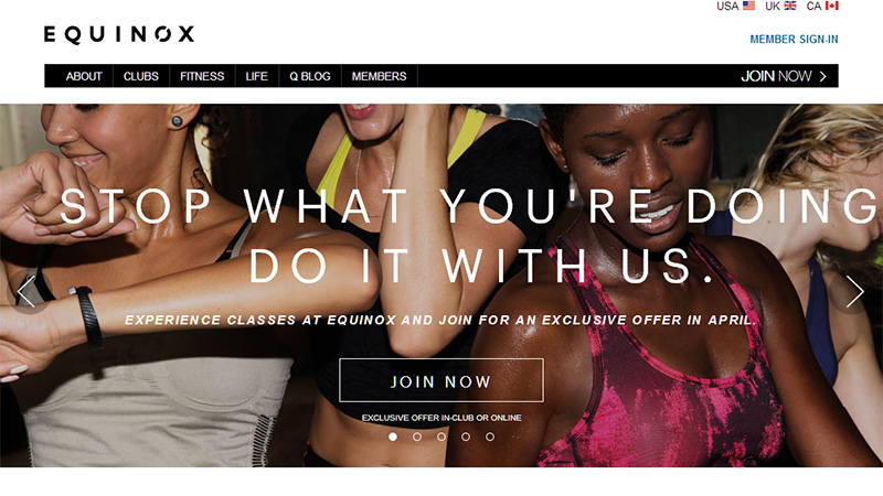
15. Equinox in Austin
The designer resorts to a winning combination of subtle narrow type and a sleek “ghost” button. These 2 elements effectively support and interact with each other, establishing a pleasant atmosphere.
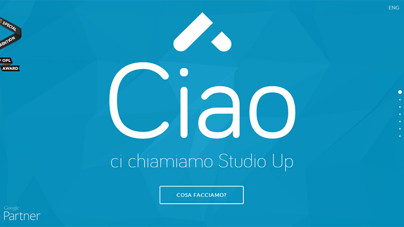
16. Studio Up
Here, the designer relies on 2 main aspects which are designed to entice users to scroll down and explore the website. The landing page exudes an image of simplicity and neatness, so the subtle “ghost” button feels right at home.
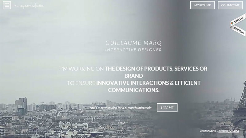
17. Guillaume MARQ
The contour style is entrenched in the project. The designer applies this solution to essential graphics, despite the video background that makes it look a bit illegible.
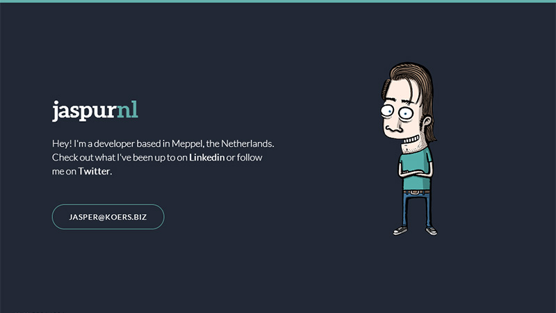
18. Jaspur
The hero page looks truly minimalistic and amusing. The funny mascot, small text block and regular contour-style button maintain clean and neat aesthetics.
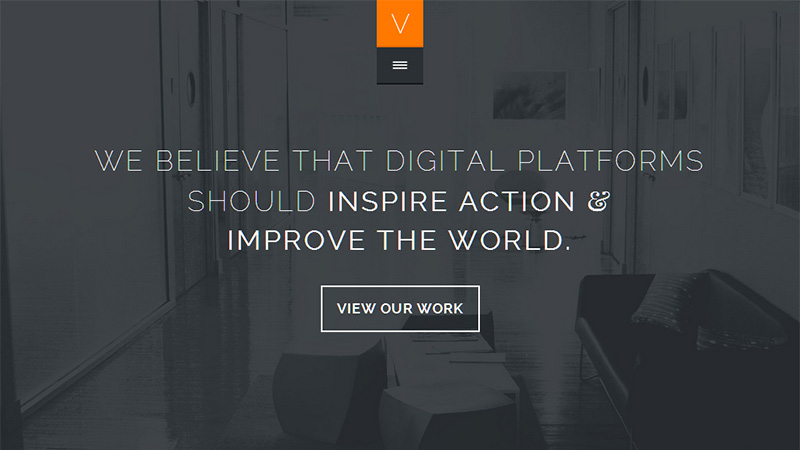
19. Verbal plus Visual
The button “View Our Work” immediately gets the users’ attention. It echoes ideally with a slick typography and darkened image background. Also the designer utilizes much lighter coloring for several elements in order to set their high priority.
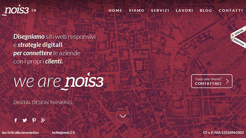
20. Nois3
Here, the designer also takes on a powerful mix of exquisite typography, outline graphics and “naked” buttons. The latter adds a surprisingly delicate touch to the design.
Conclusion
As a rule, designers don’t simply incorporate “ghost” buttons into an interface and leave them alone; they bolster them with either delicate typography and thin contour-style graphics or solid backdrops. Such support effectively contributes to its call-to-action feature as well as making it a significant part of the composition.


