
Responsive website templates are everywhere. The time has gone when websites were more nifty looking designs. Today, web designs have greatly evolved and improved resulting in more fluid and responsive web templates. This innovation in the web industry has totally changed the criteria of web development. Today, it is more about interactive and responsive web templates that can engage visitors for a relatively longer period of time.
Keeping this in mind, we thought it is a great time to share with you some flexible grid tools for creating responsive websites. So, here we are featuring 40 of the best and most useful flexible grid tools.
Flexible Grid Tools
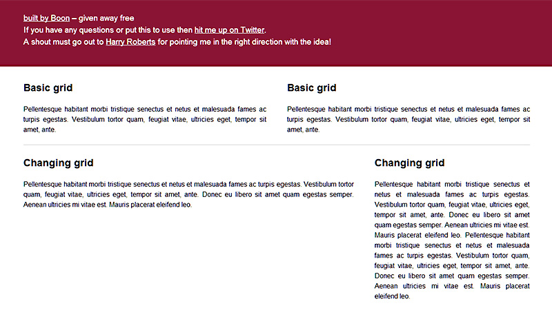
Gridpak
A responsive grid generator created by Erskine Design. Create your responsive grid system using the interface and Gridpak supplies you with a download file containing pngs, CSS and JavaScript accordingly. There is a video tutorial on the site.

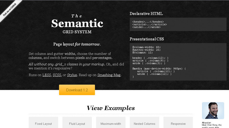
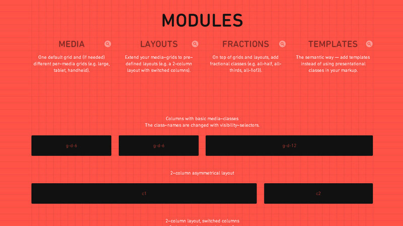
Semantic
The Semantic Grid System is a modern approach to the CSS grid. It allows you to set column and gutter widths, choose the number of columns, switch between pixels and percentages, and achieve responsive layouts, all without any unsemantic .grid_x classes in your markup.
The Responsive Calculator
A simple calculator to help turn your PSD pixel perfection into the start of your responsive website.

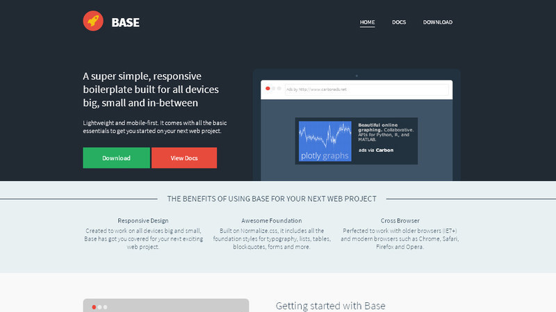
Base Framework
Base is a super simple, responsive framework, built to work on all devices, big, small and in-between.
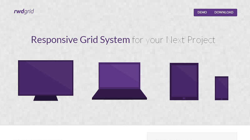
rwdgrid
rwdgrid is a grid system based on the popular 960grid. It is responsive and ranges from mobile, tablet and laptops to wide screen displays. This can be used as a base grid system that will help you to build responsive websites.
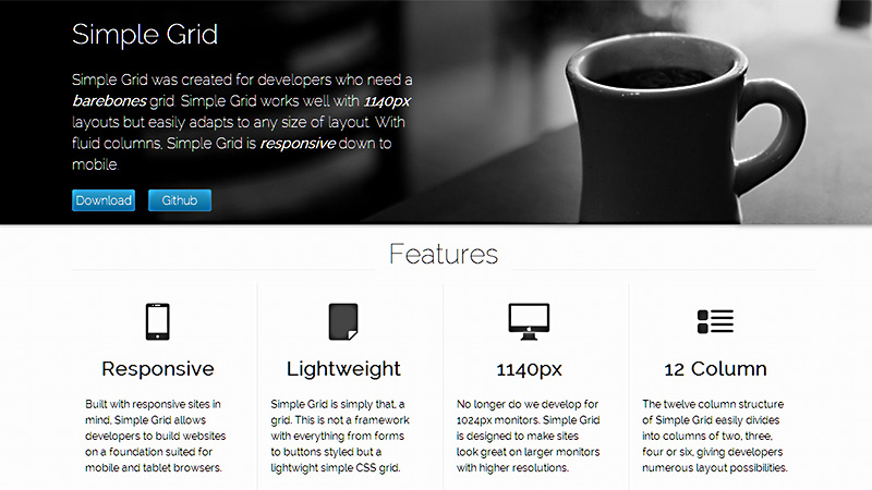
Simple Grid
Simple Grid is a basic lightweight grid, not a CSS framework. There is a grid for content and a grid for layouts. Simple Grid is also built for responsive layouts. With fluid columns, the grid will adjust to the browser resolution.
Proportional Grids
Don’t think widths, think proportions. A simple method of creating responsive fluid grids with fixed gutters. Use classes to set the proportions you want your grid to take at which breakpoint.
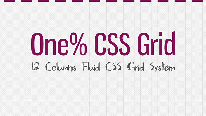
One% CSS Grid
One% CSS Grid is a 12 column fluid CSS grid system. It’s been designed as a base for building responsive web layouts easily, quickly and with minimum effort. You don’t have to take care of resizing and rearranging your layout for each platform separately. One% CSS Grid will do all this for you.
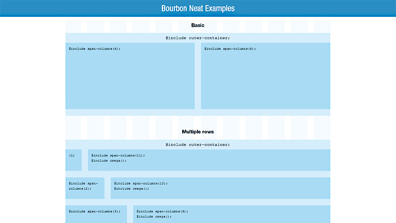
Bourbon Neat
Neat is an open source fluid grid framework built on top of Bourbon, with the aim of being easy enough to use out of the box and flexible enough to customize down the road.
Kube CSS Framework
Kube is an advanced and flexible CSS framework. It works in all modern browsers and is free for commercial use.

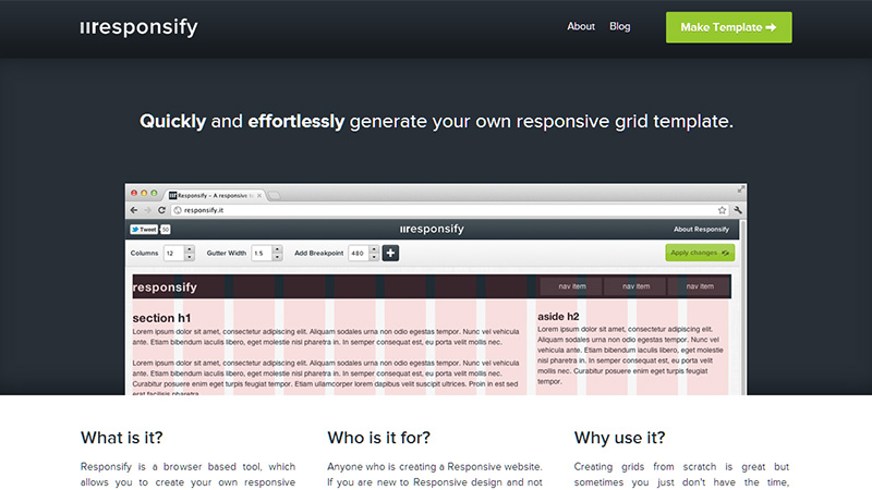
Responsify
Responsify is a browser based tool, which allows you to create your own responsive template. You can set the number of columns, the gutter width and breakpoints, then download the .zip file.
Gridless
Gridless is an HTML5 and CSS3 boilerplate for making mobile first responsive, cross-browser websites. It is meant to be a starting point, which should be edited, tweaked and overwritten to suit each project’s design requirements.
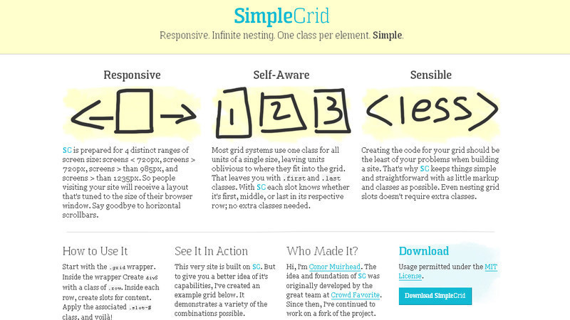
Simplegrid
Creating code for your grid should be the least of your problems when building a site. This tool keeps things simple and straightforward with as little markup and classes as possible. Even nesting grid slots doesn’t require extra classes.
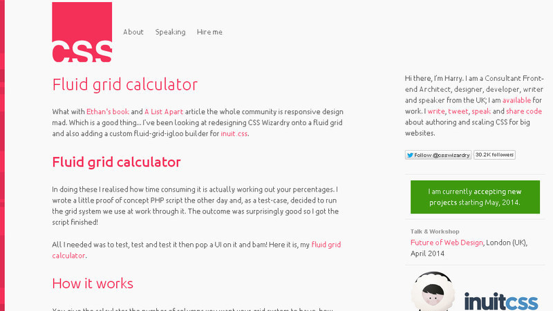
Fluid Grid Calculator
How Fluid Grid Calculator works: You give the calculator the number of columns you want your grid system to have, how wide you want each column, and how wide you want the gutters. The calculator will return a downloadable full stylesheet containing the measurements for all your possible grid sizes, their gutters and their containers.
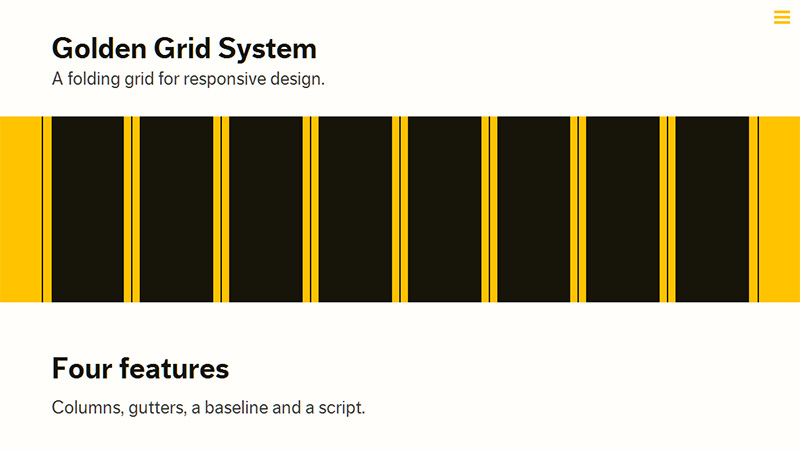
Golden Grid System
Golden Grid System splits the screen into 18 even columns. The leftmost and rightmost columns are used as the outer margins of the grid. The 16 remaining columns can be combined, or folded, into 8 columns for tablet-sized screens, and into 4 columns for mobiles. This way Golden Grid System can easily cover any screen size from 240 up to 2560 pixels.
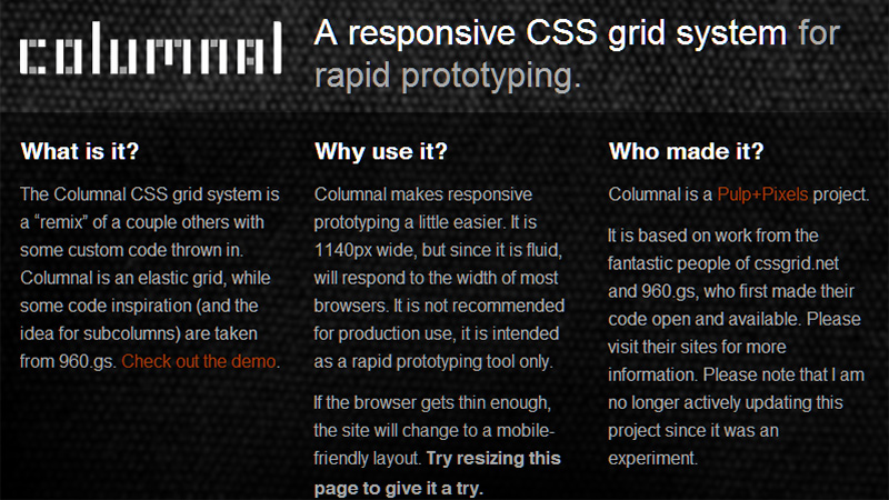
Columnal
Columnal makes responsive prototyping a little easier. It is 1140px wide, but since it is fluid, will respond to the width of most browsers.
Responsive Design Bookmarklet
A script that generates custom bookmarklets for testing responsive layout websites to see how they look in different viewport sizes.

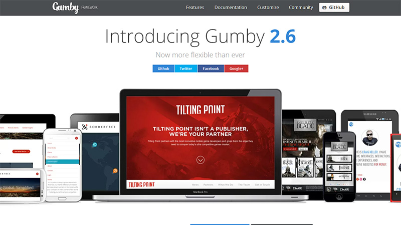
Gumby Framework
Gumby Framework is a flexible, responsive CSS Framework, powered by SASS. Create rapid and logical page layout and app prototypes with a flexible and responsive grid system and UI kit.
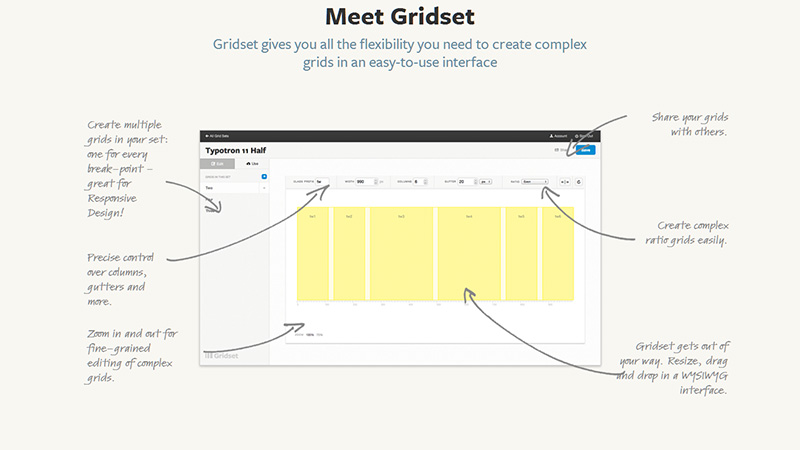
Gridset
Gridset allows you to build respoinsive prototypes without doing any math. It provides all the measurements and tools you’ll need to integrate with your existing markup, without the need for any new classes or HTML. You can take advantage of the 30-day free trial, then the cost is $9 per month, or $90 per annum.
Susy
Susy is an agnostic set of tools for creating powerful, custom layouts. Use a grid, don’t use a grid, or use a combination of grids – it’s all up to you.
A Better Photoshop Grid For Responsive Web Design
A .psd download that has different column sizes and their percentages.

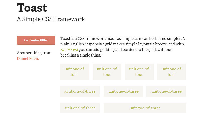
Toast
The Toast framework is a super simple CSS framework with a simple reset, a grid and type styles.
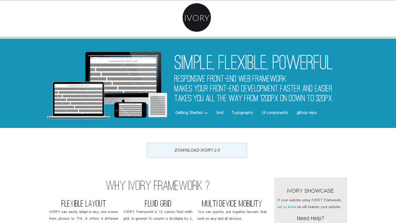
Ivory
Simple, flexible and powerful responsive framework, makes your
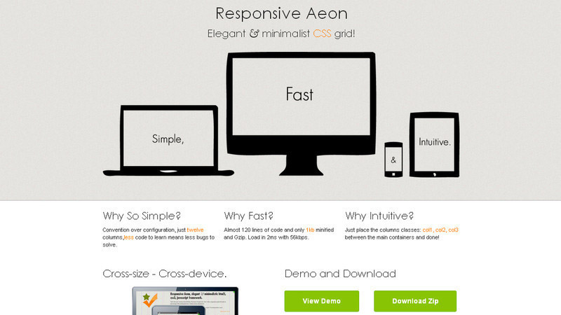
Responsive Aeon
Lightweight responsive CSS grid system, built to be simple, fast and intuitive. Only 1kb minified.
Skeleton
Skeleton is a small collection of CSS files that can help you rapidly develop sites that look beautiful at any size, be it a 17” laptop screen or an iPhone.

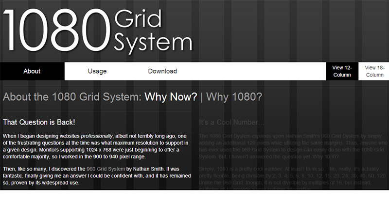
1080 Grid System
The 1080 Grid System expands upon Nathan Smith’s 960 Grid System by simply adding an additional 120 pixels, while utilizing the same margins. 1080 is pretty flexible, being divisible by 2, 3, 4 , 5, 6, 8, 10, 12, 15, 20, 24, 30, 40, 60, 120.
960 Grid System
The 960 Grid System is an effort to streamline web development workflow. The download includes printable sketch sheets and template files for Adobe Fireworks and Photoshop, OmniGraffle and Visio; and a lightweight CSS file which contains the grid dimensions.

Grid System Generator
This tool generates grid sytems in valid CSS/XHTML for rapid prototyping, development and production environments. The grid system generator offers the ability to customize the width, number of columns and margins to allow more flexibility for various designs.

Responsive Grid System
Spectacularly easy responsive web design.

Mueller Grid System
Mueller is a modular grid system for responsive/adaptive and non-responsive layouts. You have full control over column width, gutter width, baseline grid and media-queries.
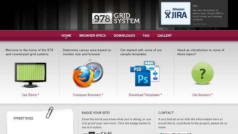
978.gs
978.gs is a website promotion modern grid system use in web design. The most popular grid system is 978, but others are also available. The 978 grid system uses 12 columns at 54px, with 30px gutters. Almost every computer and tablet in the world today is capable of displaying designs built on this grid.
34 Responsive Grid System
34Grid is a responsive grid system based on equally distributed columns layout basis. It provides equally distributed columns for each row (and also column complements for inequal distributions). Create and download a bundle with a variety of options.

Flurid
Flurid is a cross-browser fluid width grid system optimized for flexibility. The basic purpose is to break the page into a series of rows and columns, giving the designer an easy, rational way to organize and present content to the user.
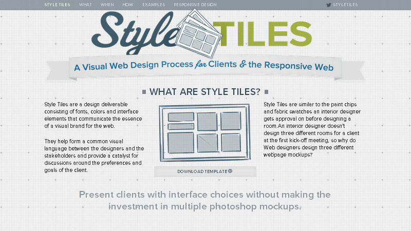
Style Tiles
Style tiles are for when a moodboard is too vague and a comp is too literal. Style tiles establish a direct connection with actual interface elements without defining layout.
Responsivepx
Enter the url to your site – local or online: both work – and use the controls to adjust the width and height of your viewport to find exact breakpoint widths in pixels. Then use that information in your media queries to create a responsive design.

Tiny Fluid Grid
Tiny Fluid Grid ships with an index.html with demo code, and the grid.css containing the CSS for the grid you created.

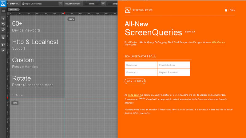
ScreenQueries
ScreenQueries is a media query debugging tool that tests responsive designs across 60+ device viewports.
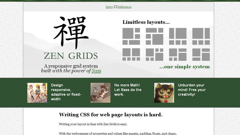
Zen Grids
A responsive grid system built with SASS
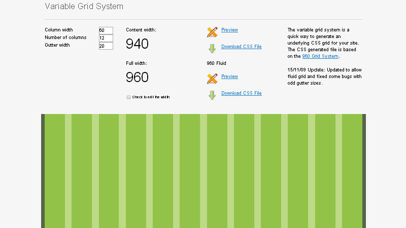
Variable Grid System
The Variable Grid System is a quick way to generate an underlying CSS grid for your site.
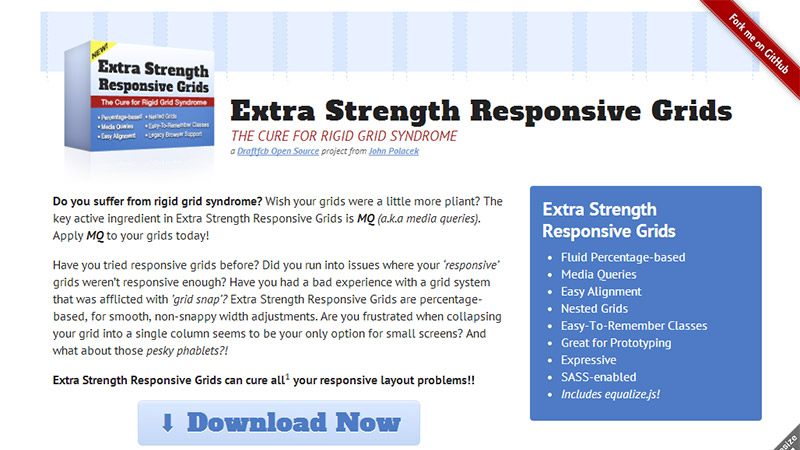
Extra Strength Responsive Grids
A fluid CSS grid system for responsive web design. Fluid percentage-based, easy alignment, nested grids, easy-to-remember classes, great for prototyping and SASS-enabled.
Conclusion
With this collection, we are showcasing flexible grid tools for responsive websites. To wrap it up, they are all free to download, so dig in. come, take a peek, and take your pick.
Leave us a comment and let us know what you think about this compilation. So, enjoy this collection and feel free to share your opinion with us. Enjoy!


