
Layout is probably the most important element when designing a website. When visitors understand your layout and feel like they can play with it, their experience becomes pleasant, they stay longer and will visit your site regularly. We’ve navigated through sites with high-quality content but darkened by very confusing design and a totally messed up layout. Our reaction is, of course, getting out of there as fast as we can.
There isn’t a standard layout for the very diverse collection of screen sizes nowadays, ranging from very small (240px) to huge (+1920px). So far, the approaches we’ve used to build our websites are either inline-blocks or floating blocks. Whatever it is, we need lots of workarounds to check the view we want, and multiply those workarounds while working on a responsive layout. Fortunately, the guys at W3C are aware of this and are actually giving options to developers. The one that concerns us is Flexible Boxes.

For your information, this post is about the new CSS3 Flexible Box Layout Module, which as of January 10, 2013 is supported in Chrome 21.0+ and Opera 12.10+ only.
Coming Up Flexible Boxes
Old and New Flexible Boxes
Flexible boxes are a bit confusing since there are a couple versions of this module that are implemented in several browsers. “Old” Flexbox and “New” Flexbox from CSS-Tricks will give you a brief explanation on the different versions of Flexbox available and how to recognize them. Clarification: this article is all about the latest version of flexbox (the ‘display: flex’ notation).
What are Flexible Boxes?
Now, the best way to explain something is by looking at it, so we will create a complete layout using flex. For the sake of this article we’ll refrain from using any sort of blocking. Everything will be built with flex containers and flex boxes.
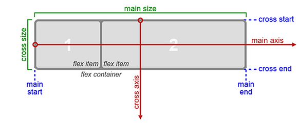
First, here you have the concepts that we’ll be working with:
<div class="flex-container">
   <div class="flex-item">1</div>

   <div class="flex-item">2</div>

   <div class="flex-item">3</div>

   <div class="flex-item">4</div>
</div>
This is just a container with 4 items, and in order to make them flex we need to add CSS3:
<style type="text/css">

   .flex-container {
       /* This is the Chrome notation */

       display: flex;
   }

   .flex-item {
       -webkit-flex: 1;

       flex: 1;
   }

</style>
This code is available as a demo at CodePen.
As you can see, when the display: flex value is added to the container it becomes a flex-container, and all its direct children become flex-items. Flex-items will always try to fit their parent container depending on the direction it has, fitting height when the container is a row and fitting width when the container is a column. Whether you want the flex container to be a row or a column, you can use the flex-flow: column property. Finally, each flex item has a flexibility property (flex: 1 in the example above). Thanks to this property we can determine the way the flex items fill the spaces in their container.
Every flex container is defined by two axes, but this is not enough to understand exactly what’s happening with these flexible boxes, so let’s practice by creating a full layout using only flexible boxes and most of our questions will be answered.
Building a full layout with flexible boxes
Here we have this HTML5 structure:
<div class="flex-container">

   <header>

       Header

   </header>

   <div class="flex-area">

       <section>

           <article class='featured-article'>

               First Article

           </article>

           <article>

               Second Article

           </article>

           <article>

               Third Article

           </article>

       </section>

       <aside>

           Sidebar

           <div class="box"></div>

           <div class="box"></div>

           <div class="box"></div>

       </aside>

   </div>

   <footer>

       Footer

   </footer>

</div>
We need to add some CSS to this structure for it to be considered as a layout. We’ll use a classic layout: full-width header and footer, a middle container (.flex-area) which will be a full-width two-column area and the main section that will have a featured article at the top and two other articles below it, like this:
<style type="text/css">

   .flex-container {

       -webkit-flex-flow: column;

       display: flex;

       flex-flow: column;

   }

   header,

   footer {

       -webkit-flex: 0px 0px 100px;

       flex: 0px 0px 100px;

   }

   .flex-area {

       -webkit-flex-flow: row;

       -webkit-flex: 3 1 auto;

       display: flex;

       flex-flow: row;

       flex: 3 1 auto;

   }

   section {

       -webkit-flex-flow: row wrap;

       -webkit-flex: 4 1 auto;

       display: flex;

       flex-flow: row wrap;

       flex: 4 1 auto;

   }

   article {

       -webkit-flex: 1 35%;

       flex: 1 35%;

   }

   .featured-article {

       -webkit-flex: 2 1 100%;

       flex: 2 1 100%;

   }

   aside {

       -webkit-flex-flow: column;

       -webkit-flex: 0px 0px 240px;

       display: flex;

       flex-flow: column;

       flex: 0px 0px 240px;

   }

   .box {

       -webkit-flex: 1;

       flex: 1;

   }

</style>
A demo can be found at CodePen.
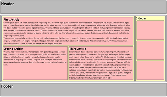
We have a handful of code, but in the demo we added some backgrounds and margins to make the example clearer. Now, this CSS step-by-step procedure shows a clear idea of what’s happening:
- First, we need a couple of containers to turn into flex containers. Our main container is a div with class
flex-container, so we just set the display property to flex. This way, all the elements within the div become flex-items. Then we want flex items to be displayed from top to bottom, so we declare flex-flow as a column. - Keep the header and footer with a fixed height. By using the flex property we can decide how they will behave: the first 0 means we don’t want it to grow, the second 0 means we don’t want it to shrink (thus, making it fixed) and the last value is the base from where the flex-item will start (
100pxin this case). - The next flex-container is the div with the class
flex-area, so we set display to ‘flex’. Notice that this div is a flex-container and a flex-item so is necessary to establish its flex properties. In this case, the base auto is used, since we want it to fill whatever space it finds in the main area, growing if the space is big enough without shrinking too much since it’s our main content. - The
.flex-areacontainer has twoflex-items: sectionandaside, we want them to be next to each other, from left to right, so we set the flex-flow to row. We also want our sidebar to have a fixed width of240px, and section will fill the rest of the space with relatively big growth and small shrinking indexes. For this, we set the flex property expressly for each one. - The section flex-item also needs to be a
flex-container, so we set it accordingly. This time we ordered flex-items from left to right, but we also want them to use more than one line, so the word wrap to the flex-flow property was added. We want it to show a featured article on top and the rest in two columns with the same size, so we set the flex property for all articles to 1, and since we want two columns we want them to be larger than 33% and less than 50% for the base. We choose 35% and let flexibility handle the rest. - In the case of the featured article, we want it to use a full area at the top, shrinking or growing depending on the needs of the user, so we set it with a base of 100%.
- Finally, the sidebar should keep a group of boxes that will work as a main menu, so we repeat the process above. This time we don’t want to use a base, but the boxes must fill automatically all the space of the sidebar.
This is a very simple layout which fits the screen with the right amount of content. Nonetheless, in small devices the sidebar might cause visibility problems, so media queries are required to make it fully responsive.
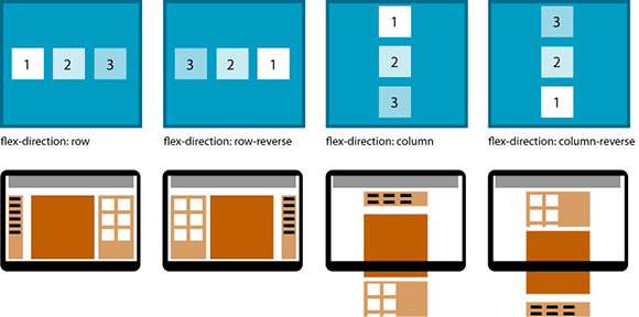
Flexbox also allows playing with the arrangement by displaying ordered boxes, whether it is in a row or a column.
Media queries and flexible boxes fit different sizes
Although we have done a great job with our layout, it is not device friendly and still needs changes to be that way, so we’re going to add a couple of media queries for this purpose.
First, we want to make our sidebar more standard to be displayed just below the header, and then place the article section and then the footer. Also, we’ll reduce the height of both header and footer. It should look like this:
<style type="text/css">

   @media only screen and (max-width:640px) {

       .flex-area {

           -webkit-flex-flow: column;

           flex-flow: column;

       }

       header,

       footer,

       aside {

           -webkit-flex: 0px 0px 50px;

           flex: 0px 0px 50px;

       }

       aside {

           -webkit-flex-flow: row;

           -webkit-order: 1;

           flex-flow: row;

           order: 1;

       }

       section {

           -webkit-order: 2;

           order: 2;

       }

   }

</style>
If the reader uses an even smaller device, the two columns in the article section are going to be discarded, so we’ll add a media query to drop those columns and create a fully vertical site for devices of 420px or less width.
<style type="text/css">
   @media only screen and (max-width:420px) {

       section {

           -webkit-flex-flow: column;

           flex-flow: column;

       }

       article {

           -webkit-flex: 1;

           flex: 1;

       }

   }
</style>
A fully responsive demo is available at CodePen.
Conclusion
This is pretty much it, a fully responsive simple layout using only the latest version of CSS3 Flexible Boxes Module. The amount of code used is far less than similar websites using similar layout processes. However, the big flaw to this technique is its cross-browser compatibility, since it will only work in Chrome 21+ and Opera 12.10+.
Still, we’re optimistic with the announcements from Firefox regarding this implementation for version 18 and the current support from IE 10 and Safari to an earlier version of this module, which makes us think we’ll be having a look at this property more often, making all our layouts cleaner and easier to view.
In the meantime, keep on investigating what’s to come about this matter, so it won’t take you by surprise when it explodes.


