
15 Best Number Fonts for Displaying Numbers (2025)
Website typography has multiple different aspects; displaying numbers on the screen is among the most important ones. There are many use cases when you might want to focus on…

27 College Fonts for Creating Academic-Inspired Designs (2025)
Ever wondered where that bold, slab-serif “college look” comes from? It goes way back to mid‑19th century Ivy League sportswear. Harvard’s baseball team embroidered an “H” on their flannel…
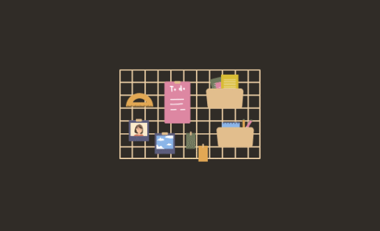
30 Mood Board Templates for Visualizing Your Ideas
Before the logo, the website, or the color palette gets approved, there’s the mood board. It’s where early ideas start to take form. They’re not fully designed and not…

22 Comic Book Illustrations to Give Your Designs Superpowers (2025)
Comic books aren’t just for collectors and cosplay. They’re a valuable design resource. With bold lines, dramatic poses, and larger-than-life characters, comic-inspired visuals instantly grab attention and bring high-energy…
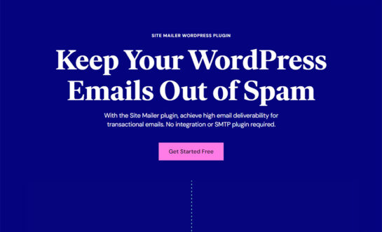
Site Mailer WordPress Plugin Review: Improve the Deliverability of Your Transactional Emails
Transactional emails are integral to many websites and online businesses, including e-commerce, membership sites, marketplaces, forums, and job boards. If you own or manage any WordPress-based website that involves…
7 Best No-Code App Builders To Deploy SaaS Apps Fast
So, you have a great idea for a SaaS startup but don’t have the coding skills to build the app. Sound familiar? If you’re in a situation like this,…

21 Best Resume Templates to Impress Employers (2025)
Thinking about applying for a new job? Looking for a way to get your resume noticed by potential employers? What you need is a resume template. Resume templates are…

Rocket.net Review of WordPress Hosting: We Use It (Here’s Why)
Debating using Rocket.net to host your WordPress site(s)? In our hands-on, honest Rocket.net review, we’ll help you decide whether or not it’s the best option for your needs. In…

20+ Best Pixel Perfect Fonts for 8-bit Designs for 2025
Pixel fonts are going through a kind of renaissance. Despite today’s high-resolution technology, artists and designers continue to use old-school pixelated fonts that were popular in the early days…


