
Responsive web design is becoming more popular day by day because users can browse such web designs from a variety of devices. For example, desktop, mobile phones, tablets, netbooks and so forth just to name a few. The reason why responsive web designs are so popular among designers is that they allow them to furnish different layouts for specific devices.
Today, in this collection we have gathered for you 55+ superb, great and useful tools for responsive web design. These tools are designed by very talented developers and can help you with your responsive website designs and also offer great tablet and smartphone user experience.
Great and Useful Tools for Responsive Web Design
Getting Started, Learning
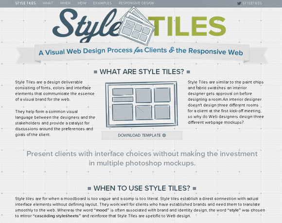
Style Tiles
Designer Style Tiles introduces a new technique in the world of responsive website design. All these designs are like swatches or moodboards and therefore, it shows the general design approach.
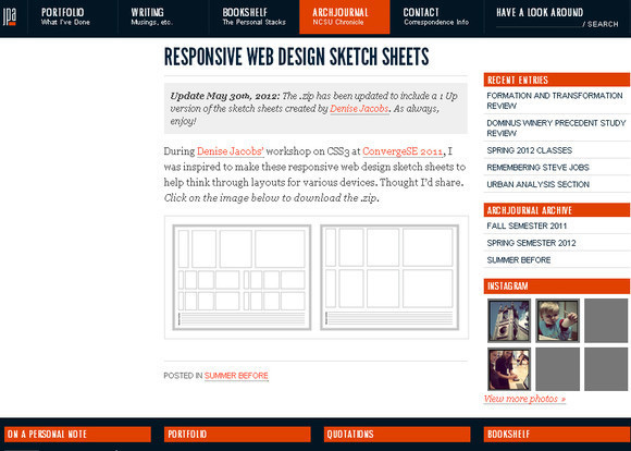
Responsive Web Design Sketch Sheets
This set will help you in mapping out how you can change page sections in different resolutions.
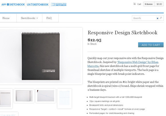
Responsive Design Sketchbook
This set contains a sketchbook in which you can easily keep your all sketches and save time too.
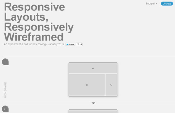
Responsive Wireframes
In this experimental tool, you will see how responsive wireframing of complex website layouts work.
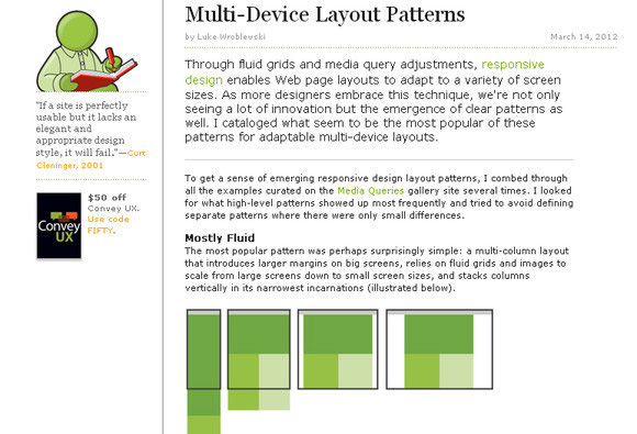
Multi-Device Layout Patterns
With this tool, you can see how other designers have approached responsive Multi-Device Layout Patterns. It is a superb place to start your own Multi-Device Layout Pattern because it contains a list of popular patterns with links.
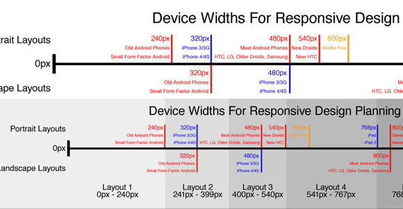
Simple Device Diagram
This tool makes it easy for you to choose what device widths to design to. This tool contains the ideal width for the design of 3 layout sites, 4 layout sites etc.
Responsive Design with Mockups
Here, you will find a library of mockup templates along with a tutorial on how to do wireframing.
Responsive Image and Text Tools
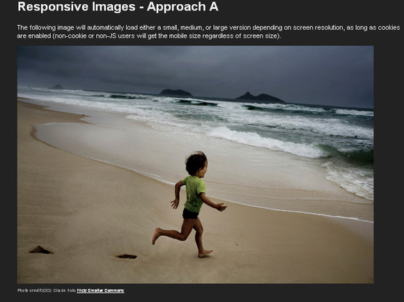
Responsive Images
This is an experimental image scaling tool that can scale your images responsively.
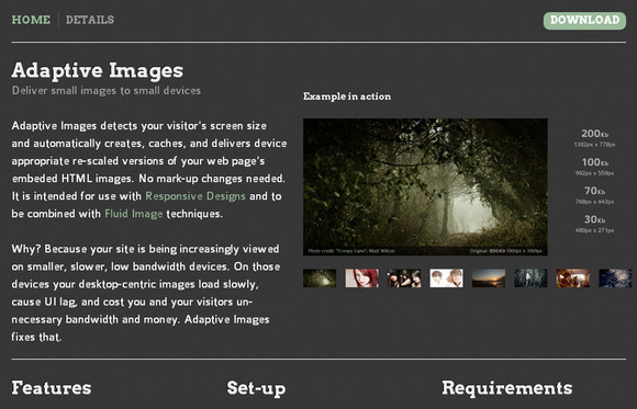
Adaptive Images
Adaptive Images detects your visitor’s screen size and automatically creates, caches, and delivers device appropriate re-scaled versions of your web page’s embeded HTML images. No mark-up changes needed
Seamless Responsive Photo Grid
If you want to show images edge-to-edge without any gaps inbetween images on the browser, then this tool will help you.

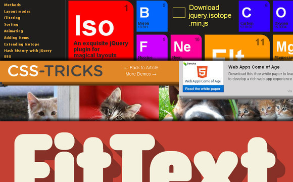
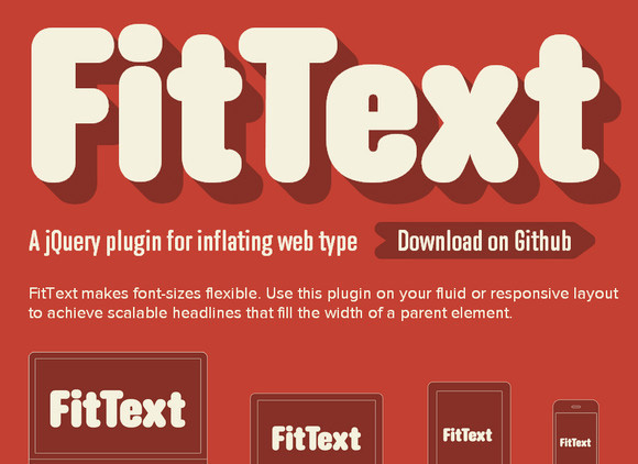
FitText
With this tool, you can make font sizes flexible and in this way you can achieve scalable headlines.
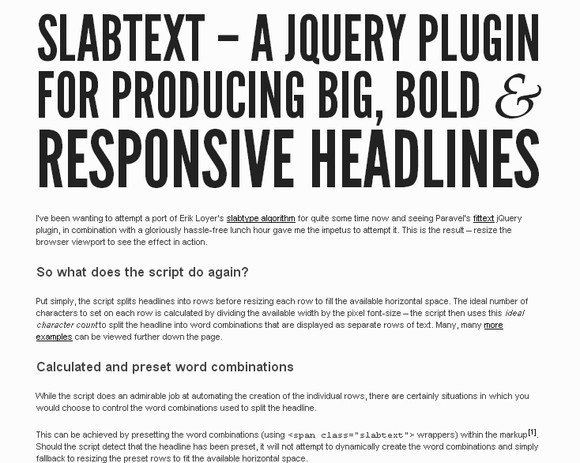
slabText
This is a jQuery plug-in that will help you make bold blocks of text that can be resized responsively.
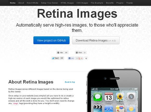
Retina Images
This tool will help you to show 2x larger, high-resolution images when viewed on retina display devices.
Flexible/fluid Grid, Media Queries
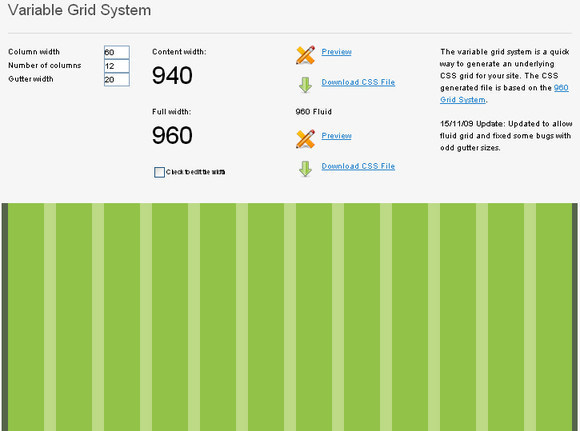
Variable Grid System
With this fluid grid system, you can easily create an underlying CSS grid for your website.
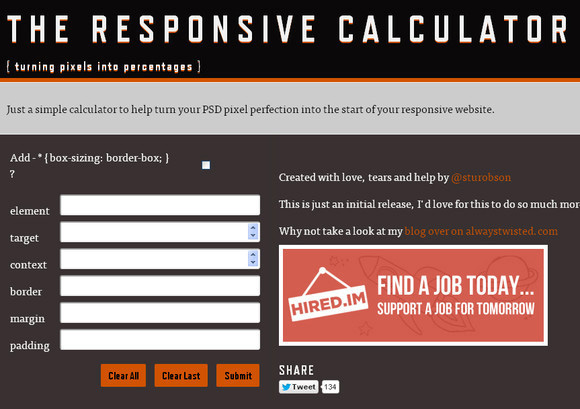
Responsive Calculator
With this calculator you can simply change your PSD pixel perfection into the start of your responsive website.
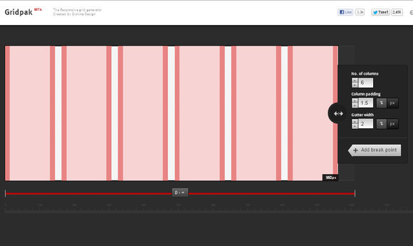
Gridpak
Improve your workflow and save time with GridPak that can generate PNGs, CSS and JavaScript for your responsive website layout.
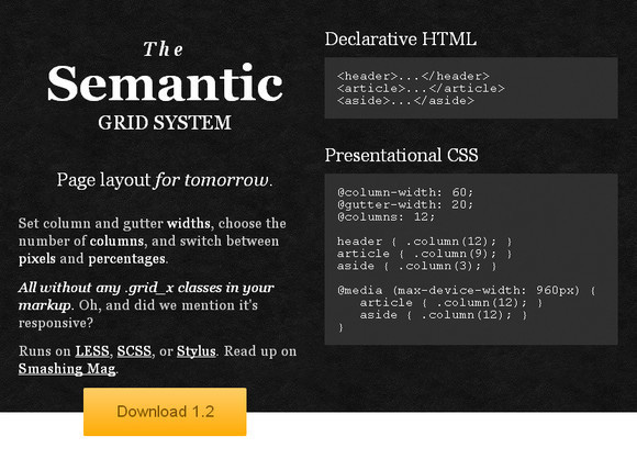
Semantic Grid System
This tool lets you set column and gutter widths along with the number of columns. Moreover, you can switch between pixels and percentages, and can achieve responsive layouts.
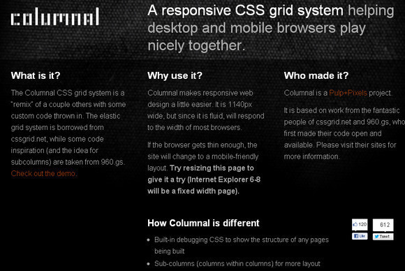
Columnal CSS Grid System
This grid system helps you to create more responsive website designs in an easy way. This is a fluid grid system that responds well to the width of most browsers.
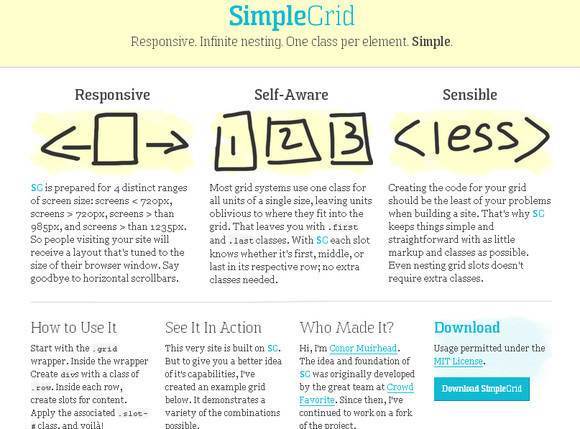
Simple Grid
This is an easy to use grid system that will help you create responsive website layouts.
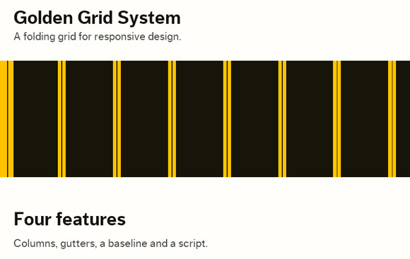
Golden Grid System
With this tool you can easily create 18 even columns 16 central columns to be used for designing purposes while the leftmost and rightmost columns are used as outer margins.
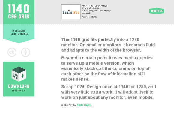
1140 CSS Grid
This grid system works best on smaller screens and becomes fluid and adapts to the width of the web browser.
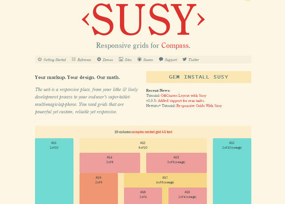
Susy
With this tool you can create a grid system that does not make use of any extra markup or special classes.
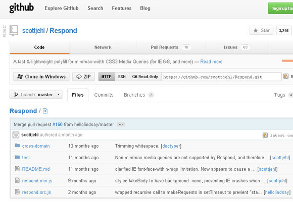
Respond.js
This is athe fast and lightweight polyfill for minimum or maximum width CSS3 Media Queries.
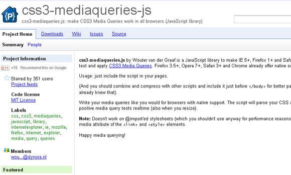
CSS3-Mediaqueries.js
With this tool you can enable older versions of IE as well as other web browsers to efficiently try out and employ all types of media queries.
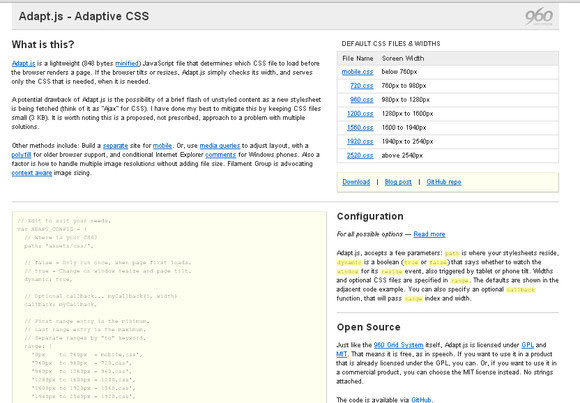
Adapt.js
This tool will automatically decide which CSS file to load prior to the browser rendering a page. Furthermore, this tool only serves the needed CSS files if the browser is resized.
Categorizr
This script will help you serve your website as a mobile website unless otherwise detected as a desktop or tablet and thus, serve resources to web browsers in an appealing manner.

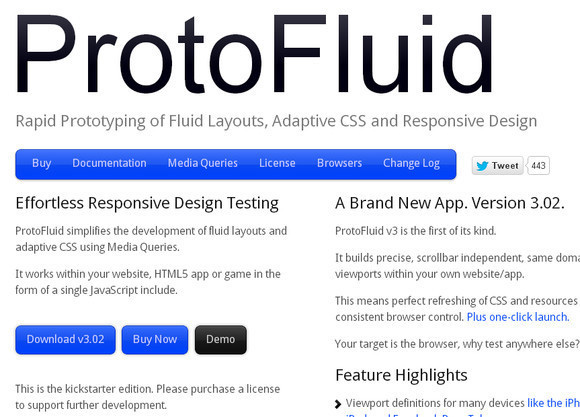
ProtoFluid
With this tool, you can quickly do prototyping for adaptive CSS, fluid layouts and responsive web designs.
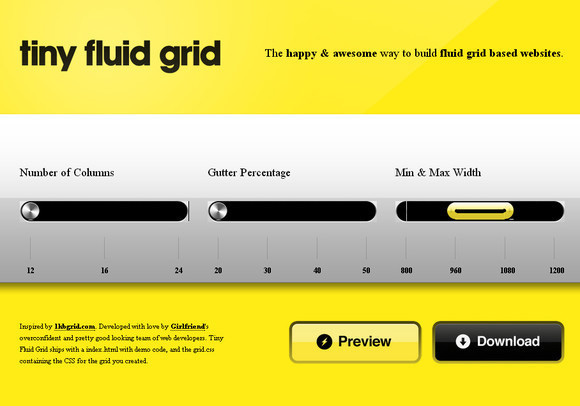
Tiny Fluid Grid
Tiny Fluid Grid will help you to find out the grid system for your design and it is a web based app that offers you downloadable CSS for your responsive grid.
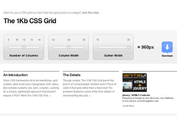
1Kb CSS Grid
With this CSS generator, one can easily generate a downloadable CSS file for the website grid with the set numbers of columns along with columns and gutter widths.
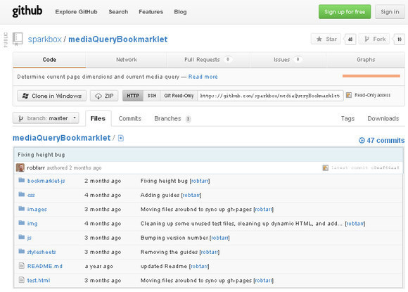
mediaQuery Bookmarklet
Create a visual representation of the recent viewport dimensions as well as the most freshly fired media query.
Responsive Design (and Mobile) Boilerplates, Framework
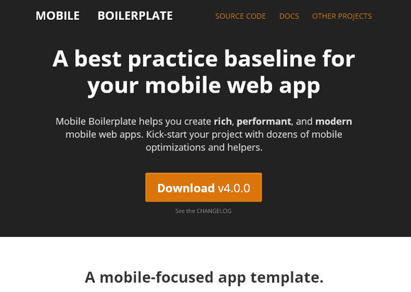
Mobile Boilerplate
This tool will help you to generate modern, rich and performant mobile web applications.
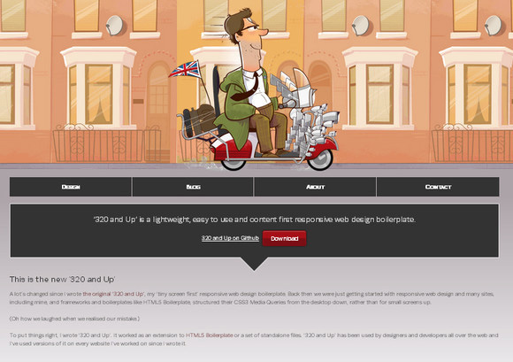
320 and Up
320 and Up is an active and smart way to get a site up and running quickly. It comes with so many modern web design tools.
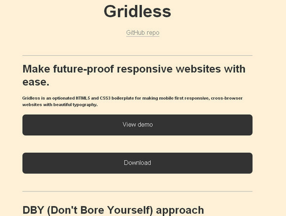
Gridless
Gridless focuses on typography and baked-in cross-browser compatibility and it is packed with HTML5 and CSS3 boilerplates.
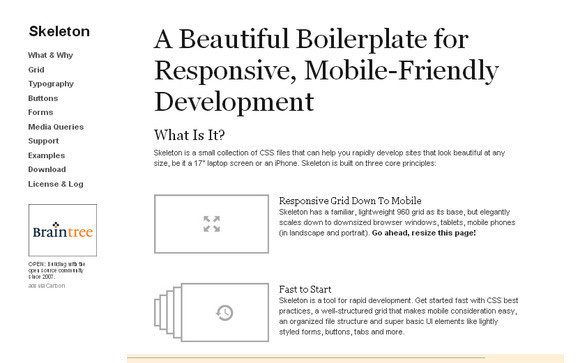
Skeleton
With this tool, you can easily and quickly change your website and make it look good because it contains a small collection of CSS files.
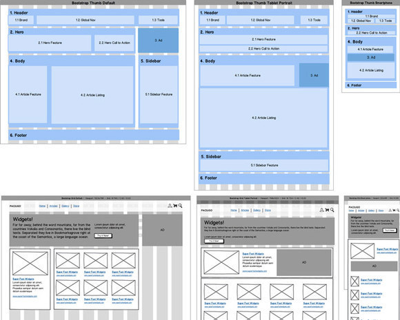
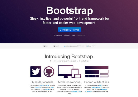
Bootstrap
Bootstrap will help you to get a site online very quickly as it contains a framework and series of components.
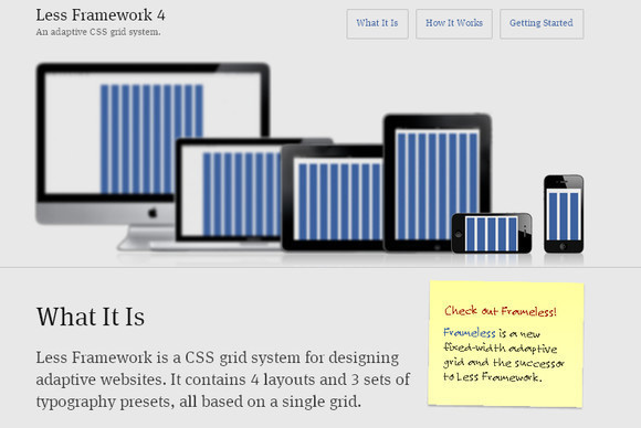
Less Framework 4
This tool currently holds 4 layouts and 3 sets of typography, and they all are based on a single grid and it has a CSS grid system.
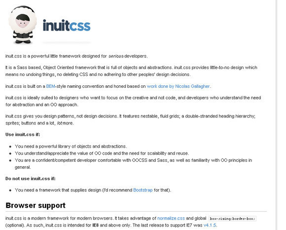
Inuit.css
This tool is a CSS framework and based on a custom grid system and it is packed with a plugin called igloos It covers the core framework to contribute more particular functionality.
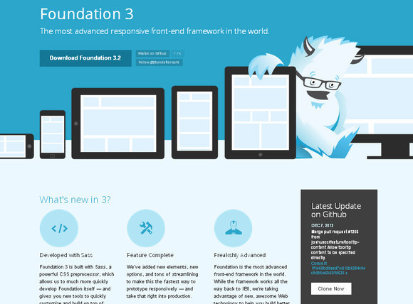
Foundation 3
Throughout the world Foundation 3 is the most progressive responsive front-end framework.
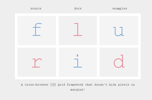
Flurid – The Fluid CSS Grid Framework
This tool does not obscure pixels in margins because it has a fluid width CSS grid framework.
Responsive Plugins, Shims and Polyfills
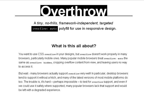
Overthrow
This tool offers most possibly the best user experience for mobile users because it contributes coherent elegant degradation across devices.
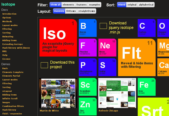
Isotope
This tool will help you when your browser window is resized or the screen size is smaller; it reorganizes all the components of a page and also filters those components. Isotope is the best source when you are designing a responsive design because it is a brilliant jQuery plugin.
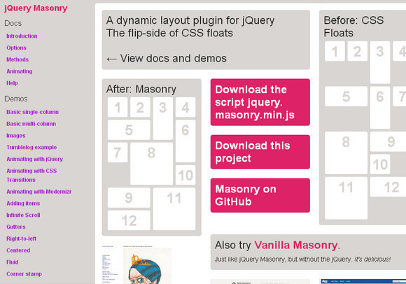
Masonry
If you want to generate dynamic and adaptive layouts then you should use Masonry. This tool is a superb jQuery plugin that allows you to reorganize the elements in your responsive design. After that they can be easily fixed in the open-spots on the grid.
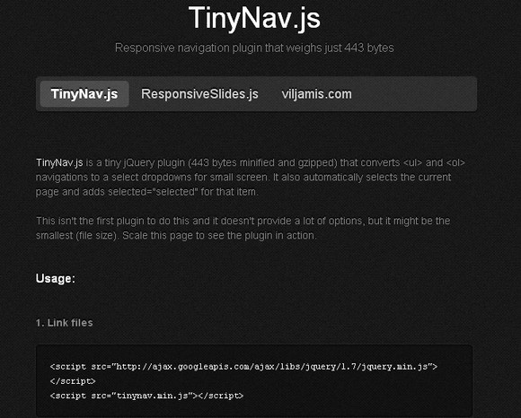
TinyNav.Js
For the smaller screen, TinyNav.js converts big navigation lists into small dropdown menus for smaller screens. This jQuery plugin tool is light in weight and small.
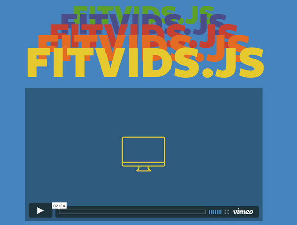
FitVids.Js
When your browser window is resized or you have a small resolution device and you want to modify your embedded videos this tool will help you. FitVid.js is an easy to use jQuery plugin and lightweight.
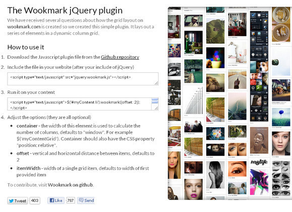
The Wookmark jQuery plugin
This jQuery plugin tool will help you to find out the size of the window and automatically arranges the images into columns. You can resize your browser to see the layout adjustment.
Testers, Debuggers
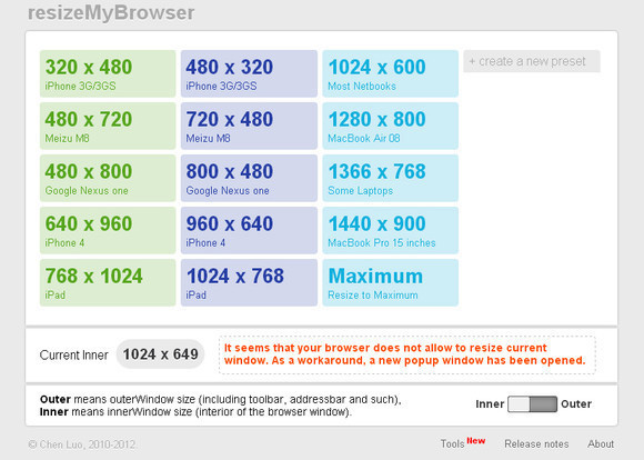
ResizeMyBrowser
This tool contains several preset dimensions for your browser window and will help you to test responsively designed pages or you can also create a new preset.
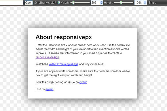
Responsivepx
With this tool, you can check the width and height of a web page to determine how well your media queries are working.
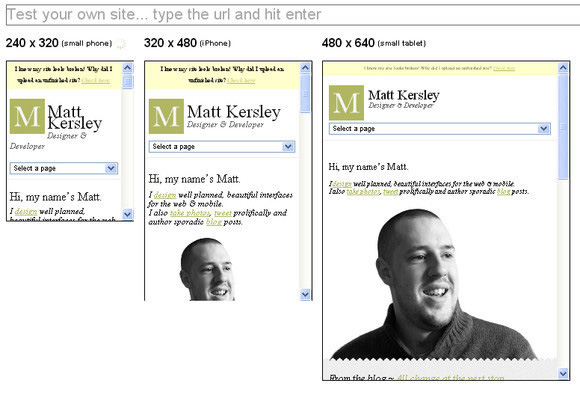
Responsive Design Testing
This tool allows you to check how your responsive website design renders at different browser sizes.
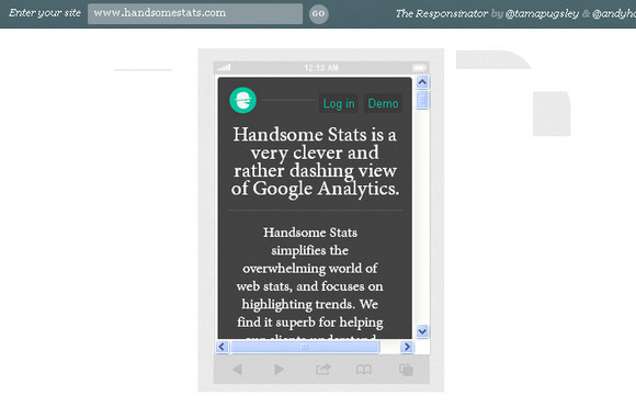
The Responsinator
You can use this tool to check out how your responsive website design will be displayed in different common device sizes with robotic efficiency.
Responsive.is
Simply type in the URL of your website and see how quickly it resizes your web page between a range of predefined presets.
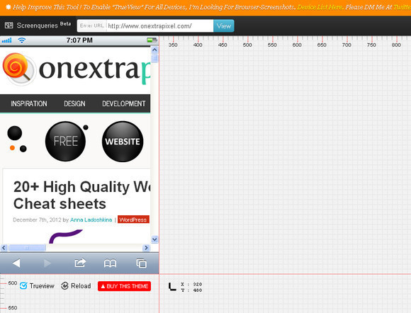
Screenqueri.es
This tool makes fine measurement so much easier because it contains a broad range of mobile as well as tablet presets. It also contains a huge range of grids and rulers.
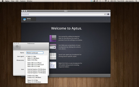
Aptus
With this tool you can easily preview, modify and screenshot your responsive website.
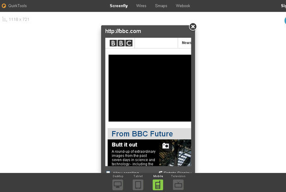
Screenfly
Check your responsive website on different resolutions on desktop, tablet, mobile and television.
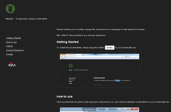
Resizer
Resizer will help you to speedily alter the dimensions of a webpage in order to test responsive design.
Responsive Sliders
Blueberry
This tool is a jQuery image slider which works for fluid and responsive layouts.

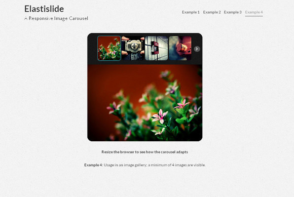
Elastislide
With this jQuery plugin your responsive website automatically resizes when the browser window is resized.
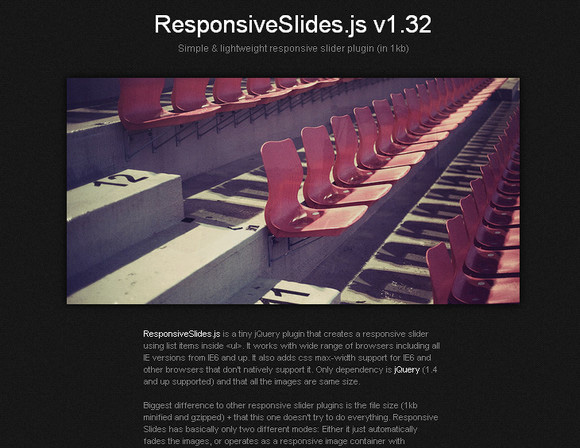
ResponsiveSlides.Js
This tool allows you to create responsive sliders that can work on a wide range of browsers, also on IE6 and up.
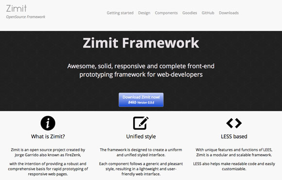
Zimit Framework
Zimit is an open source project created by Jorge Garrido also known as FireZenk, with the intention of providing a robust and comprehensive basis for rapid prototyping of responsive web pages.
Conclusion
Hopefully you have enjoyed browsing this round-up, and have found some useful tools that you can use in your future projects.
Please let us know your thoughts in the section below.


