CSS3 is rapidly expanding the toolkit that web developers and designers have to make visually appealing components without the use of images, Photoshop, or CSS sprites. While all of those have their place, and will never be completely removed from the development process, buttons are one component of a website that we can make dynamic, slick and scalable – exclusively in code.
If you want to see these CSS3 buttons in action, check out the demo. You can also download zip file of the html and CSS markup.

[tut demo=”https://onextrapixel.com/examples/css3-buttons/” download=”https://onextrapixel.com/examples/css3-buttons/css3-buttons.zip”]
Getting Started
All of the CSS3 buttons that we create today will be styled forms of anchor tags. Some like to use button elements for these, but I find it’s easiest to use anchor tags so you can easily add the :hover and :active pseudo classes and quickly add href to it to complete the button.
What We’re Creating
For this tutorial, we’ll be creating several different CSS3 buttons, all of which can have different colors, shadows, sizes – all using pure CSS3. We will be using the following properties: border-radius, linear-gradient, box-shadow, text-shadow and opacity.

But before we begin getting fancy, we need an anchor tag to make our buttons. Since we don’t want this to apply to all links on our website, we’ll utilize classes to target the buttons. So let’s make our button.
<a href="#" class="button">This is a button</a>
For the purpose of this tutorial, I’m going to go ahead and add some padding to the a element. The padding will help form the button, and also retain its flexibility and scalability. We’ll also add a margin to let it breath a bit. Finally, since we’re going to be attaching this class to all of our buttons, let’s go ahead and style the text of our buttons by making the font white, adding some text-shadow, and bolding our button text.
Obviously, you might want to change some of these to fit your purpose, and for light colored buttons, a different color would likely be a wise choice. But that’s for you to decide.
a {
    padding: 6px 12px;
    margin: 4px;
    color: #fff;
    font-family: "Helvetica Neue", Arial, sans-serif;
    font-size: 12px;
    text-shadow: 1px 1px 2px #000;
    text-decoration: none;
    font-weight: bold;
}
Now that we’ve got that established, let’s start making the classes that we’ll attach to the anchor tag.
Creating the Gradient Class
In order to maintain our sanity when working in stylesheets, we’ll create a .gradient class that we can attach to any of our buttons. This uses CSS3’s linear-gradient and opacity to create a dynamic background that will give the effect of a gradient to practically anything you attach it to, allowing the background color to shine through.
To someone that hasn’t looked at a lot of CSS3 markup, this code may look daunting, but I assure you, it’s not. If you want to brush up on your properties syntax and browser prefixes (those -moz, -webkit, -o things you see here), check out.
.gradient {
    background-image: -moz-linear-gradient(rgba(0,0,0,0.1), rgba(0,0,0,0.3));
    background-image: -webkit-linear-gradient-webkit-gradient(linear, 0% 0%, 0% 100%, from(rgba(0, 0, 0, 0.1)), to(rgba(0, 0, 0, 0.3)));
    background-image: -webkit-linear-gradient(rgba(0, 0, 0, 0.1), rgba(0, 0, 0, 0.3));
    background-image: -o-linear-gradient(rgba(0, 0, 0, 0.1)), to(rgba(0, 0, 0, 0.3));
    background-image: -ms-linear-gradient(rgba(0, 0, 0, 0.1)), to(rgba(0, 0, 0, 0.3));
    background-image: no-repeat;
    border: 1px solid rgba(0, 0, 0, 0.2);
}
.gradient:hover {
    background-image: -moz-linear-gradient(rgba(0,0,0,0), rgba(0,0,0,0.2));
    background-image: -webkit-linear-gradient-webkit-gradient(linear, 0% 0%, 0% 100%, from(rgba(0, 0, 0, 0)), to(rgba(0, 0, 0, 0.2)));
    background-image: -webkit-linear-gradient(rgba(0, 0, 0, 0), rgba(0, 0, 0, 0.2));
    background-image: -o-linear-gradient(rgba(0, 0, 0, 0)), to(rgba(0, 0, 0, 0.2));
    background-image: -ms-linear-gradient(rgba(0, 0, 0, 0)), to(rgba(0, 0, 0, 0.2));
    background-image: no-repeat;
    border: 1px solid rgba(0, 0, 0, 0.2);
}
.gradient:active {
    background-image: -moz-linear-gradient(rgba(0,0,0,0.2), rgba(0,0,0,0));
    background-image: -webkit-linear-gradient-webkit-gradient(linear, 0% 0%, 0% 100%, from(rgba(0, 0, 0, 0,2)), to(rgba(0, 0, 0, 0)));
    background-image: -webkit-linear-gradient(rgba(0, 0, 0, 0.2), rgba(0, 0, 0, 0));
    background-image: -o-linear-gradient(rgba(0, 0, 0, 0.2)), to(rgba(0, 0, 0, 0));
    background-image: -ms-linear-gradient(rgba(0, 0, 0, 0.2)), to(rgba(0, 0, 0, 0));
    background-image: no-repeat;
    border: 1px solid rgba(0, 0, 0, 0.2);
}
Let’s dissect those gradient classes real quick. The .gradient class uses the CSS3 property linear-gradient to create a gradient that starts at a 10% opacity and finishes at a 30% opacity. This allows the background color of the underlying object (in our case, it will be the background color of the button) to shine through, creating a gradient background while only requiring one color or hex code. It also adds a 1px border with 20% opacity to give it a little pop on the edges.
The :hover pseudo class changes the opacity at the top from 10% to 0% and at the bottom of the gradient from 30% to 20%, giving it a highlighted look. Finally, the :active pseudo class flips the gradient (making it darker at the top, and lighter at the bottom), giving it a nice depressed look.
Adding a Splash of Color
We’ve got the anchor tag and the gradient classes, now let’s add some color to our buttons. This is where the true beauty of our linear-gradient with opacity shines through absolutely intended.
For my colors here, I’m just going to hop on to Kuler and grab five vibrant colors. Let’s create classes and specify the background-color property to that color.
The CSS:
/*--- The Colors ---*/
.red { background-color: #F20C0C; }
.green { background-color: #30AC04; }
.blue { background-color: #0F9BF2; }
.pink { background-color: #FD13DC; }
.yellow { background-color: #FEF95B; }
The markup:
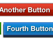
<a href="#" class="button red gradient">This is a Red Button</a>
<a href="#" class="button green gradient">This is a Green Button</a>
<a href="#" class="button blue gradient">This is a Blue Button</a>
<a href="#" class="button yellow gradient">This is a Yellow Button</a>
<a href="#" class="button pink gradient">This is a Pink Button</a>

Rounding the Corners
The border-radius property is one of the widely adopted CSS3 properties that almost all modern browsers use (except, of course, for Internet Explorer 8 and previous). iOS Safari and older versions of Safari and Firefox still use the -webkit and -moz prefixes, so we’ll use them here to insure compatibility. CanIUse’s support grid shows 61.1% support across users. That number should continue to rise as the most updated version of every major browser supports border-radius and our code gracefully degrades to display the nice box button in the previous example.
Leveraging the flexibility of classes, we’ll create three classes for rounded corners, which gives you flexibility when deciding how you want your button to look.
.large-corners {
    border-radius: 20px;
    -moz-border-radius: 20px;
    -webkit-border-radius: 20px 20px;
}
.medium-corners {
    border-radius: 12px;
    -moz-border-radius: 12px;
    -webkit-border-radius: 12px 12px;
}
.small-corners {
    border-radius: 6px;
    -moz-border-radius: 6px;
    -webkit-border-radius: 6px 6px;
}
So by simply attaching these classes to your buttons, you can quickly switch between a button with large 20px rounded corners, to one with small 6px corners, or leave the class off all together and get a button with square corners. Plus, throwing the color classes in there (and the ability to make more color classes) gives you a complete tool set to create an unlimited number of buttons.
<a href="#" class="button green gradient">This is a Green Button</a>
<a href="#" class="button blue gradient small-corners">This is a Blue Button</a>
<a href="#" class="button pink gradient medium-corners">This is a Pink Button</a>
<a href="#" class="button yellow gradient large-corners">This is a Yellow Button</a>

Dynamic Sizing
The greatest part about using CSS3 to create your buttons is the freedom it allows you to change things up on the fly. No more firing up Photoshop every time you want to create a larger button for an emphasized call to action, or a smaller button to link to the rest of a story. To create different buttons here, simply create different classes, with varying text size. Since the .button class already has a padding of 10px on the top and bottom and 20px on the left and right, the gradient button will automatically resize.
For this example, I’ve created four new classes (.button-small, .button-medium, .button-large, and .button-xlarge) and simply altered the font-size property. Additionally, to keep the visuals looking good, I’ve altered the padding on the smaller two buttons, so the button size doesn’t overwhelm the call to action (the text).
.button-small {
    font-size: 10px;
    padding: 5px 10px !important;
}
.button-medium {
    font-size: 12px;
    padding: 8px 12px !important;
}
.button-large {
    font-size: 16px;
}
.button-xlarge {
    font-size: 24px;
}
To activate these classes, simply attach them to the anchor tags in your code.
<a href="#" class="button gradient green button-small">This is a small button</a>
<a href="#" class="button gradient blue button-medium">This is a medium button</a>
<a href="#" class="button gradient pink button-large">This is a large button</a>
<a href="#" class="button gradient yellow button-xlarge">This is a XL button</a>

Drop that Shadow
Time to make another class. Getting sick of them yet? It may seem like a lot, but when you think about the flexibility that it provides you to literally be able to have any type of button on your website, a little leg work in the stylesheet pays off.
So we’ll create a .shadow class with the CSS3 box-shadow property. For details on this property, check out CSS3Files.com.
shadow {
    box-shadow: 0px 0px 4px 2px #aaa;
    -webkit-box-shadow: 0px 0px 4px 2px #aaa;
    -moz-box-shadow: 0px 0px 4px 2px #aaa;
}
<a href="#" class="button pink gradient medium-corners button-xlarge shadow">This is a Pink Button</a>

A Gradient Twist
Another popular method of using gradients is to make the background come to a ‘point’ in the middle. This is done by using the linear-gradient property with a 50% stop. For these, you will need to specify specific colors.
.alt-gradient {
    background-color: #ee432e;
    background-image: -webkit-gradient(linear, left top, left bottom, from(#ee432e 0%), to(#c63929 50%));
    background-image: -webkit-linear-gradient(top, #ee432e 0%, #c63929 50%, #b51700 50%, #891100 100%);
    background-image: -moz-linear-gradient(top, #ee432e 0%, #c63929 50%, #b51700 50%, #891100 100%);
    background-image: -ms-linear-gradient(top, #ee432e 0%, #c63929 50%, #b51700 50%, #891100 100%);
    background-image: -o-linear-gradient(top, #ee432e 0%, #c63929 50%, #b51700 50%, #891100 100%);
    background-image: linear-gradient(top, #ee432e 0%, #c63929 50%, #b51700 50%, #891100 100%);
    border: 1px solid #951100;
}

Breaking the Mold: Adding 3D Depth
Now is when we start to experiment a little bit more. By using the box-shadow property and defining multiple shadows separated by a comma, we can add an inset box-shadow (like an Inner Shadow in Photoshop), a light shadow on the top and sides, and a deep shadow below. While this may not look like much, when you “erase” that deep shadow, while offsetting it with some margin and padding, you really get the effect of a 3-dimensional button that you’re pushing down. Check it out.
.push {
    box-shadow: inset 0 1px 10px 1px #5c8bee, 0px 1px 0 #1d2c4d, 0 6px 0px #1f3053, 0 8px 4px 1px #111111;
    -webkit-box-shadow: inset 0 1px 10px 1px #5c8bee, 0px 1px 0 #1d2c4d, 0 6px 0px #1f3053, 0 8px 4px 1px #111111;
    -moz-box-shadow: inset 0 1px 10px 1px #5c8bee, 0px 1px 0 #1d2c4d, 0 6px 0px #1f3053, 0 8px 4px 1px #111111;
    display: inline-block;
    margin-bottom: 10px
    padding: 10px 0 12px 0;
}
.push:hover {
    box-shadow: inset 0 0px 20px 1px #87adff, 0px 1px 0 #1d2c4d, 0 6px 0px #1f3053, 0 8px 4px 1px #111111 !important;
    -webkit-box-shadow: inset 0 0px 20px 1px #87adff, 0px 1px 0 #1d2c4d, 0 6px 0px #1f3053, 0 8px 4px 1px #111111 !important;
    -moz-box-shadow: inset 0 0px 20px 1px #87adff, 0px 1px 0 #1d2c4d, 0 6px 0px #1f3053, 0 8px 4px 1px #111111 !important;
}
.push:active {
    box-shadow: inset 0 1px 10px 1px #5c8bee, 0 1px 0 #1d2c4d, 0 2px 0 #1f3053, 0 4px 3px 0 #111111 !important;
    -webkit-box-shadow: inset 0 1px 10px 1px #5c8bee, 0 1px 0 #1d2c4d, 0 2px 0 #1f3053, 0 4px 3px 0 #111111 !important;
    -moz-box-shadow: inset 0 1px 10px 1px #5c8bee, 0 1px 0 #1d2c4d, 0 2px 0 #1f3053, 0 4px 3px 0 #111111 !important;
    margin-top: 8px;
}

Compatibility
While more and more browsers are starting to adapt CSS3 properties, there are still the holdouts (and users that haven’t upgraded) and thus, the buttons we created today won’t appear perfectly across all browsers.
Gradient Backgrounds
Our pretty gradient backgrounds will work across most modern browsers, but won’t work in – you guessed it – IE (including IE9). This is why we specify a solid fallback color for the buttons. According to W3Schools’ latest browser statistics, the gradients will work in just over 75% of your reader’s browsers.
Box Shadow
The box-shadow property is widely used, and renders properly in all modern browsers (although it breaks in past versions of IE). CanIUse has the support at about 60% for this property. Note, for older versions of IE, the degradation of the push button is not the most graceful. With the rest of the buttons that use this property, the shadow doesn’t make or break the button – simply adds elegant design components.
Rounded Corners
The rounded corners of our buttons will have even more compatibility throughout the modern browsers, but should still include the -webkit and -moz prefixes to ensure compatibility with older and newer browsers.
If you’re looking for a comprehensive list of what works and what doesn’t when it comes to CSS3 properties, check out OXP author Christian Krammer’s CSS3files.
[tut demo=”https://onextrapixel.com/examples/css3-buttons/” download=”https://onextrapixel.com/examples/css3-buttons/css3-buttons.zip”]
Moving Forward
There will always be new and innovative ways and methods to create buttons with and without the use of images. Some may find it easier to use the CSS3 property opacity and not specify a color in the main .button class. Explore the options that work best for your purpose and your website. As the web becomes focused on being more lightweight utilizing CSS3 buttons are one simple way to allow for slick, stylish and dynamic buttons that are flexible without the use of images!
How do you plan on using CSS3 buttons on your website or for client projects?


