
The Contact Us page. It’s often forgotten, abused, poorly maintained and made so that no one can find it.
Why? Why would a company or designer neglect the one part of the website that truly matters when it comes to customer relationships?
Sure, a fancy support knowledge base is nice, but nothing can replace a beautiful, fun and engaging Contact Us page.
Therefore, I want to walk you through some of my favorite Contact Us page best practices. These aren’t mind-melters or anything close to brain surgery. But they’ll introduce simple tactics, along with real world examples to get you inspired.
So, keep reading to improve your Contact Us page.
Use Call to Action Buttons So Users Know What to Do
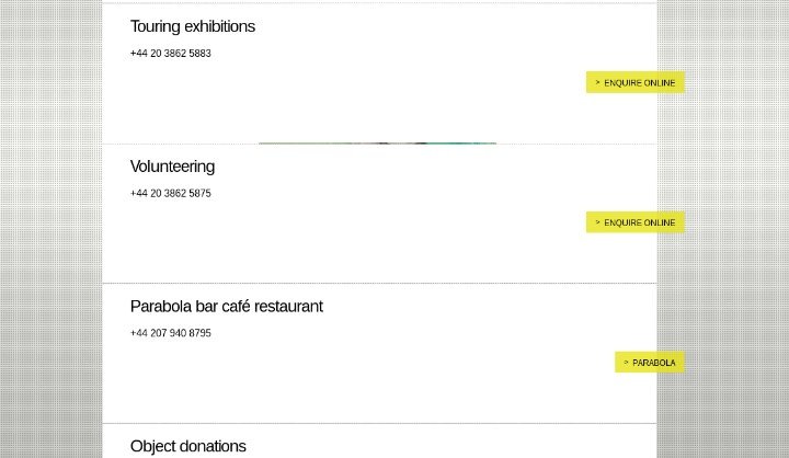
Taking a look at the Production Locations Contact Us page, you immediately notice where you should go. The company has several departments, making it all the more necessary to break up your contact page into multiple call to actions.
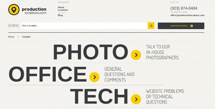
For example, the Photo department has its own email address. But Production Locations didn’t stop there. The web designer generated some bold fonts to make the Photo department standout. Then she added a little yellow arrow icon to draw attention. Then she has the large call to action, “Talk to Our In-house Photographers.”
You can’t get much better than this example, considering each call to action is clear, concise and complemented by various other strong design elements.
Offer More Contact Options Than Just Email
Some companies or individuals are not interested in sharing lots of contact information. For example, when I started my first blog I was not about to give out my phone number to a bunch of random people all over the world. I was even hesitant to share my email address. However, an electronics retailer has no choice but to have a support phone line as well as options like email, chat, social media and more.
Therefore, it’s essential to figure out what type of contact information your users expect from you, then provide all of them on the Contact Us page.
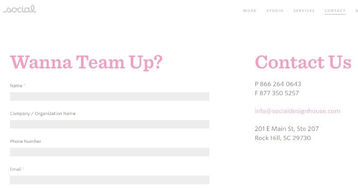
The Social Design House company is a digital marketing studio, so it makes sense they would have the standard email form for potential clients to get in contact. However, clients are probably more likely to reach out over the phone for a quick call. So that makes sense as well. Lower on the Contact Us page you’ll find social media buttons, and it’s worth mentioning that the address is provided just in case a client wants to stop by for a visit.
Avoid Boring Written Content on the Contact Form
One of my favorite Contact Us page best practices is to get creative. Far too often we see businesses that pretty much do the bare minimum throughout their websites. But what’s the point of building a presence online if you don’t plan on standing out? The cool thing is that you don’t need to spend tons of time or money as a developer or online business to make your contact form less boring.
Take QuickSprout for example:
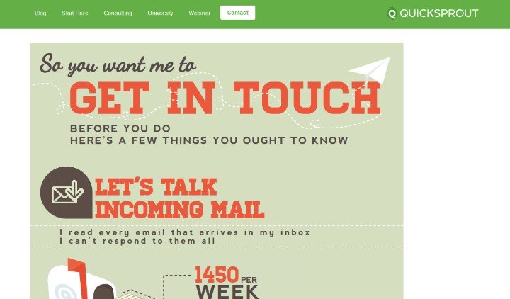
Instead of showing a standard contact form, the folks as QuickSprout made an infographic. Yes, much of it has to do with telling how much email they get (and how they probably won’t respond,) but much of the information is rather informative, such as the topics Dev Patel doesn’t want to hear about through his email.
What’s more is that he combined an email form with the infographic. If you’re looking for an area on your website to get more creative, look no further than the contact form. You don’t have to make jokes or anything, but even something like an infographic doesn’t take much time or money.
Place Contact Information at Bottom and Top of Page
This is kind of a general rule for your entire website. If you have a footer, place a contact form or your contact information in this area. Headers should contain this information as well (or at least the information you’d like to give out). This depends entirely on the type of business being run. For example, a hosting company would be foolish to not have a phone line, email, chat box and knowledge base.
Companies with customers who need advanced support are going to need all of this information in the header, footer and Contact Us page. As for, say, a simple travel blog, you might only need a little contact form towards the top of your Contact Us page and in the footer so that it reaches every page on your website.
Make it Easy With Only Necessary Fields
The only time this shouldn’t apply is when you have a large company with a wide variety of departments. Even then, all the contact form should have is a little dropdown box for the customer to select the department. They shouldn’t have to specify or read anymore than that. It’s up to the company to then have a support system that sends the right emails to the right departments.
However, most other companies are only in need of three or four fields on the email contact form.
Take the R Leonardi Contact Us page for instance. The form is actually shown on the bottom of the onepage homepage, but it’s only asking for the email, subject line and message. You can’t get more rudimentary than that, and that’s what customers enjoy.
Some of Our Favorite Contact Us Pages
Bert Timmerman
The Bert Timmerman Contact Us page presents multiple options for you to contact him, and you can see social media buttons. It’s simple and to the point, just like you would want for a personal blog or portfolio.

Design Museum
The Design Museum company does a solid job of breaking apart its department. They might be able to clean this up with an FAQ or accordion-style design, but overall the buttons and call to actions stand out.
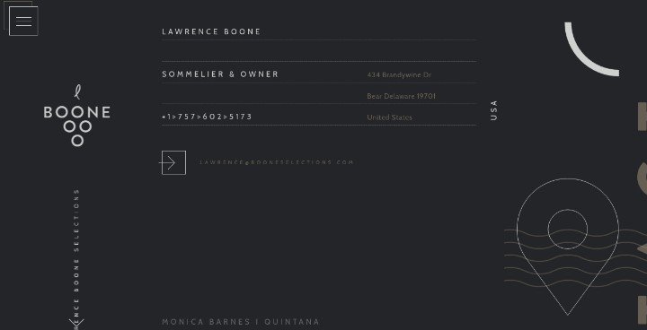
Boone Selections
I suggest you click through to view the Boone Selections page due to its storytelling and visual wonders. As a user scrolls down on the Contact Us page they see all sort of animations and new contact information.
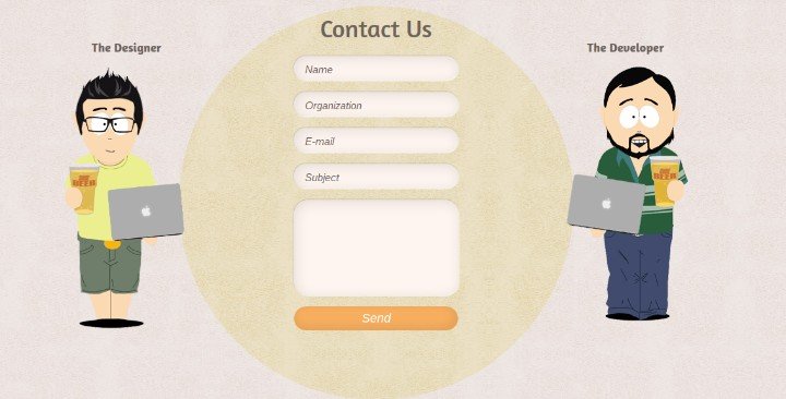
Melon Free
Melon Free goes the South Park route, showing that the company is fun, creative and interested in grabbing attention without making the user do much work with a long form.
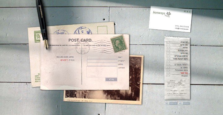
Lion Ways
Not only does Lion Ways have a short email form, but they’ve included various other contact options, such as the phone number. Oh yeah, and the design is creative as hell.
Hello Innovation
Hello Innovation is another example of solid storytelling. The brand uses the Contact Us page as an opportunity to explain more about the company and share all about the culture and people.

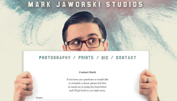
Mark Jaworski Studios
Here’s a personal portfolio. Showing his face on every page is certainly going to help with a freelancer or studio, and the quick contact form doesn’t try to get too crazy. Why? Because the website already looks sweet, and there’s no reason to clutter up the contact form.
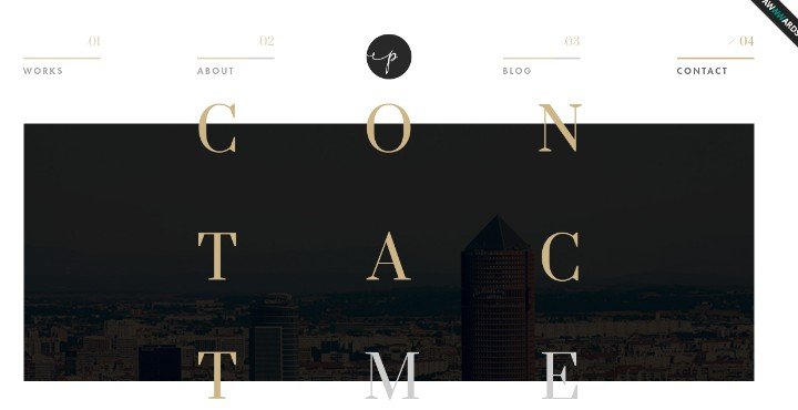
Pauline Osmont
Pauline Osmont utilizes typography to intrigue guests and make the Contact Us page look incredible. The form design ties into the overall brand, and the social media buttons are clearly right below the form.
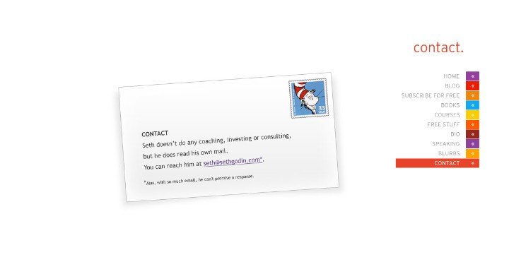
Seth Godin
This is classic Seth Godin. He bluntly tells you what he’d like to see in his inbox. Then he provides a simple, fun design for people to get a laugh out of.
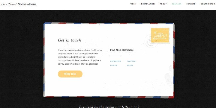
Let’s Travel Somewhere
The best Contact Us pages have designs that fit the brands. For Let’s Travel Somewhere, it makes sense the contact form is a postcard.
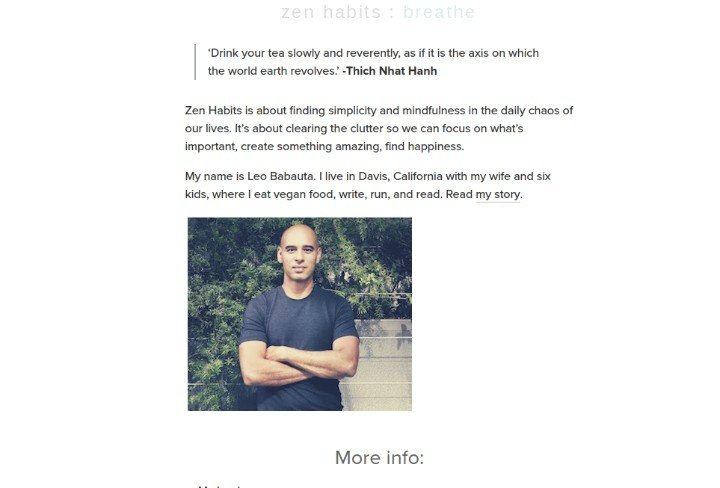
Zen Habits
Be sure to visit the Zen Habits Contact Page, since it’s filled with links, information, resources and images to help the creator stand out. I’d argue this is one of the best ways to configure a blog Contact Us page, so take notes.
Sweet Basil
The Sweet Basil Contact page incorporates parallax effects, maps, pictures of the restaurant and all the contact information a patron needs.

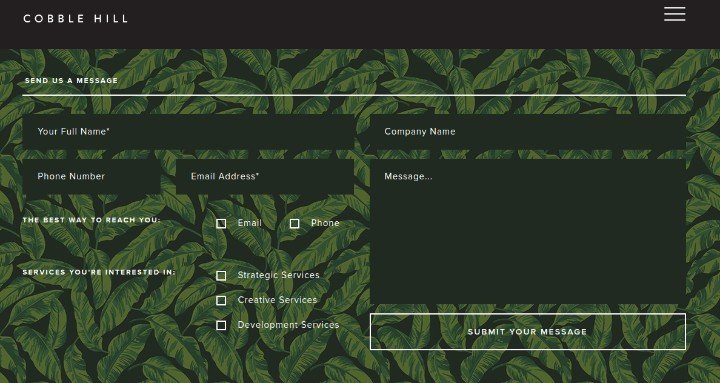
Cobble Hill
Although I think the Cobble Hill form is a little too complicated, it’s good to see a studio ask the user what types of services they are interested in. Other than that, you can see social media buttons, addresses and phone numbers above the form.
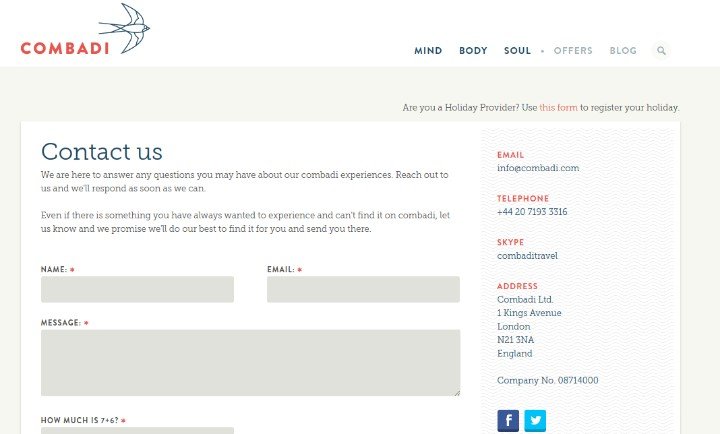
Combadi
The Combadi brand is all about mind, body and soul, so it makes sense that the Contact Us page is pretty simple and soothing.
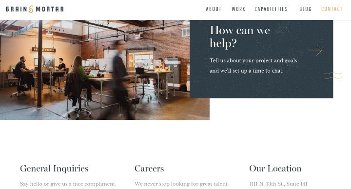
Grain and Mortar
Some companies want to get a little more information about the user before reaching out to chat. This is common with lawyers and consultants who need the whole span of a project before wasting their time with a call. Not only that, but sometimes it’s good to include information about your Career on the contact page. One thing I’ve found is that career information never seems to be easy to locate.
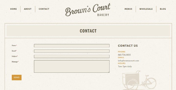
Brown’s Court Bakery
Brown’s Court Bakery has a nicely branded Contact page, complemented by an email address, form, phone number and the hours. Sweet and simple.
Over to You…
Now that we’ve had a chance to check out some wonderful Contact Us page best practices be sure to share links to your own Contact pages in the comments below. Do you have any questions or suggestions for other people?


